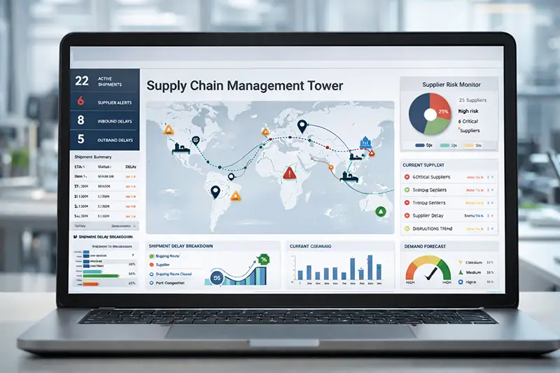
If there is one thing that is certain about the supply chain, it is that it can be unpredictable. For organizations in the supply chain industry,...

How Data Holds the Answer to Cross-Docking
read more
See how analytics trends are impacting your business and industry
If there is one thing that is certain about the supply chain, it is that it can be unpredictable. For organizations in the supply chain industry,...

To some people, analytics is an art form. To others, the data itself is art. Those people, including Grammy winner Jewel, bring data to life through...

Colleges and universities use vast amounts of data to make sure they are operating at peak efficiency. There are numbers focused on maintaining a...

Healthcare organizations have invested millions in electronic health record platforms such as Epic, Oracle Health, and MEDITECH. These systems have...

Some of the most successful implementations of artificial intelligence (AI) have been in areas where it is clearly saving people time in tangible...

Artificial intelligence is quickly becoming a priority across the beverage alcohol industry. Companies are exploring AI for everything from demand...

Organizations can do everything in their power to set themselves up for shipping success only to be derailed by a problem. When it comes to a train...

Organizations have invested heavily in modern data platforms. Cloud warehouses, data lakehouses, and artificial intelligence tools promise faster...

After the Cleveland Cavaliers lost Game 3 of the Eastern Conference Finals to the New York Knicks to fall behind 3-0 in the best-of-seven-game...

There is a lot of change in the utilities industry. Increased demand for electricity, the need for cleaner energy, and an aging infrastructure are...

Organizations are constantly taking steps to make sure their supply chains are running as efficiently as possible. There are all kinds of possible...

Baby boomers caused the largest-ever 10-year gain among the 65+ population from 2010 to 2020. The increase of 15.5 million people was the fastest...

One of the ways colleges and universities use data is to determine if they could be offering more classes that might draw prospective students....

Over the past few years Major League Baseball has introduced a number of new rules. For a sport notoriously slow – or even resistant – to making...

The next disruption in beverage alcohol isn’t coming from a new product—it’s coming from healthcare. For years, the biggest shifts in beverage...
If there’s been one constant in the supply chain industry over the past half-decade it is the likelihood of disruption. Dating back to the pandemic,...

At some point, every healthcare organization runs into the same problem: two reports, same metric, different answers. Finance has one number....

Data can serve different purposes for different organizations. Many organizations acquire an analytics solution to develop a plan for their own...

As the 2026 election nears, energy prices are expected to be front and center in the political conversation. Lawmakers who already felt prices were...

Data can sometimes be intangible. We don’t encounter the numbers in our everyday lives that organizations spend most of their time trying to make...