The rainbow is a beautiful example of a terrible use of color. Well, that’s not entirely true. It’s wonderful to look at in nature. But it’s misused...
Proper Use of Color in Data Visualization
read more
See how analytics trends are impacting your business and industry
The rainbow is a beautiful example of a terrible use of color. Well, that’s not entirely true. It’s wonderful to look at in nature. But it’s misused...
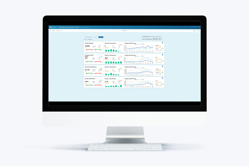
On the healthcare applications team, we have developed standard Measure Factory applications for visualizing, analyzing, and understanding data. In...