
Your organization has invested a lot of time and money collecting data and wants to get some useful information out of what you’ve collected. In the early days of BI, usually only a few people in the company could make sense of the data. But today, with dashboards, more and more employees are able to access the data and use it to make better decisions.
Tweet: Back to Basics: 5 Things to Think about When You Create a Dashboard
What does this mean to you, the dashboard designer? It means you are probably creating dashboards for more than just one or two individuals. And because you have so many end users, creating dashboards that are used or not can severely impact what the company experiences in terms of ROI in the dashboards themselves. The bottom line: you want your dashboards to be understood by every end user. How can you do it? Get back to basics and follow these 5 concepts.
1. Think of the user first
It’s easy when undertaking any kind of project to get carried away with details that satisfy our own needs or impress our bosses. But the truth is: you wouldn’t have a job creating dashboards if the end user did not exist. So, make your most important task fulfilling the needs and desires of your client – the end user. If they are happy with the work you’ve done, you’ve got job security for the long run.
2. Keep it simple; don’t overwhelm the viewer
“Keep it simple” has been overused as an adage so I am leery to bring it up. But like so many sayings that are repeated incessantly, it is a concept that stands the test of time. It’s important. The reason why is that people have a lot on their minds. There are many distractions in the work environment and in everyday life. Keeping the dashboard simple assists people in understanding the information they see. Make it difficult for the user to understand your dashboards and your inbox will be filled with complaints. Make it easy for users to understand your dashboards and they will love you.
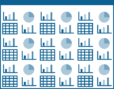
Figure 1: No.

Figure 2: Yes!
3. Don’t be afraid of white space
I’ve met people who want to fill every space in a layout with some sort of content, even if they must enlarge a single item or add meaningless decorations to the layout. If they’d read item number 2, they would realize that a busy layout can be confusing to the user. The thing they fear most (white space) is actually a designer’s best friend. A designer can use white space around the most important item to bring most of the visual attention to that item. Don’t be afraid of white space; use it to your advantage.
4. Label everything
Using white space to your advantage and keeping the layout simple do not mean that you can neglect necessary information like labels. Do not assume that the end user knows what any chart or graph means. Label the overall content with a title and label each element using a “key” for things like colors, line thicknesses, patterns, and so on. Labels do not have to be big – but they must be present.
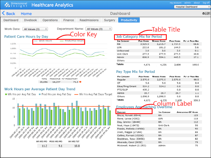
Figure 3: Label examples
5. Focus on meaning
In one’s zest to create a beautiful dashboard, the real purpose of the dashboard can elude the designer. The real purpose is to provide meaningful information to the end user in the form of data displays. Focus on the meaning for successful dashboards that users love. Think about how a new user will experience seeing the dashboard user interface for the first time. If there is anything in the layout that is confusing, use labels, images, size, position … any tool in your dashboard toolbox … to get rid of the confusion.
These 5 concepts are pretty basic, but they are important to remember. If you have a dashboard design tip that you would like to share, please let us know in the comments box below, and we may use it for an upcoming article!

- Meet the Dimensional Insight Team: Gabrielle Amarosa - December 1, 2022
- What You Need to Know About President Biden’s Marijuana Pardon - November 2, 2022
- How to Ace this Year’s OND - September 27, 2022