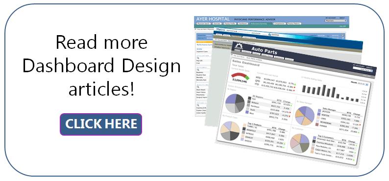
 There are tons of dashboard design examples on the Internet. Just Google “dashboard design examples” yourself and you’ll see. (I got 1,060,000 results!) If you click on any of the results, you will notice that some of these pages offer free templates of dashboard designs.
Tweet: How to use a feedback loop to refine your dashboard design
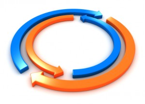
Using one of these can be a fast and easy way to create a dashboard. But will it be a dashboard that your users love and enjoy using? We all know there are lots of different dashboard designs and advice about best practices. But which design is best for YOUR users and their needs? There is a way to find out and you do so with what’s called a “feedback loop.”
What is a feedback loop?
According to dictionary.com, a feedback loop is the path by which some of the output of a circuit, system, or device is returned to the input. The essential factor is that something from what comes out goes back into the origin of the path. In the case of design, the thing that comes out of the system is the user’s unique experience with the design. That experience is returned to the designing of the object by way of the user’s approval or disapproval and comments — their feedback. Output from users of an item cause the designer to modify their design, or stop modifying their design depending on the feedback, positive or negative.
The feedback loop is a great mechanism for creating designs that keep users happy. Some dashboards serve a huge audience. When this happens, dashboard designers may not have a way to get feedback from that audience. For the designer, it becomes difficult (if not impossible) to know what is working and what is not working on a dashboard. But that is the most important thing dashboard designers need – user feedback and a chance to use an iterative process when developing dashboards.
How a feedback loop works
Let’s look at a different kind of design to see how a feedback loop works.
Consider spoon design. Spoons have been in existence for thousands of years. You’d think by now people would have perfected its design and there would be one ideal spoon design. But there isn’t. There are a lot of different spoon designs. Here are some examples that I found:
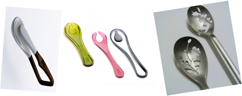
Sources: http://design-milk.com/contestant/pin-spoon/; http://www.hometone.com/10-strange-stylish-spoon-designs.html; http://www.yankodesign.com/2010/09/16/two-parts-and-then-one/
And there are many more spoon designs than what I’ve presented here. How did we end up with so many different spoon designs? It happened because the end user and the uses of the spoon are different. There are big people, small people, fancy people, and simple people. There are spoons for measuring, eating, and serving. The list of users and uses for spoons is long. Enter the feedback loop.
Here’s the way this would work while designing a spoon:
Step 1. The user makes a request of the designer based on his or her unique needs.
Step 2. Based on the request, the designer interprets the request and creates a draft. Then, the designer shows the draft to the user.
Step 3. The user reviews the design, with 2 possible outcomes:
- The user disapproves the design because it does not meet his or her needs. Return to Step 1.
- The user approves the design and the process ends.
Steps 1 through 3 are repeated over and over until reaching part 2 (the end) of Step 3.
The movie “Groundhog Day” is great example of how the feedback loop works to improve outcomes. Only by reliving a single day over and over again can Bill Murray learn exactly how to win over Andie MacDowell.
The feedback loop is iterative and for some, this can be unnerving. How do you know when to stop? Ideally, the process never ends completely. As needs change, feedback returns to the designer and designs are modified. However, for the sake of efficiency, it is wise to have some sort of goal or measure of when success has been achieved. In the case of a dashboard design, something like, “When the top 10 users agree that the dashboard fills their needs without any major difficulties, the dashboard is ‘done.’”
The feedback loop in dashboard design
I cannot stress enough how important it is for the person who designs the dashboard to engage in an iterative design process with the dashboard end users. The designer doesn’t have to meet with every single user – as we know, some dashboards have thousands of users so feedback from every one of those users would be too time-consuming to be practical. But the designer does need to hear straight from at least a sampling of users to know what the complaints are — and what the praise is too.
Feedback loops can be positive or negative. (You don’t get rid of something if it is perfect!) If you do not have the luxury of meeting with even a single user, there are 2 things you can do:
- Create a survey (simple surveys in Survey Monkey are free) and provide a link to that survey right on the dashboard page. (You can use an HTML portlet to do this.)
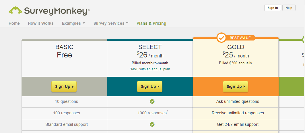
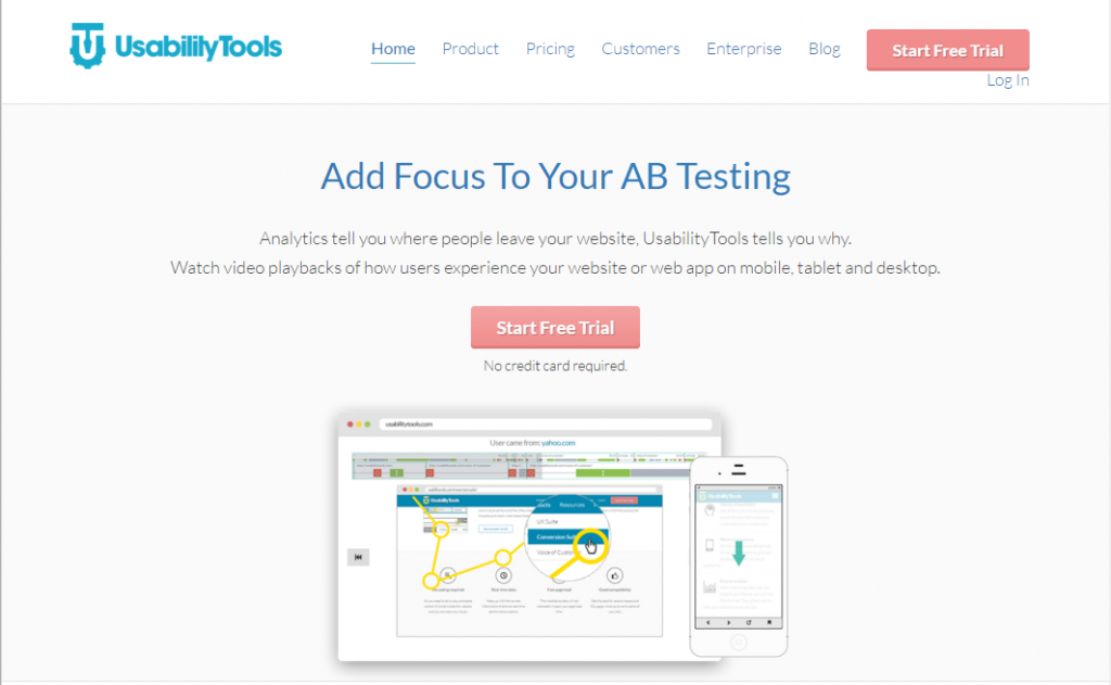
- Employ the use of Usability Tools (http://usabilitytools.com/) to understand how your users are interacting with your dashboard. You can start using this particular product with a free trial.
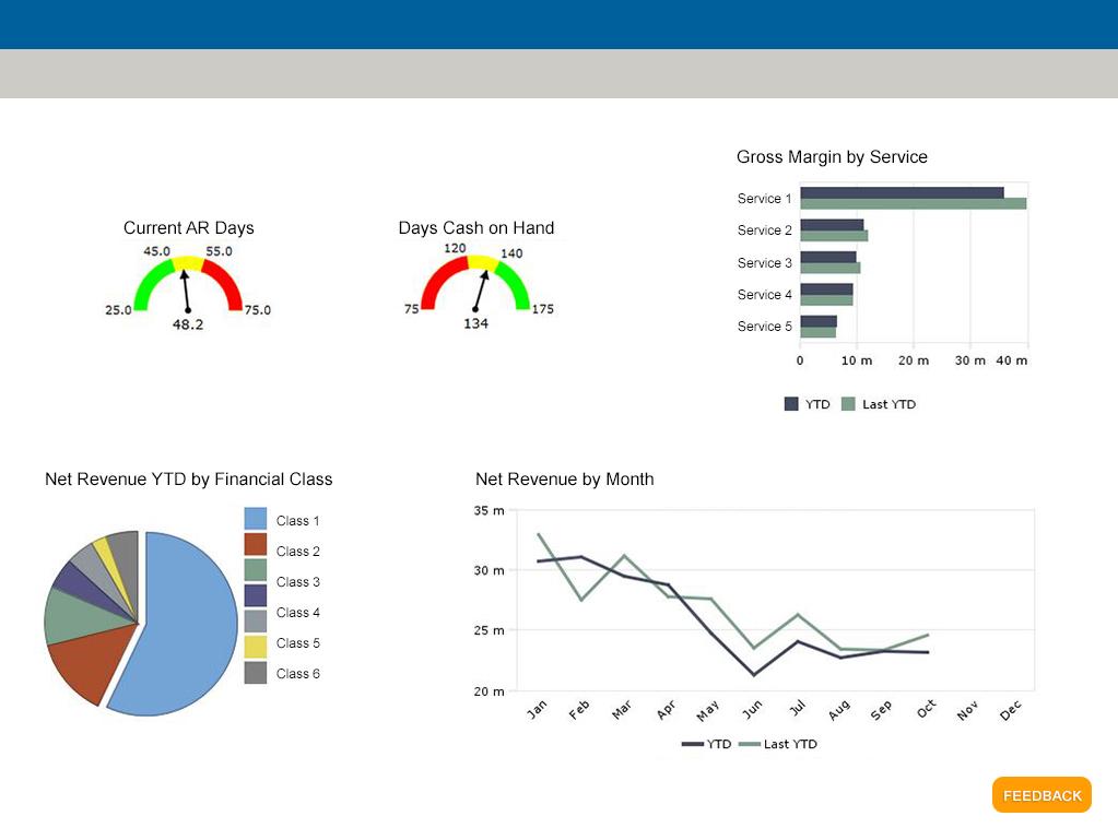
Here’s how I’d include a survey on my own dashboard. It’s just a simple “Feedback” button in the lower right hand corner of the screen that links to my survey:
Here are some questions that I would include on the survey:
- What do you think of the dashboard layout?
- The layout is perfect.
- There’s too much white space. I’d prefer to have more charts and graphs so that I don’t have to dive on the existing data. The additional charts I’d like to see are:___________
- The layout is too cluttered. I’d prefer to have fewer charts and graphs so that I can more easily read what’s important to me. The charts I’d like to see removed are:__________
- What do you think of the typography on this dashboard?
- The typography is perfect. It is easy to read and comprehend.
- I find the typography hard to read. I think it is too small.
- I just don’t like the typography. I think it is too big, small, ugly (select one).
- What do you think of the colors on this dashboard?
- The colors are perfect.
- The colors are too dark.
- The colors are too light.
- I find it hard to distinguish between the different colors on this dashboard.
Of course, some of your questions will revolve around the data and usability of the interface. Start with a simple survey and use your final question to gather open-ended comments. From these comments you may be able to develop more concrete, multiple-choice questions.
There are tons of different dashboard designs that could work for your own project. Looking at “best practices” and templates provided by others is an easy way to get up and running quickly. But for the most effective dashboard designs, employ a “feedback loop”. Your dashboard design may not look like anyone else’s design, but it will best suit the needs of your users. And when users are happy with their dashboards, they are more apt to engage with them. Productivity is the ultimate reward.
- Meet the Dimensional Insight Team: Gabrielle Amarosa - December 1, 2022
- What You Need to Know About President Biden’s Marijuana Pardon - November 2, 2022
- How to Ace this Year’s OND - September 27, 2022

