“I’m not a designer, dang it!”
Does that sentiment sound familiar to you? You’re not alone. Lots of IT professionals find themselves in this situation. You’ve been asked to create a dashboard design that is pleasing to your users, but you have no design training to fall back on while creating the dashboard.
The problem is that business intelligence professionals working in IT have lots to do:
- Writing code
- Understanding business rules and how to apply them to the dashboards
- Integrating tons of data
- Pleasing lots of users with varied backgrounds
With so much to do, wouldn’t it be nice to find a FAST way to design your dashboard AND know that it’s going to look good in the end?
Tweet: How to design a dashboard when you’re not a graphic designer
Try this advice on the best way to arrange elements on a dashboard page.
Using the Rule of Thirds to organize your dashboard
Simply follow the “Rule of Thirds” to easily organize tables, charts and graphs on your dashboard page. The fact that artists from a wide variety of practices have used the “Rule of Thirds” for years should be reason enough for you to believe its effectiveness. However, if you want to understand more about it, its history, and how it works, Wikipedia’s page does a good job of explaining it. But if you just want to use the rule, read on…
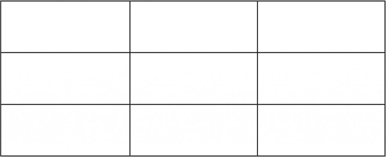
First, use this simple grid to layout the elements of your dashboard. The grid divides a rectilinear space into 9 smaller equally spaced, equally sized, rectilinear spaces.
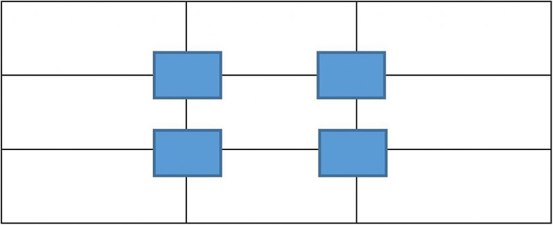
Next, position data objects (tables, charts and graphs) at the intersections of the grid lines.
Or, you can use the spaces between the grid lines to help organize the elements.
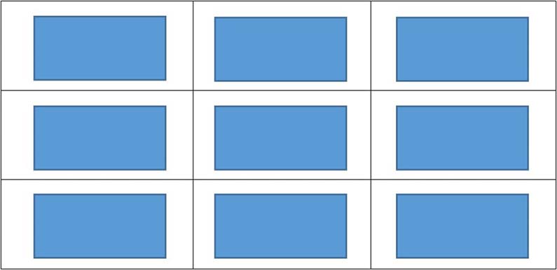
Now, you may be saying to yourself, “What’s so crazy-good about that?” What’s good about it is that, with the grid lines removed, the tables, charts and graphs are spaced out evenly in the available screen area. Believe it or not, I HAVE seen dashboard layouts where the designer decided to squeeze everything as close together in the upper left-hand corner of the page like this:
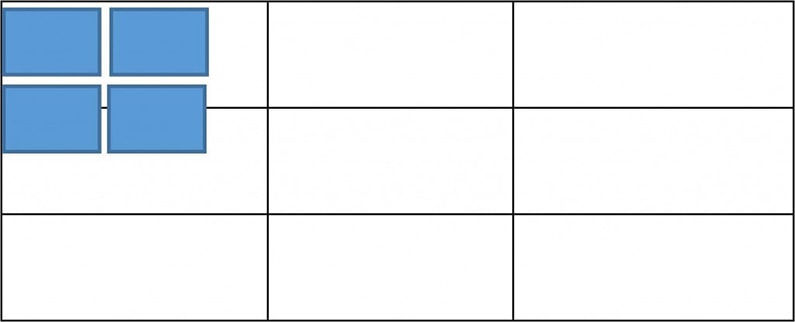
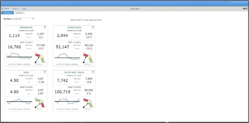
The problem is that in such a layout, the white space overwhelms the area containing the tables, charts and graphs. And, as we all know, the area of highest contrast gets the most attention. So that BIG giant white space is going to draw the viewer’s eyes away from the data delivery – the objects that are tables, charts and graphs. We created this sample dashboard to show you what the issue would look like.
Now here is how the dashboard would be laid out using the Rule of Thirds.
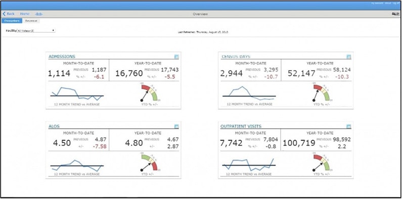
“So”, you might say to yourself, “I’ll just evenly space out the objects within the screen space”. This works for some scenarios, like when you have an even number of objects to show or when every object can be sized to about the same dimensions. But when objects vary in size, and spacing them out evenly becomes troublesome, The Golden Ratio is a good way to organize objects in a way that will lead the viewers eye throughout the entire page.
Use The Golden Ratio to assemble different sized elements
What if the objects in your layout are different sizes? Another design theory relies on “The Golden Ratio”. To use this composition technique, scan in the image below and use it as a template for your dashboard layout to help you organize elements in a pleasing composition.
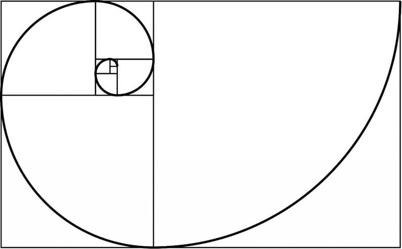
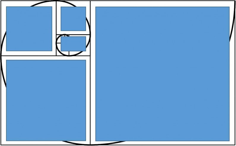
And voila! Now you have a cool looking dashboard without relying on any designer skills at all! (Of course, the template should be used for layout purposes only and would NOT appear in the actual live dashboard itself.)
Remember, as a business intelligence IT professional, you have a lot of important stuff to do. Spend only enough time on design as needed so that you can focus most of your efforts on the meaty stuff: data integrity and information delivery. Use the “Rule of Thirds” or “Golden Ratio” templates for your dashboard designs and save time.
Dimensional Insight’s Simplified User Interface
Of course, if you’re a Dimensional Insight customer, our new Simplified User Interface will help you easily create pleasing dashboards. Some of its benefits are:
- Design standards create a modern, unified look and feel for dashboards and application
- Clean, uncluttered design makes dashboards easier to use
- Consistent and familiar navigation reduces the learning curve
The Simplified User Interface creates a great environment for your analytics pages and you can include your custom dashboard layout within the confines of its modern environment.
Here’s a SlideShare that provides some useful information on the Simplified User Interface.
Learn more:
- Meet the Dimensional Insight Team: Gabrielle Amarosa - December 1, 2022
- What You Need to Know About President Biden’s Marijuana Pardon - November 2, 2022
- How to Ace this Year’s OND - September 27, 2022

