On the healthcare applications team, we have developed standard Measure Factory applications for visualizing, analyzing, and understanding data. In addition, our team has identified valuable patterns for creating dashboard templates across related measures groups within applications. Customers can use these to build custom Measure Factory applications or extend one they already have.
To better understand how these patterns expose data, let us look at the Overview, Trends, and Compare pages in one section of our Emergency Department Advisor Measure Factory application.
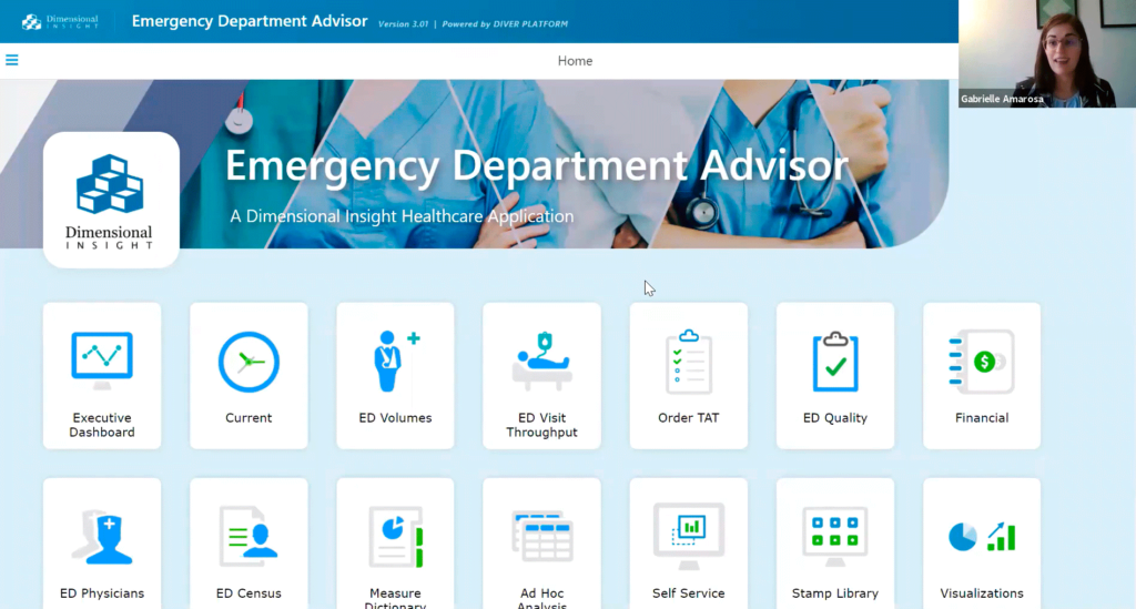
Figure 1
Figure 1 shows the menu page or starting page of the Emergency Department Advisor application. As shown in Figure 1, the menu tiles break out related focus groups of measures. For this article, let us stick with ED Quality.
Overview
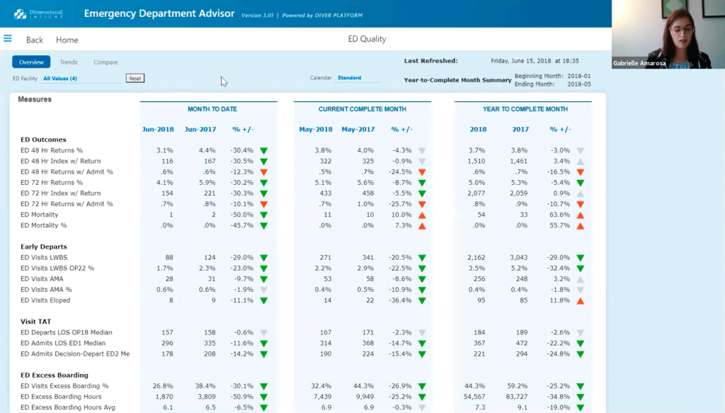
Figure 2
The Figure 2 Overview page displays related measures broken out by the Month to Date, Current Complete Month, and Year to Complete Month time-frames, all in one Matrix Portlet In addition, there are subdivisions displayed within each timeframe on this page: Current, Previous, Percent Change, and a visual indicator to communicate whether that number is moving in the desired direction over time or not. This page is interactive and a great starting place for our users to identify measure values or changes in measure values that warrant further investigation.
Something immediately jumps out when looking at this page: our ED Mortality number has increased significantly over the past Year-to-Complete Month. So that’s something to keep an eye on.
Trends
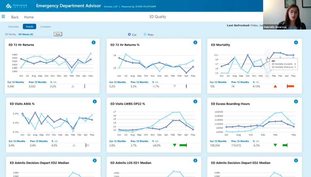
Figure 3
We may find an answer as to why ED Mortality has increased significantly on the next page, Trends, shown in Figure 3. We can see that the Trends page shows similar information to what we saw on the Overview page, but in a more visual medium. Each measure shows a line chart for 24 months of data. As shown on the Overview page, the Trends page shows Current and Previous time-frame comparisons.
The Trends page is helpful because it can help users focus or narrow in on some patterns that may not have been as obvious on the Overview page without the graphical representation. In addition, the Trend page’s visual display of quantitative information helps the user find answers to questions like “have current trends been persistent over time?” For instance, if we consider our previous example, the upper right-hand line chart clearly illustrates that rising ED Mortality has persisted over time. It deserves further analysis to uncover an explanation for that pattern
Another thing to note about this page is that it is built using stamps. Stamps make replicating portal design structure while modifying each portal with different measures (or even in a separate application) very efficient and straightforward.
Now let us look at a different page in the ED Quality section of the Emergency Department Advisor application.
Compare
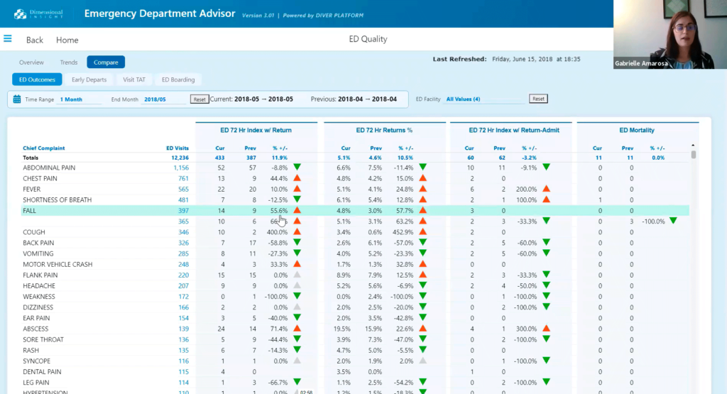
Figure 4
Figure 4 shows the Comparison page of the ED Quality section of the Emergency Department Advisor application. We can see that this page is composed of QuickViews and a Measures Portlet broken out by a dimension and a time range, where we have control over changing both. This page is useful because it lets you slice the data in many ways to see what might be driving significant trends. For instance, if a user wants a better idea of what might be going on with ED Mortality, they could select 12 months of data for a time range and select the patient age group dimension. Then, the user can quickly see that the oldest population is driving the increase in ED Mortality. If the user wants to investigate further, they could also change the facility to see if the same driver is consistent across all hospital locations. The phenomenon may be unique or prevalent in different sites. The user can select any dimension from the QuickView on this Comparison page that might be interesting or relevant to what’s driving an increase in ED Mortality.
It can be interesting to look at the Measure Overview in conjunction with the Compare page. Suppose a user does more in-depth analysis and wants to understand more about the measures displayed. They can go to the Measure Dictionary and open the Measure Overview from the measure name. The Measure Dictionary shows the definition and business logic for the measure of interest and the rules that comprise that measure. Users can quickly flip back and forth between the analysis and the definition of the measure they’re analyzing. We can navigate to that same information by directly clicking on the measure name on the Overview or Trends page.
One more page that can be useful to look at in tandem with the pages we have discussed is the Current Month page. On the Current Month page is another Matrix Portlet, but it serves a slightly different purpose from what we saw earlier. On the current Month page, one can see the measure values broken out over individual dates to simulate a flash report, where we have control over the Year and Year-Month combinations. Controlling the Year and Year-Month combinations is helpful because it can help the user identify whether a date or a group of dates is responsible for some of the changes we’re observing.
To look further into that through this lens, one could analyze a different Year-Month combination to see if there’s any degree of seasonality that might be driving the increase in ED Mortality in addition to the age group component we identified from the Compare page.
I hope that this has helped you see how these five pages – Overview, Trends, Compare, Measure Dictionary, and Current Month – can be used to expose measure data from different angles to generate answers to user analysis questions. I also hope this sparks some ideas about how you might be able to use these patterns to design your Measure Factory application – or extend the one you already have – to facilitate exciting analysis.
Click here to see the original Knowledge Forum presentation of this material.

- Healthcare Applications Dashboards: Patterns for Exposing Data - December 8, 2022