 Year after year, our web site visitors have shown a great deal of interest in an article I wrote about a tool that can be used to explore color combinations online – Adobe Color. Since I have never gone into detail about how to use the tool, I thought people might benefit from a short tutorial. So I am updating my original blog post for this month’s dashboard design article.
Tweet: A Cool Tool for Experimenting with Dashboard and Portal Color Schemes
For DivePort users who want to create a beautiful user interface that is both highly functional and visually appealing, color choice is an important factor. If selecting colors is not your forte and you need something other than what is available on your company’s color palette, you can use Adobe Color. Let’s take a look at how to use Adobe Color Creative Suite to find colors for your dashboards.
Why change the color?
But first, you may ask yourself, “Why do I need to change the colors at all?” Well, it’s true, you DO have the option to use default colors that are bundled with the product. Or, you may choose to customize the colors.
You might want or need to create a dashboard with a different color scheme for many different reasons.
- Your company may have no defined corporate colors.
- You may need to optimize contrast and readability of the existing corporate colors.
- Your company may be in-between established corporate colors during a re-branding.
- You have determined the need for color variance from the corporate colors during a new product launch.
- You need complementary colors that work well with a main corporate color.
An obvious first choice for color selection that will improve user adoption rates is to use your company’s corporate colors.
But your company may have no such corporate color theme. Or maybe the colors of the corporate theme just won’t work well in bar charts and line charts.
So how do you know what kind of colors to select?
Here’s what Steven Few said about color choice.
“Information Dashboard Design”, Steven Few
Choose Colors Appropriately
Poor use of color is perhaps the most common offense to a dashboard’s appearance. Colors that are bright or dark naturally demand more attention. Too many bright or dark colors can quickly become visually exhausting. When selecting colors, keep the following guidelines in mind:
- Keep bright colors to a minimum, using them only to highlight data that requires attention.
- Except for content that demands attention, use less saturated colors such as those that are predominant in nature (for example, the colors of the earth and sky).
- Use a barely discernable pale background color other than pure white to provide a more soothing, less starkly contrasting surface on which the data can reside.
There’s a lot here. You see that I highlighted the first sentence in his paragraph about choosing colors appropriately.
He says, “Poor use of color is perhaps the most common offense to a dashboard’s appearance.” And that’s important to remember. Because, if you can make better color choices for your dashboards, they will stand out as being superior to other dashboards.
I agree with much of what Few says. The main thing I want my colors to do is to communicate the data without overpowering the design on the page. So, readability must be number one.
The colors in this chart are too similar
I know that the main thing that allows people to distinguish colors from one another is contrast. The colors shown in this chart are too similar in my opinion.
I could use high contrast colors on my charts to increase the distinction of one item from another. But as Steven Few points out, too much high contrast will visually exhaust the audience.
So, I like to select colors that are “just enough” different. They have just enough contrast for readability — but not so much contrast that the overall look is jarring. How does one achieve just “enough”?
50% increments of red in RGB
I know that in print, we make sure colors are specified with at least a 30% level of intensity change if we wanted to distinguish one color from another. But look at this experiment I did for screen colors.
Each color is separated by an increment of 50 “Red” in an RGB color mode. Yet the first two colors are difficult to distinguish from each other. As you can see, using numerical values of Red, Green, and Blue in a systematic approach won’t work.
To find distinguishable chart colors
Truly, you’ll have to use trial and error to make sure one color is easy to distinguish from others in your charts color themes. That’s why the Adobe Color tool is so valuable. It allows you to use trial and error freely without showing your clients, without committing code to DivePort. It’s also fun to use.
Where will I use these colors?
Whatever your reasons may be for choosing different colors, there are many areas on a dashboard where you need to choose colors. The areas where you might customize colors include skins, portlets, and indicators. You can learn about how to customize these colors in the online help of DivePort 7.0.
Let’s get started
Let’s look at this “cool tool”. Why do I call it a cool tool? Well, it IS very nifty … but also, it was formerly named Adobe Kuler. I’ve mentioned it in some past articles and presentations. Now, it has been renamed “Adobe Color” and it is part of the Adobe Creative Cloud suite of Adobe products. As the name implies, the products are all available “in the cloud”. Adobe Color also has a mobile app that you may find useful.
The first thing you’ll need to do
The first thing you’ll need to do is get an Adobe User ID. Don’t worry, it’s completely free. Adobe only charges when you integrate your color work with Photoshop and Illustrator. But we will not be doing those integrations. Instead, we’ll be taking note of the color codes that we find, and use those codes later in DivePort.
To get an Adobe User ID
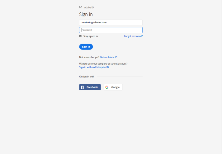
To get an Adobe User ID, just go to www.adobe.com and click on the “Sign In” link in the upper right-hand corner of the page.
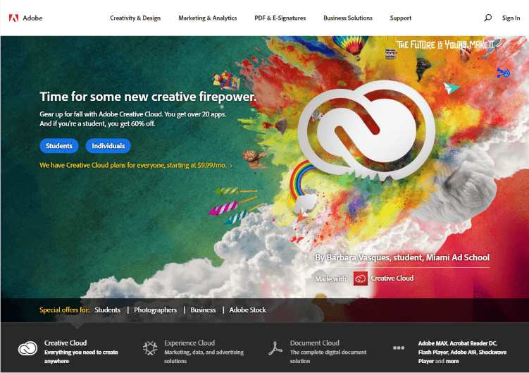
This will bring you to the “Sign In” page.
But some of you don’t have an Adobe ID yet, so you can’t sign in! However, in the middle of the page there is a link to “Get an Adobe ID”. Click on that and you can easily sign up for a free Adobe ID.
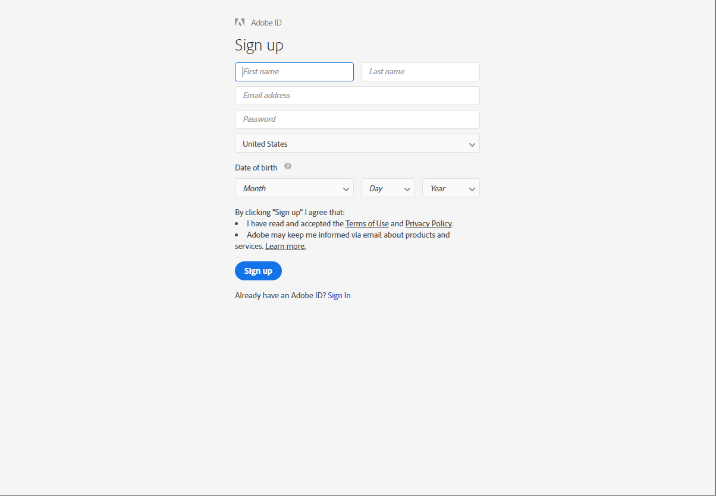
Adobe ID Signup Page
Here is the Adobe ID Signup page.
Adobe asks a few questions to set up your profile, but they will NOT ask you for a credit card number.
https://color.adobe.com/create/color-wheel/
Once you have an Adobe ID, go to: color.adobe.com and sign in.
The first thing you’ll see – whether you are signed in or not – is a color wheel. It’s pretty cool looking. But without a little background information, it’s easy to spend a lot of time whizzing through color combinations and leave with nothing to use on your dashboard.
Create – Explore – My Themes
So, let’s go through all the parts of this interface and start using it so you can do this on your own later. First, you’ll sign in. Signing in won’t change the look of this page, but it will give you the ability to access your saved themes and save new ones. At the top of this page you have three buttons to choose from: Create, Explore, and My Themes. These are the three basic areas that you have access to inside of the Adobe Color tool.
Create
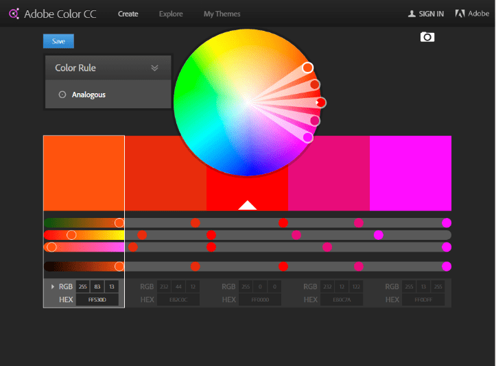
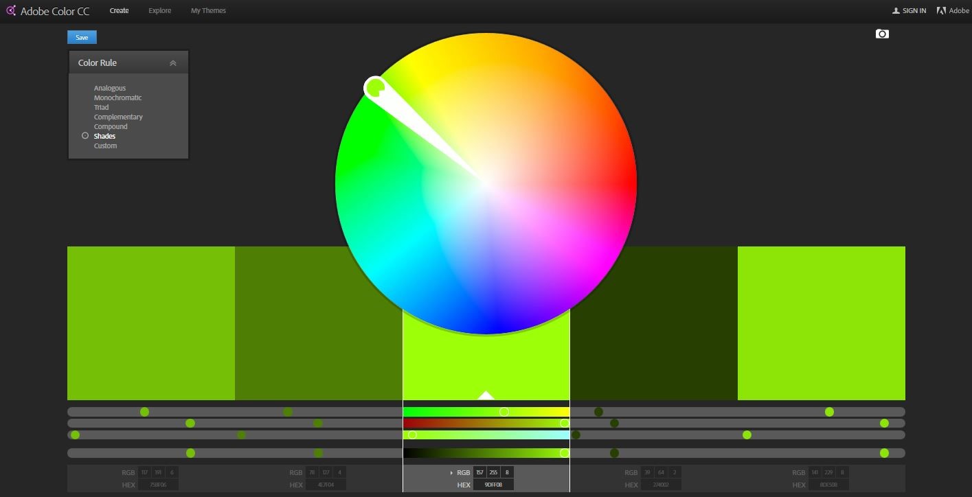
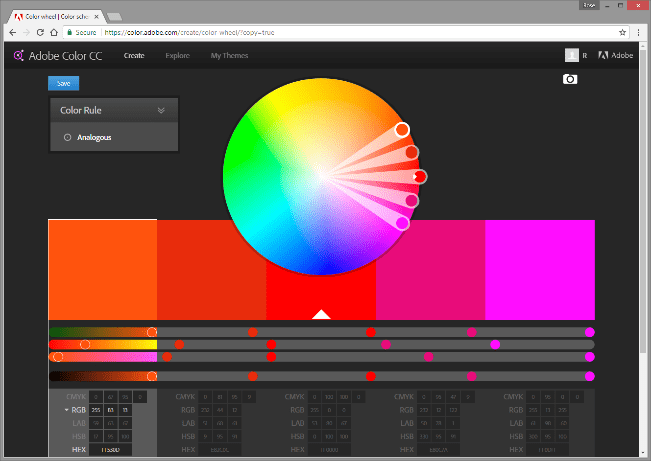
When you’re on the “Create” tab, (the default page that you land on when you go to color.adobe.com), this is what you’re going to see. You’re going to see a big color wheel and several color swatches underneath it. You’ll also see a drop-down menu showing all the different color rules embedded in the tool. We’ll talk about the color rules later.
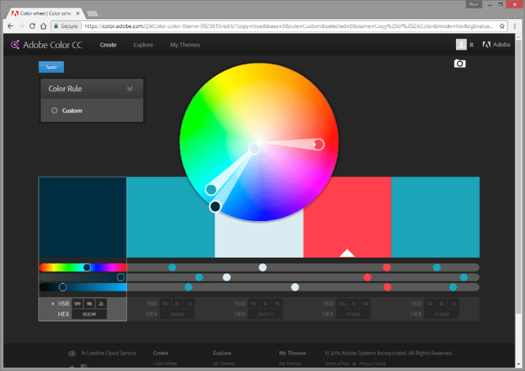
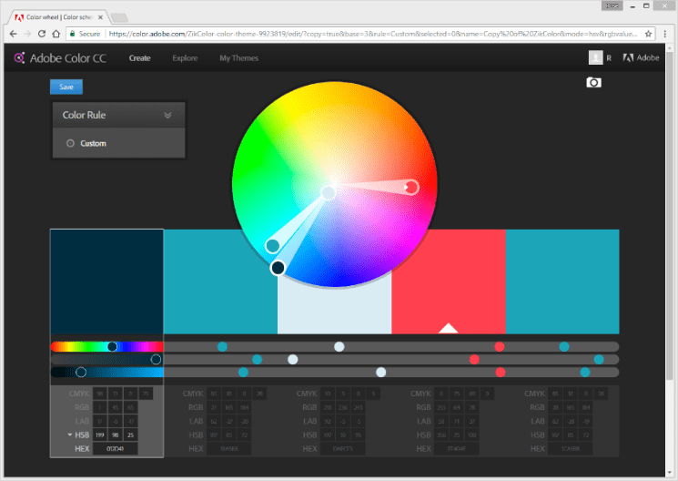
The color wheel is simple. To modify the colors, drag any one of the small circles around to set what is called the base color. The base color is the one with the white triangle on it. You can change any of the 5 colors shown to be the Base color simply by hovering over the bottom of the color until the “Set as base color” pop up appears. Once the popup appears, click on it and voila! You have changed the base color. Underneath each color swatch is a list of color modes so that you can record the code for each mode and later recreate the color using the given code. The color modes include: CMYK, RGB, LAB, HSB, or HEX colors.
What’s great about this is that if your corporate colors are supplied to you in CMYK, you can enter the values in this interface and the tool will translate the color into RGB code – the code you’ll need in DivePort.
Explore
The “Explore” button is the second button of the primary navigation. Explore is a little like Pinterest or Snapfish … but instead of sharing images or photos, you are sharing color themes.
If you are short on time and need a fresh color theme, you could simply go to Explore, filter by most popular, and select any one of numerous color themes that someone else has created.
Say for instance that I like the color in the top left corner of this page, “ZikColor”.
I can hover over the ZikColor theme and a row of buttons appears on top of the color theme. From here I can use “Edit Copy” to quickly access the RGB values for this theme.
The complete options in Explore are:
- Info
- Edit Copy
- Download
- Appreciate
- Save
You can also search from a search box in the upper right-hand corner of the page.
Let’s see what each of these does.
Info
Click on “Info” to learn who created the color theme, when it was created, how many times it has been viewed, how it has been rated, and how many people have “Appreciated” the theme.
Honestly, I don’t see any reason you’d need the information in “Info” except maybe to confirm that you have found a color theme that a coworker made.
Edit Copy
Next comes “Edit Copy”. When you click on this, the colors of the theme you are exploring pop into the “Create” section of Adobe Color, like you see here.
Here, you can take note of the codes for each color. But as you can see, we are looking at HSB codes. Because DivePort requires RGB color codes, I suggest that you modify your own portal so that Create is working with RGB values.
To have the tool focus on RGB values only, just click on whatever mode is shown. The color mode menu will expand to reveal all the color mode codes that are available for your use. By slowly clicking twice on RGB, we can select and then isolate just the RGB codes.
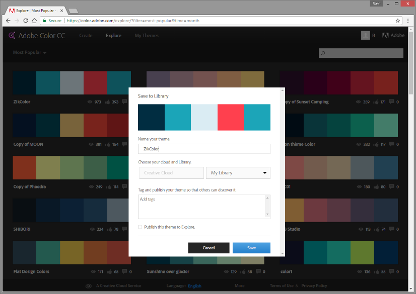
In the upper left-hand corner of the new Create page there is a “Save” button. Here, we can either save the theme exactly as it is, or we can edit the theme and save it as a new theme in My Library. (The time out period for Adobe Color is short so if you pause for very long, don’t be alarmed if you must sign in again.)
Let’s go back to our options in “Explore”.
Download
The “Download” button is useless unless you own other Adobe Creative Cloud products. Clicking on the Download button allows you to save an Adobe Swatch Exchange file that is used to share color themes between fellow users of PhotoShop, Illustrator, or other Creative Cloud products.
Appreciate
This is self-explanatory. It’s a “Like”!
Save
I find the “Save” button to be very useful. In the Save dialogue box, I can rename the theme, add tags to it (like the name of a client or an industry this might be used in), and choose whether my version should be made public for others to see.
You’ll notice that you have the option to “Choose your cloud and Library”. If you are using the free version of Adobe Color, there will not be a cloud to choose. So, the words Creative Cloud will be grayed out.
You can only save the colors to your own “My Library” or a new Library that you create to sort color themes you’ve saved.
Write unique, specific titles
So, if you need to share color ideas with your team, you should give team members the specific name of your color theme and make it public so they can search for your color theme in the Explore section of Adobe Color.
It wouldn’t hurt to make the name of your color theme something very specific …. Something not close to what others are using to name their themes.
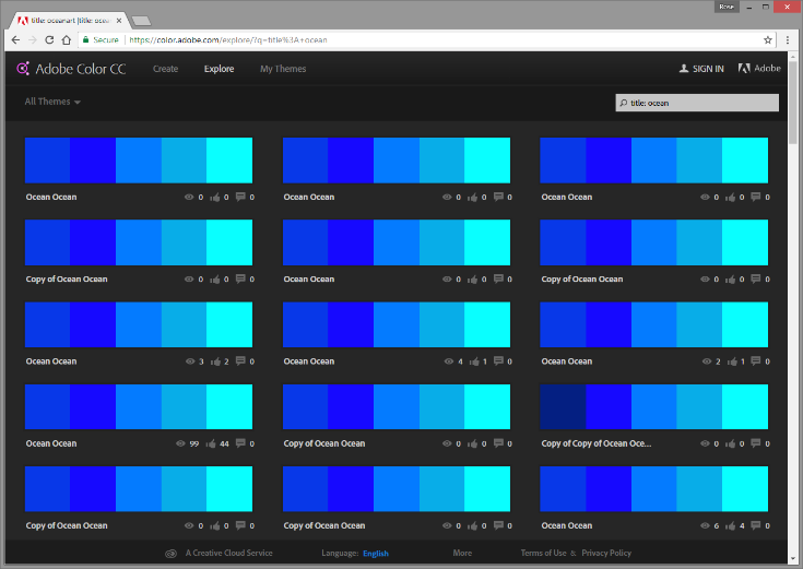
For example, here’s what a search for “Ocean” returned.
Every copy of Ocean that others have experimented with shows up! In my test, I named my new color theme “Warm reds” … looks like a lot of other people thought of this title too.
So, as you can see, if you are going to use Adobe Color to select and share color themes, you should make your theme name something very specific to distinguish it from the thousands of other themes … yet vague enough that a competitor wouldn’t be able to locate your theme easily. Something like DI-RW-09-26-2017-A. You get the point.
My Themes
The last button in the primary navigation is “My Themes”. My Themes is basically a link to your Libraries.
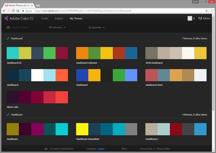
When you click on My Themes, you’ll get a summary of your libraries. Libraries can help you sort what you’ve saved.
If you want to move a theme out of one library and into another, you must use Edit Copy to open up the theme in Create and then you can use Save to rename and relocate the theme.
Color Rules
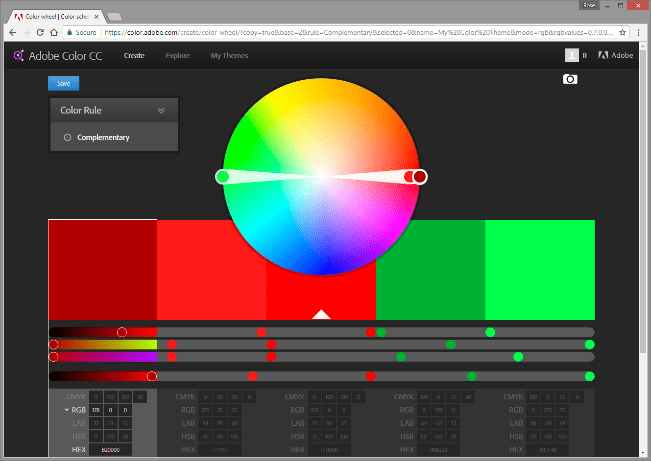
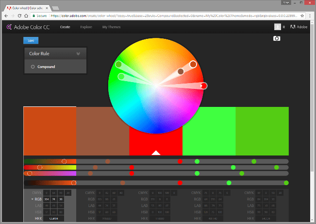
Now let’s look at the color rules. The color rules exist as launch pads for you to start your own themes from.
Click on “Create” in the primary navigation and expand the “Color Rule” menu.
Here are the color rules that are embedded in Adobe Color. Let’s just run through them quickly.
- Analogous
- Monochromatic
- Triad
- Complimentary
- Compound
- Shades
- Custom
Analogous
Analogous colors correspond in some particular way to each other – they appear next to one another on the color wheel.
Monochromatic
Each color in a monochromatic color theme has ONLY the same hue. BOTH the saturation and the brightness and darkness of the color is changed from one color to another in the theme.
Triad
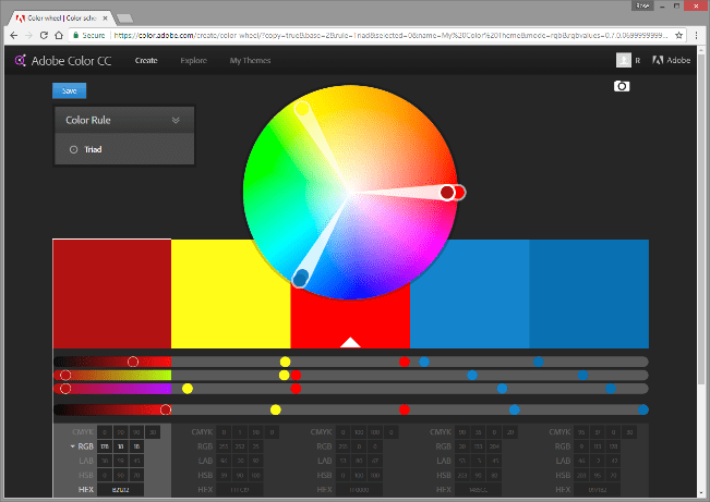
Triad colors simply start with the 3 basic colors of reflective color (red, yellow, and blue) and keeps the relationship consistent no matter where you are on the color wheel.
Complementary
Complementary colors are opposite each other on the color wheel, like red and green, for example.
Compound
The relationship between the colors in the “Compound” selection is random. Yet, it is fixed so that if you change any ONE color, all the other colors change in the same way.
Shades

Each color in this theme will have the same hue and saturation. ONLY the brightness and darkness of the color is changed.
Custom
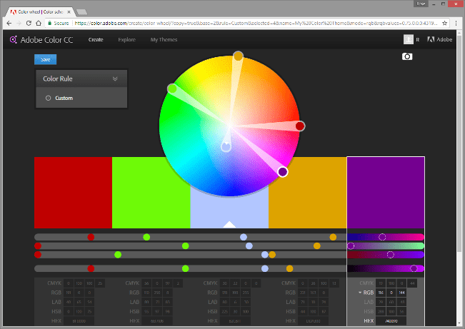
Custom is my favorite way to create color themes so that I have more control over the selection of the colors.
Unlike with the other color rules, with Custom, I can change variables of a color independently of other variables … so I can come up with a theme that is just right for me.
Create from Image
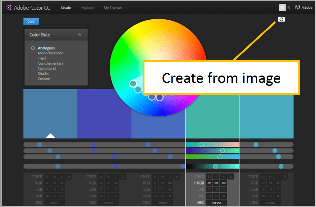
The “Create from Image” button isn’t in the primary navigation. It is located up at the top right-hand corner of the Create page. It is a camera icon. The function of this button is exactly what it says: you can create a color theme based on an image. You can use photos or any other file that has an image format.
Now, let’s look at the mobile app version of Adobe Color.
Mobile Adobe Color
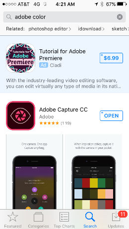
The mobile version of Adobe Color is called Adobe Capture. Just use search in either App Store or Google Play to download a copy to your phone.
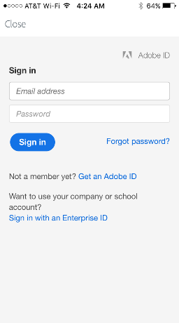
Once you have it on your phone, you can sign in using your Adobe ID.
Click on Sign In and then fill in your credentials.
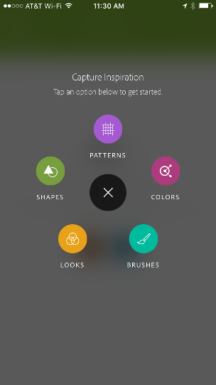
Here’s the start panel.
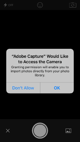
Although there are a lot of tools in this app, just click “Colors” to get started. The app will invoke this popup query asking if it is OK to access your camera.
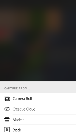
Respond by clicking OK. Once you approve access, the app gives you the choice of 4 places from which to pull a photo.
I had a photo on my phone from last winter, so I chose “Camera Roll”.
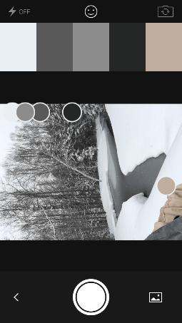
I selected a photo and immediately, the app determined this theme based on my photo.
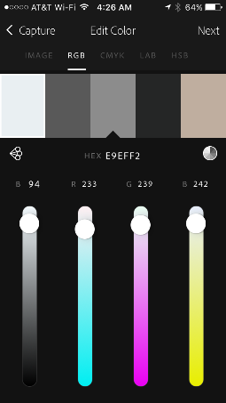
You can edit the color theme once it has been captured.
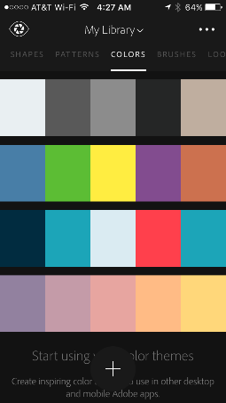
And then you can save it to one of your libraries in the cloud.
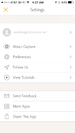
When you are ready to sign out, click on the eye in the upper left-hand corner of the screen.
This brings you to the “Settings” panel.
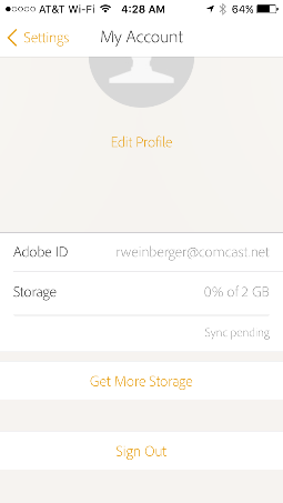
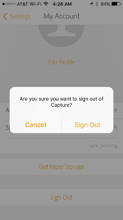
Click on your email address. This brings you to information about your account, and the sign out button. You will probably have to scroll down a bit to see the sign out button since it is hidden. You might think that is all … but Adobe Capture may give you this query before you leave asking if you are sure that you want to sign out.
I thought, “Yes. I’m ready!” And I clicked “Sign Out”.
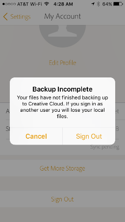
And that brought up this screen notifying me that my color theme had not yet synced in the cloud. I changed my response to “Cancel” and decided to sign out later.
If you like Adobe Color, you may like these other color tools
- COOLORS (https://coolors.co)
- Pantone Studio for iOS phones
- myPANTONE for Android phone
Also …
If you know of a cool tool that helps you build your dashboard designs, we’d love to hear from you so your tip can be shared with others. Please email your tip to me at [email protected].
- Meet the Dimensional Insight Team: Gabrielle Amarosa - December 1, 2022
- What You Need to Know About President Biden’s Marijuana Pardon - November 2, 2022
- How to Ace this Year’s OND - September 27, 2022

