
To some people, analytics is an art form. To others, the data itself is art. Those people, including Grammy winner Jewel, bring data to life through sculpture. Using real-time data, they have made creations that have different reactions depending on what the data is telling them.
The organizations that use analytics most effectively are the ones that can use it to tell a story. The results may look different, but there’s a similarity in how artists and businesses approach data. Let’s take a look at some of the work these artists are doing and what organizations can learn about the way they produce results from data.
Jewel is an artist now?
Jewel burst onto the scene as a singer-songwriter in the mid-1990s, and she has added many more hyphens to her multi-hyphenate career in the years since. The musician-actress-author-mental health pioneer is now also a visual artist, and she connected with NASA to create Heart of the Ocean
Jewel connected each piece of data to a different color and sound, and in 12-minute cycles the displays of the sculpture change to reflect what is happening in the ocean. Some of the data includes dolphin movement and water temperature. While Jewel was inspired by the idea of building a giant instrument that nature could play, she also recognized how the work makes science more accessible and can also bring people more in touch with nature.
View this post on Instagram
What other kinds of work are artists using data for?
While Jewel may be the most high-profile person doing this kind of work, she is far from the only one. An artist who goes by the name BREAKFAST has created a variety of kinetic sculptures that use real-time data. A piece called Consumption ripples when someone walks through its arches, and the rippling movements are driven by the real-time water consumption of the city in which the piece is installed. There are pieces that reflect data collected on river flow, oxygen levels in rivers, wind movements in different cities, and much more. Some of the pieces include a human element, hoping to get people to reflect on their role in the environment.
View this post on Instagram
What does any of this have to do with my organization?
While Jewel was loyal to the data and didn’t change any of it for her sculpture, she carefully selected the data she wanted to use in her work. Organizations working with analytics sometimes have the luxury of being selective with their data, but in order to use the data effectively, they need to look at the whole picture and let the data inform their work, rather than the other way around.
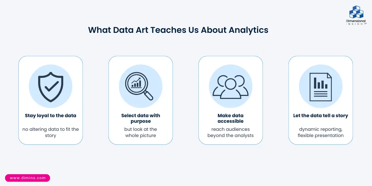
The sculptures make the data accessible to people who might not otherwise study, for example, the movement of the ocean. It underscores the importance of visualizing data – it is one thing to use the data to draw conclusions, it is another to successfully convey to an audience what you are hoping the data will say. The right analytics solution can help you figure out how to appropriately present your organization’s data so that you can achieve your goals, whether that is a weekly report that goes to executives at your company or releasing information to the wider public.
Not every piece of data has to be turned into fine art. An analytics solution with dynamic reporting capabilities can help you present data in a way that effectively gets the same result as a kinetic sculpture: making people think about information in a way they might not have otherwise. A flexible analytics solution can help you present the story you want your data to tell.

- Data can Lead the Way for Tuition Decisions - October 15, 2026
- Proper Data Governance Prevents Data Slop - October 8, 2026
- Tracking Shipping Price Changes with Analytics - October 1, 2026