If you think about it for a moment, the purpose of visualizations is to communicate information effectively. And you want to do that in ways that brings out patterns and trends that can’t be seen just by looking at tables of numbers. Ideally, this is going to be something that is aesthetically pleasing. You can have a positive emotional response when you look at some of these displays and engage users more, so they are willing to really dig in to analyze data.
In this article, we’ll review some of Dimensional Insight’s Chart portlet visualizations in order to illustrate a wide variety of ways to visualize data. I think you’ll see that with all of the options available, it is easy to communicate information in a way that is both effective and pleasing to the eye.
Chart types
Although not exhaustive, here is a list of some different chart types for visualizing data.
| Basic: | Advanced: | Specialized: |
|
|
|
Some favorite chart types
Let’s look at a few of our favorite chart types so you can get a better understanding of how they communicate information.
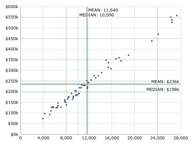
Scatter chart with the X and the Y axis
This example shows both the Mean and the Median.
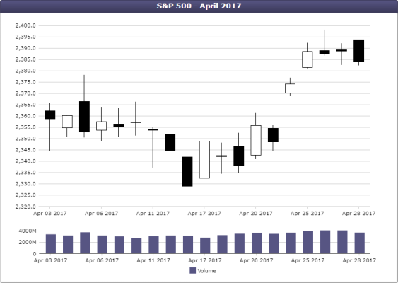
Candlestick chart on top of a bar chart
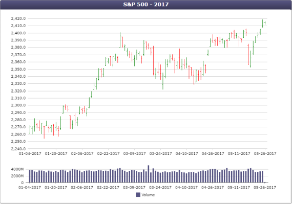
Open-high-low-close (OHLC) chart
Typically, both Candlestick charts and OHLC charts are used to display financial data. The Candlestick chart uses white and black to show rise and fall in value. The OHLC chart uses green and red to show rise and fall in value. The reason to use one type over another is really a matter of personal preference.
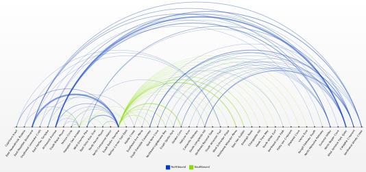
Arc chart
Here is something that is perhaps more interesting. It is a very specialized chart for the transit industry. It shows connections between points in a transit system. One can get an idea of route interconnections. In fact, if you highlight an arc or a destination, a hover tool tip will appear showing all different kinds of information like the number of trips going back and forth. There are many display options available in the Arc chart.
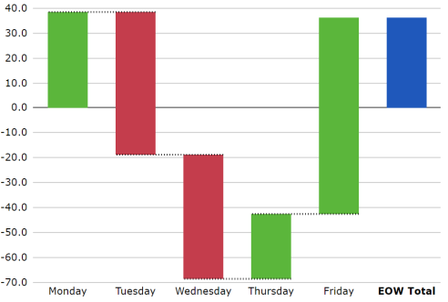
Waterfall chart
The Waterfall chart is good for tracking a process over time. This example shows that a value started at zero on Monday and it went up to almost 40. Then on Tuesday, it fell (the bar is red) all the way down to almost negative 20. On Wednesday it fell further. On Thursday it rose. On Friday it rose again. At the end of week, a single bar shows where the value ended up. For tracking something over time, the Waterfall chart communicates in a granular way—in this case down to days—what the movement of a value was over time.
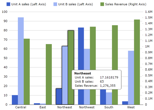
Dual Axis Chart
When you are comparing two data sets or two column values that—although they don’t have the same scale—have common patterns you want to see, use a Dual Axis chart. Here we are looking at the number of sales versus revenue. Although the data values are not of the same magnitude, there are certain patterns between the two that are worth considering.
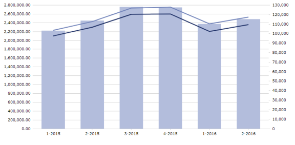
Combination chart
There are a multitude of ways to combine various chart styles in order to analyze the relationship of two sets of data. This chart combines the different styles of bars and lines at the same time, in addition to a dual axis.
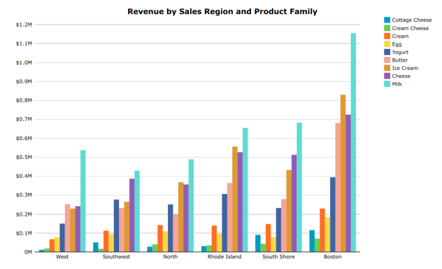
MultiTab chart
This MultiTab chart displays the sales region dimension along the bottom of the chart, and then the product family dimension as uniquely colored bars. (There is essentially a chart within a chart.)

Heat map chart
This heat map shows days of the week on the vertical axis and time of day on the horizontal axis. Each cell represents the on-time percentage of a particular transit system being analyzed. There is a scale on the right showing you green is good and red is bad.
This is only a taste of what can be done with various chart styles. As you can see, selecting and utilizing just the right chart type makes it easy to communicate information in a way that is both effective and pleasing to the eye.

- Meet the Dimensional Insight Team: Gabrielle Amarosa - December 1, 2022
- What You Need to Know About President Biden’s Marijuana Pardon - November 2, 2022
- How to Ace this Year’s OND - September 27, 2022