 Many of our customers have commented recently on how beautiful our new application interface designs look. But do they know who is responsible for these visually stunning displays? It is Zhenggang Hu, our user interface (UI) designer. Zhenggang has been the designer of many of Dimensional Insight’s software; he currently resides in Boston, Massachusetts and works out of the Dimensional Insight Burlington office.
I sat down with Zhenggang recently to get an idea of how he works and thought our readers might also be interested in learning more about him. Read on to learn more about Zhenggang’s role at Dimensional Insight, his creative process, and the project he’s most proud of.
Where were you born?
Guangzhou, China. I’m a Cantonese.
Where else have you lived?
I lived in Boston, Massachusetts for three years when I was studying at Northeastern University.
When did you move here?
About a year ago.
How long have you worked for Dimensional Insight?
About four years. I was an employee in the Dimensional Insight China office for the first three years and then moved to Burlington and became an application designer.
What is your role at Dimensional Insight?
My job title is Application Designer. My main roles are User Interface (UI) Designer, Teamer Tester, DiveTab Developer, and Project Manager for projects outsourced to Dimensional Insight China, our Guangzhou office. I find it very easy to find fulfillment at Dimensional Insight because I can bring most of the knowledge and skills I’ve learned into play. And I learn more from the work I do daily.
How long have you done this type of work?
For four years – ever since I joined the company.
How did you learn how to do this type of work? What inspired you to do it?
Like learning most skills, I started with “copying” others’ works — from textbook examples to real world projects. And over time, as I copied and practiced, eventually the use of colors, layouts, chart types, and interactions became an integral part of my own design instinct. Then, I started paying attention to the patterns that I learned from others. With all that I learned — the patterns and the requirements from customers — I started creating my own dashboard designs.
Describe your creative process.
It starts with understanding the requirements and the people who come up with the requirements. Then I try to lay them out on a white paper. Prioritize the elements. Create different areas (pages, boxes or a page), layers (main page, popup 1, popup 2, etc.). And before going into the visual design, go back to understanding requirements and check the prioritization again. I will find something different that might end up with recreating the areas and layers. It is an iteration process. Patience is the key (which is easy to lose).
Once you understand the requirements and the users, the next step is easy — the visual design. Colors and layouts mostly. It is good to follow the existing colors, layouts and visual styles that you’ve been using in the company or project to keep things consistent. And you will need paper to sketch on if you are starting something new.
Laying out a dashboard is like laying out the scene in a movie. You need to know who the “leads” are (the most important actors). They are the first thing that catches a user’s attention. And the rest should be lower on the page or positioned around the “leads”. That’s why prioritization is so important. Without this step, the dashboard will look like the layout of the letter keys on a keyboard (irregular). It would still provide the same information, but require much more time to understand.
How do you get unstuck creatively?
I get stuck all the time 🙂
To get unstuck, I keep digging into the requirements, creating more drafts on paper until I have a solution. Design is an iterative process.
Tell me about the goals of your current project and the thought process behind your solution.
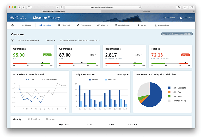
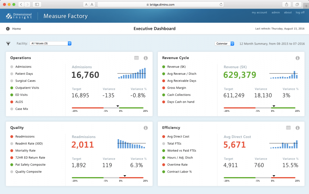
I am currently working on the Measure Factory UI. The goal is to provide a modern UI (clean, business oriented, lively colors but not too much, etc.) and keep it consistent with our collaboration product Teamer — because part of Teamer is integrated into Measure Factory.
The process is basically the same as what I mentioned above. What’s interesting is that the requirements are always changing. For the UI, I try to keep the visual elements as minimal as possible. This way I can get the prototype done as soon as possible so stakeholders can provide feedback without waiting for days.
Tell me about a time when a client didn’t like your work. How did you deal with it?
Some people like to think about design as more like creating art. I believe design is more like engineering. It starts with problems. So, if a client doesn’t like my work, it could be something wrong happened during the requirements stage or I don’t understand the client. It was hard or even infuriating a couple years ago for me. But now I know it is about solving a problem – I don’t take it personally.
How do you stay organized when you are provided with multiple design assets, files, and ideas?
I try to keep my design assets as simple as possible. I use iCloud Drive to keep my design project files. In addition, I use www.iconfinder.com for icons and www.wrapbootstrap.com and www.behance.net for inspiration. Since most design resources are on the web, I don’t need to keep them on my computer.
Another way to organize design assets is to use Adobe Creative Cloud (CC) Library. There, you can create groups to categorize assets and share with a team.
What questions do you ask before you begin any design project? What information is most important?
Who will be using it? And for solving what problems?
Tell me about a project you’ve completed that has made you the proudest.
It was my college graduation project – iNote. It was the last year when I was studying software engineering in China. iNote is software developed for college students to take notes and manage their class schedules. I was an iPhone hardcore fan back then (Iron Man as well). When I got my 1st generation iPhone, I liked it so much that I decided to copy it to the Windows world, from a design perspective. After 6 months of development, I submitted it to the school and won the school’s Software Development Competition – I was the champion. I worked very hard, learned a lot, and achieved success. Even though I started with copying others’ works, I rose above that to create something unique of my own: iNote. It is so unique that you can’t find anything else like it on the Internet. I was so proud of it that I created an animation about iNote.
You can find it here: https://vimeo.com/30609876 (I apologize for the spelling errors in the animation.)
What advice do you have for others doing your kind of work?
My personal advice would be, when you are in school, try to do it all when you can. Design. Code. Test. Distribute and market. All by yourself. No one blames you if the work is not good enough. I find that experience helped me a lot in my career.
Thanks for your time, Zhenggang! We look forward to seeing your most recent work on the Measure Factory as it is implemented in the future.

- Meet the Dimensional Insight Team: Gabrielle Amarosa - December 1, 2022
- What You Need to Know About President Biden’s Marijuana Pardon - November 2, 2022
- How to Ace this Year’s OND - September 27, 2022