Data informs many aspects of the world of higher education. The numbers are just half the battle, though. Often it is just as important to put the data in a format that people can understand in order to truly benefit from analytics.
Scattergrams
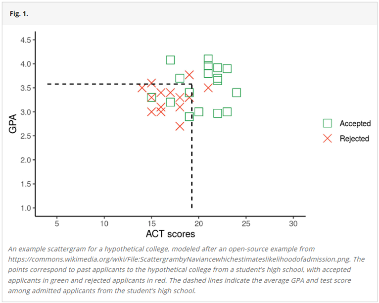
When it comes to the college application process, one of the most popular ways of displaying data to prospective students has been through a scattergram. In this case, a high school might show a graph with a student’s test scores and GPA making up the axes, and for select colleges and universities, show where graduates of the high school fell on the graph and whether they were accepted to or rejected by the schools.
For current students, the graphs could help them decide what schools to apply for: they can figure out where their grades and test scores line up with the information about the alumni, and decide whether it’s worth applying to a school. But, as is the case in any industry, the way data is presented can tell different stories to different people.
Source: PNAS, Vol. 120, No. 45, https://www.pnas.org/doi/full/10.1073/pnas.2306017120
A recent study published in the Proceedings of the National Academy of Sciences offers an interesting look at what students can take from the scattergrams described above. The study, published in October 2023, looked at college applications from 70,000 students at 220 public high schools over five application cycles between 2014 and 2020. The researchers estimated that of the 17,000 students the study determined to be high-achieving, the scattergrams resulted in undermatching by more than 50%. Undermatching, as defined by the study, is when a student applies only to schools for which they are academically overqualified.
Key takeaways
One study does not make a complete argument for or against certain graphs. There are also limitations in the study and room for further research; for example, the scattergrams only provide information about applications and not enrollment. But this study offers some important takeaways about data visualization:
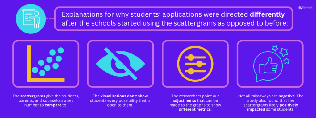
- There are a couple of explanations for why students’ applications were directed differently after the schools started using the scattergrams as opposed to before. One is that it gives the students, parents, and counselors a set number to compare to. If students see that their scores fall below the threshold of previously admitted students, they won’t even bother to apply to that school.
- Another explanation for undermatching is that the visualizations don’t show students every possibility that is open to them. If they are applying to schools based on where they have seen that their peers have had success, they might be missing opportunities because of the way the scattergrams are put together. The scattergrams only show schools where more than a handful of students have applied, in order to protect student privacy. Because the data is anonymous, if there is a school where only a couple of students have applied, that school is not included so those students can’t be easily identified. That means there might be colleges and universities where a student should be thinking about applying that they might not be sending an application because they haven’t seen the data.
- The researchers point out adjustments can be made to the graphs to show different metrics so that students are not solely comparing elements like grades or average test scores. In order to include a wider array of schools, for the colleges that don’t have a larger sample of students from a particular high school, the graphs could include comparable regional or national statistics.
- Not all takeaways are negative. The study also found that the scattergrams likely positively impacted some students. Some lower-income students, for instance, who might have only pursued community colleges ended up in 4-year colleges, and the researchers say the scattergrams increased the number of colleges where students applied by an average of one application per student.
Data visualization can be an element of analytics that people take for granted. Sometimes users don’t think about its impact until they see that people are getting the wrong message from their data. It is important to always think about having the right solution and making sure the information you want to present is shown in the right way.
One last benefit of the use of scattergrams at the high school level is that it exposes the students to data in a different way than maybe they’ve seen before. The high schools that use these visualizations are encouraging students to look at data and graphs and apply what they are seeing to their own decision-making. For many students, that is exactly what they’ll be doing as part of their studies in college and in their careers beyond that. It may be an unintended consequence of the scattergrams, but it could end up being the skill that is most practical for the students down the line.

- Data-Driven Sculptures Can Teach Lessons about Analytics - July 7, 2026
- Using Data to Improve Perceptions of Higher Education - June 25, 2026
- What AI on the Farm Teaches Us About Data-Driven Decision Making - June 18, 2026