Types of QuickViews
The Diver Platform offers the following display types or styles of QuickView:
-
Flex
-
Hidden
-
Free Entry
-
Calendar
If you have a Measure Factory license, the following additional types can be available, depending on the factory configuration:
-
Current Date
-
Detail
-
Time Range
-
Measure
For more information, see Measure Factory-Specific QuickViews.
Flex QuickViews
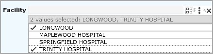
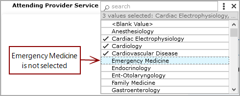
By default, a flex QuickView appears as a closed list with an expansion arrow next to it. 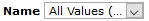 Click the arrow to open the list. To select values, click the space to the left of the value name. A check mark indicates selected values.
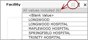
If enabled, you can select all values by clicking the Select All Values icon  .
.
If only one value is selected in a marker-backed QuickView that does not allow All Values, you cannot clear the selected value.
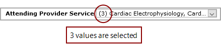
QuickView settings can specify that users can select either a single value, multiple values, or all values. If you set more that one value, the number of selected values appears on the left side of the collapsed list.
If selecting multiple values is allowed, be sure that the check mark appears for each value that you want to include. A value that displays with a  highlight but no check mark, is not selected. You can use Ctrl+Click (Windows) or Command-Click (macOS) to highlight multiple values, and then select or clear their selection as a group.
NOTE: If the QuickView is defined in a marker and was originally created as a combo box, pull-down, or free entry, users can select a single value only.
Settings can also specify that the QuickView list is expanded by default, similar to a picklist.
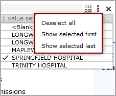
Clicking the expand arrow enables a Selection Option menu, that you can use to take action on items in the QuickView list.
Optionally, flex QuickViews can include a search box. By default, the search results show items that begin with the search string. However, you can edit the portlet to list items that contain the search string anywhere within the text.
Hidden QuickViews
A hidden QuickView list does not display. They are suitable for QuickViews that are required for dependency, but you do not want users to change their values.
Free Entry QuickViews
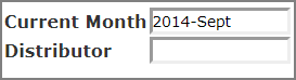
A free entry QuickView is a text box that contains a default value. You can enter a new value directly in the QuickView text box.
Free entry QuickViews are available for QuickViews defined as Free Entry QuickViews within a Marker.
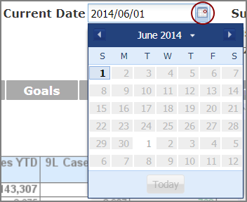
Calendar QuickViews
A calendar QuickView is a text box that allows you to work with date values. You can enter a date directly into the box or click the calendar icon to select a date. .
Calendar QuickViews are available for date-type QuickViews defined in markers and for Measure Factory-licensed DivePorts when a calendar is defined in the factory configuration. If the source data is changed to a different type, such as string, the QuckView displays as a flex QuickView.
See also: