Areas
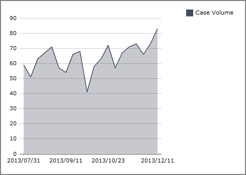
An Area Chart draws straight lines between data points. ![]() Example
Example
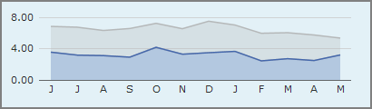
A Multitab Area Chart shows an aggregate of values. ![]() Example
Example
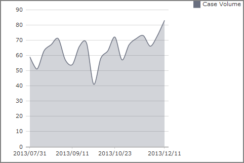
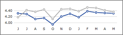
A Spline Area Chart draws curved lines between data points.![]() Example
Example
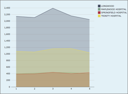
A Stacked Area Chart show stacks areas on top of each other, visualizing change in composition or sum total. ![]() Example
Example
For information about MultiTab Area, Spline Area, and Stacked Area charts, see MultiTab Chart Variants.
Bars
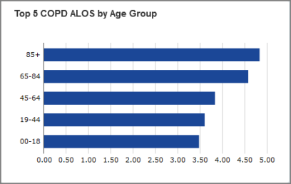
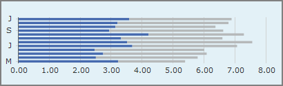
A Bar Chart displays data as horizontal bars.![]() Example
Example
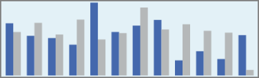
A Column Chart displays data as vertical bars. ![]() Example
Example
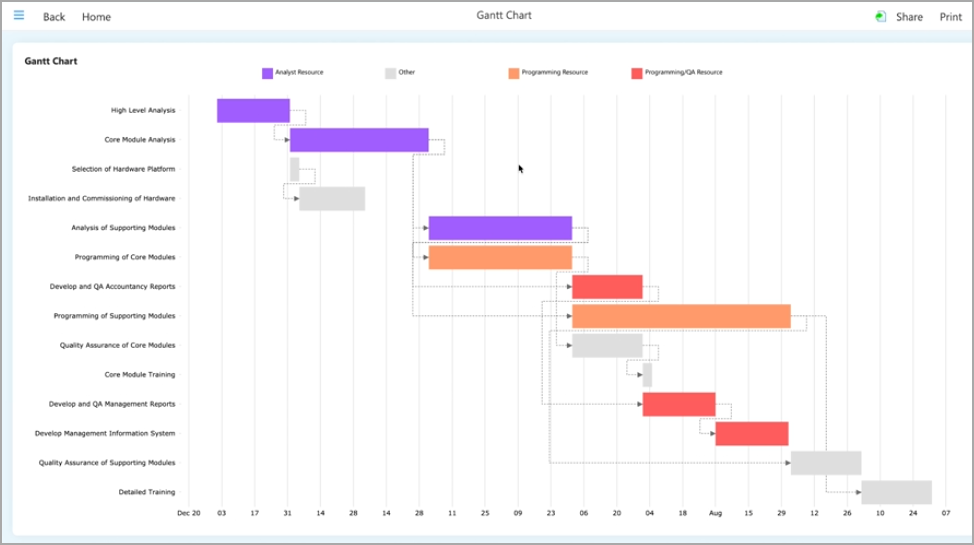
A Gantt Chart displays the duration of tasks and their dependencies during a project life span. ![]() Example
Example
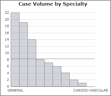
A Histogram displays the distribution of numeric data across several dimension values. ![]() Example
Example
Dimension data must be binned into categories before it can be used in a histogram.
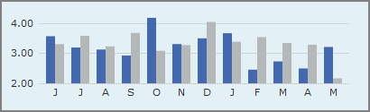
A Sparkcolumn Chart is a simplified column chart without labels or axes. It is ideal for small multiples or finding trends at a glance. ![]() Example
Example
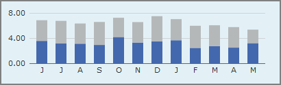
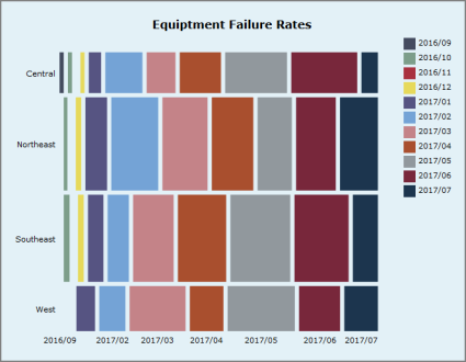
A Stacked Bar Chart or Stacked Column Chart stacks values together, visualizing composition and sum total. ![]() Example
Example
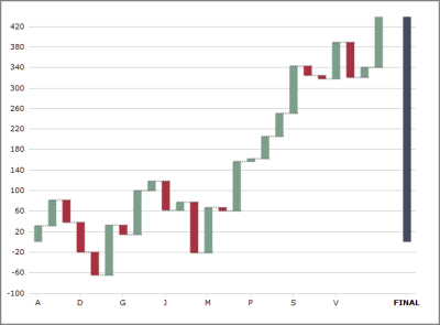
A Waterfall Chart displays rectangles that represent the change in a single value, rather than the magnitude of the value. ![]() Example
Example
For information about MultiTab Bar, MultiTab Column, MultiTab Stacked Bar, and MultiTab Stacked Column charts, see
Calendars
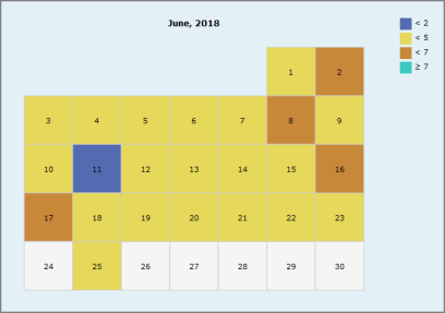
A Calendar Heatmatrix displays a single dimension whose daily values display as colors on a calendar. ![]() Example
Example
Combination
Charts in this category combine multiple charts into one display.
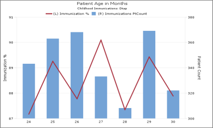
A Combination Chart displays multiple values as superimposed Area, Column, Line, Spline, or Spline Area charts.![]() Example
Example
A Trellis Chart displays a CrossPlot, where one chart is split into subcharts based on a second dimension called a category. Several subchart types are available, such as bar, column, line, and area. ![]() Example
Example
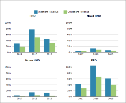
In this example, the column-type trellis chart compares Inpatient Revenue against Outpatient Revenue values (x axis) for the Discharge Year dimension (y axis) split into Financial Class categories (HMO, Medicaid HMO, Medicare HMO, and PPO).
Connection
Charts in this category show connections between source and target nodes.
An Arc Chart displays nodes on an axis and arcs connecting the nodes. ![]() Example
Example
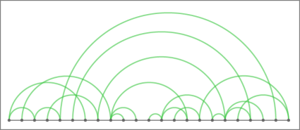
- The height of an arc is proportional to the distance between its source and target nodes.
- The color of an arc indicates the direction of the connection; that is, which connected node is the source and which is the target.
- The thickness of an arc line is indicates represents the magnitude of a single value for that connection.
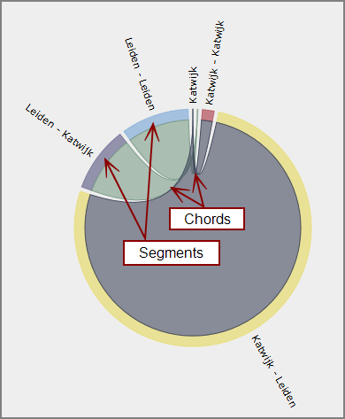
A Chord Chart displays segments around a circle, one for each dimension value, and chords connecting the segments. The thickness of a chord at each end represents the magnitude of a single value where the attached segment is the target. The color of a chord corresponds to the connected segment with the greater output, that is, the greater value where that segment is the source. ![]() Example
Example
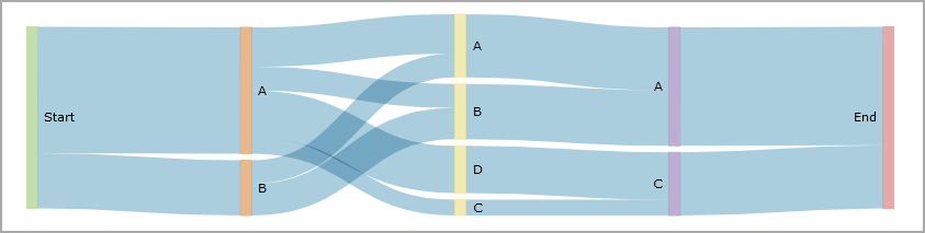
A Sankey diagram visualizes major transfers or flows within a system. ![]() Example
Example
Finance
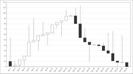
A Candlestick Chart displays boxes with edges at the open and close values and lines with endpoints at the high and low values. The color of a box represents the direction of movement from open to close: up (white) or down (black). ![]() Example
Example
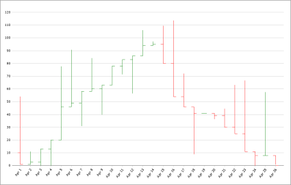
An Open-High-Low-Close Chart displays vertical lines with endpoints at the high and low values. To the left of each vertical line is a tick mark representing the open value, and to the right another tick mark representing the close value. The color of each line represents the direction of movement from open to close: up (green) or down (red). ![]() Example
Example
Lines and Points
Charts in this category display values as points, optionally connected by lines. Line charts are best for visualizing change over a temporal or categorical dimension.
A Line Chart draws straight lines between data points. ![]() Example
Example
A Scatter Plot displays the relationship between two values. Scatter plots are best for visualizing correlation between variables, the clustering or distribution of data, or anomalies and outliers. ![]() Example
Example
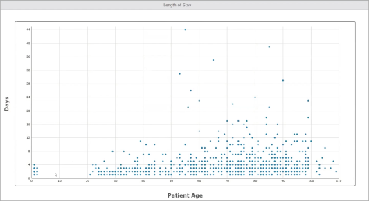
TIP: Scatter plot charts are a good choice when you need to show many data points.
A Sparkline Chart is a simplified line chart without labels or axes. They are ideal for small multiples or finding trends at a glance. ![]() Example
Example
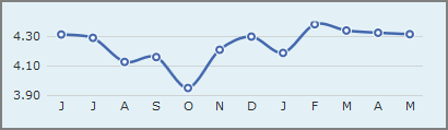
A Spline Chart draws curved lines between data points. ![]() Example
Example
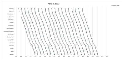
A Stringline Chart is a variant of a MultiTab Line Chart that displays multiple values sliced by a second dimension, called a category. Commonly used to visualize timing of public transit routes, stringline charts are best for showing groups of processes that progress through a series of checkpoints.
![]() Example
Example
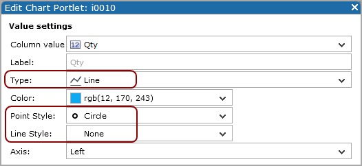
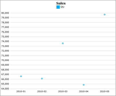
TIP: You can emulate a ![]() point chart by using a Line Type and changing the Point Style and Line Style
point chart by using a Line Type and changing the Point Style and Line Style ![]() values.
values.
MultiTab
Charts in this category have two categorical axes. They use colors or tile size to show values.
A Heatmatrix uses a color scale to represent a single value for each cell of a matrix. ![]() Example
Example
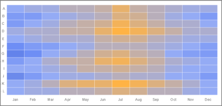
See also Click Actions on Heatmatrix Charts.
A Mosaic Chart displays tiles in a matrix, where the size of each tile is determined by the magnitude of a single value. ![]() Example
Example
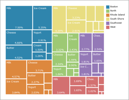
A Treemap displays hierarchical (tree-structured) data as a set of nested rectangles. ![]() Example
Example
Pies
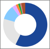
Donut Chart ![]() Example
Example
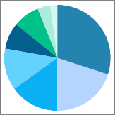
Pie Chart ![]() Example
Example
Statistics Charts
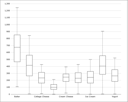
A Box Plot or a Horizontal Box Plot displays the minimum, maximum, median, and first and third quartiles of a distribution for each dimension value. It can also show outliers. ![]() Example
Example
MultiTab Chart Variants
In the following multiple value chart types, values are defined when the portlet is configured:
- MultiTab Area Chart
- MultiTab Spline Area Chart
- MultiTab Stacked Area Chart
- MultiTab Bar Chart
- MultiTab Column Chart
- MultiTab Stacked Bar Chart
- MultiTab Stacked Column Chart
- MultiTab Line Chart
- MultiTab Sparkline Chart
- MultiTab Spline Chart
Each of these multiple value chart types has a MultiTab variant in which the values are defined not by the portlet configuration, but by a second dimension called category. The chart show one value or color for each distinct value of the category column. In other words, a MultiTab chart shows one value divided into multiple categories.
For more information, see About MultiTab Charts.
See also, About Chart Portlets.