MultiTab charts show data for two dimensions, unlike standard charts that show data for one dimension only.
The first dimension is a numeric value that is then divided into colored parts based on a second dimension, called a category.
For example, the following graph is a standard bar chart showing the number of COPD hospital visits by admission type.
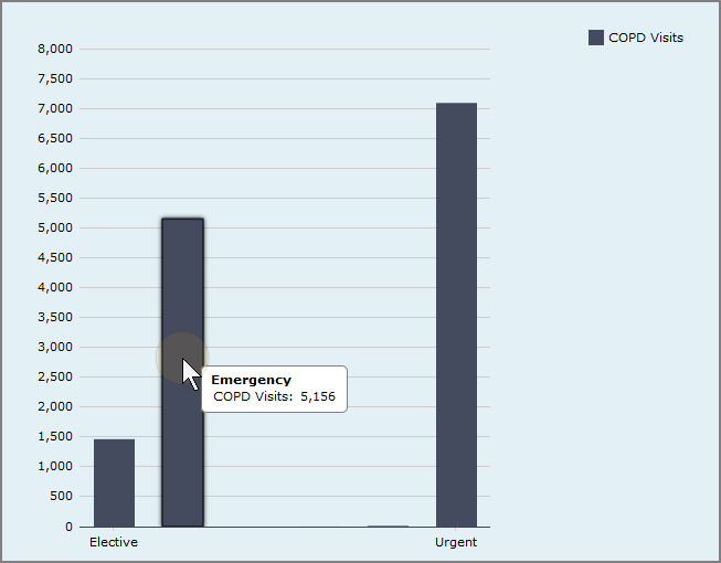
Placing the pointer on a bar shows that the emergency department saw 5,156 COPD visits.
Compare that to the following MultiTab bar chart showing the number of COPD hospital visits by admission type and a Facility category.
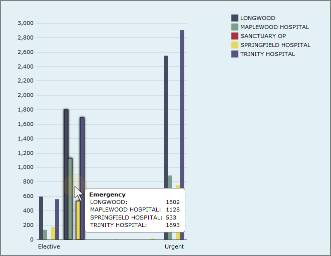
Each column in the standard chart now appears as a group of five columns (The column for Sanctuary Op is empty). The data is broken down by Facility. Placing the pointer on a group of category bars shows the number of emergency department COPD visits for each hospital. When you add the number of Emergency visits for all facilities, the total is 5,156.
NOTE: Sort and item display options are not available for MultiTab charts.
The following MultiTab chart types are available:
- MultiTab Area Chart
- MultiTab Spline Area Chart
- MultiTab Stacked Area Chart
- MultiTab Bar Chart
- MultiTab Column Chart
- MultiTab Stacked Bar Chart
- MultiTab Stacked Column Chart
- MultiTab Line Chart
- MultiTab Sparkline Chart
- MultiTab Spline Chart