-
Browse to the data you want to view.
NOTE: If you cannot find the content you want to work with, contact your DivePort administrator.
-
If QuickViews are available, use them to filter your view of the data.
NOTE: You might need to click
 Go to update the screen.
 -
Review the data:
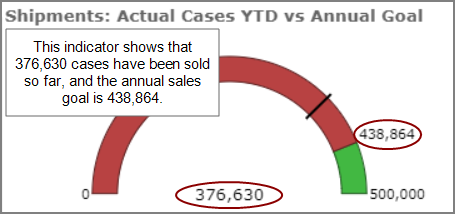
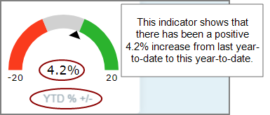
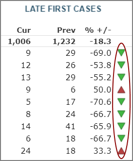
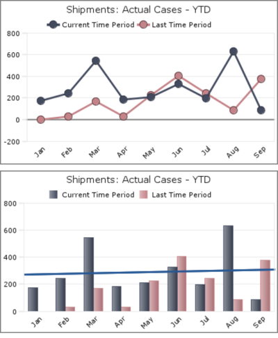
- Indicators are visual representations of data that you use to monitor performance.
- Indicators can show current performance in relationship to a goal, or performance over time.
- Indicators can display as graphics or text.
- Indicators often use colors to show whether performance has improved, declined, or remained neutral.
- Indicators can display as stand-alone page content or beside number values in a table.
- When viewing a chart, consider how it helps you interpret the data.
- For example, line charts help you monitor change over time, while bar charts help you notice differences in values.
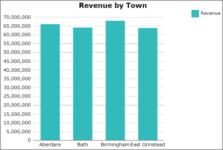
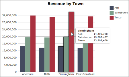
- Charts can display data for only one dimension, or for two dimensions.
- Charts with only one dimension show total values.
- Charts with two dimensions also show total values, but the totals are broken down by a category.
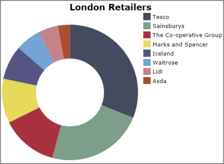
- Charts often have a title and a legend, though they do not have to.
- Administrators specify a chart's title and legend when they create it.
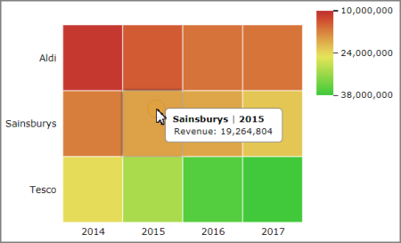
- On some charts, you can point to a value to see labels and numeric data.
- This can be useful if the chart does not have a legend, or if you want to see additional details.
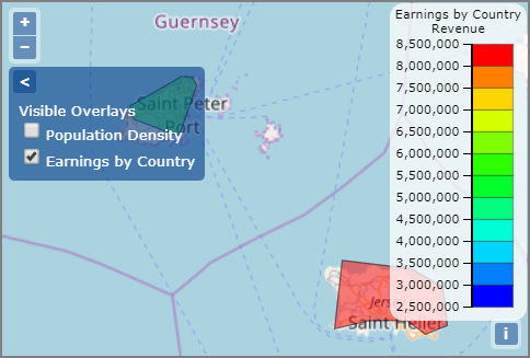
- In the upper left of the map, you can click the chevron >, and select one or more overlays that you want to view.
- Administrators can specify a name for each overlay to provide context about what it shows.
- TIP: If the map has a legend, it displays information about how to interpret the data.
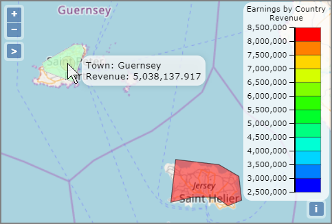
- You can point to an area of the map to see labels and numeric values.
- To zoom in or out, click the + and - icons in the upper left of the map.
- To view a different geographic area, click and drag the map.
- TIP: A browser refresh sometimes helps with display of base map layers when using third party web map services.
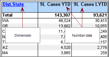
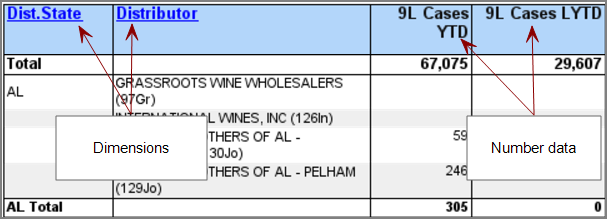
- Typically, dimension values display on the left, and data values on the right.
- Most tables show data for only one dimension at a time, though some tables can show data for two or more dimensions.
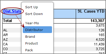
- In some tables, you can choose which dimension you want to view.
- To change the dimension you are viewing, click the dimension column header and select a new dimension.
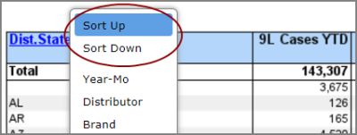
- Administrators can specify whether the columns in a table are sortable.
- To sort a column in ascending or descending order, click the column header.
- NOTE: If you can choose which dimension you want to view, to sort the dimension column, click the column header and select Sort Up or Sort Down.
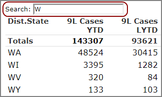
- If enabled, a Search box appears to the upper left of the table.
- You can search for all or part of a dimension value.
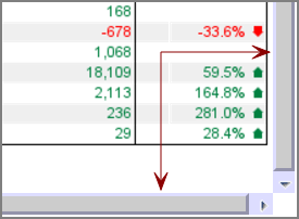
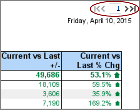
- If the table contains more data than can fit on screen, one of two navigation options are available:
- Scroll bars, which display on the right of the table, and along the bottom.
- Page selectors. By default, page selectors display on the upper right of the table, though administrators can choose for them to display elsewhere.
- To move one page forward or backward, click the
 or
or  arrows.
 - To move to the last page or the first page, click the
 or
or  arrows.
 - NOTE: The total number of pages displays below the table.
-
If you cannot find the information you need by looking at the data, try clicking content on the page.
Additional functionality might be available, depending on the options that an administrator specified.
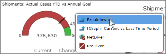
-
A
context menu appears, displaying one or more options. -
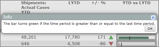
A window opens, displaying
context-sensitive help.Context-sensitive help can be useful when you are not sure what something shows, or if you need more information to understand the data.
-
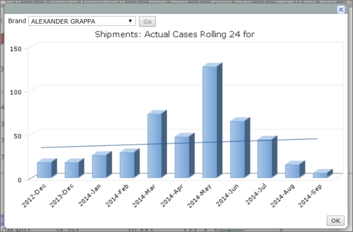
A
window opens, displaying additional data. -
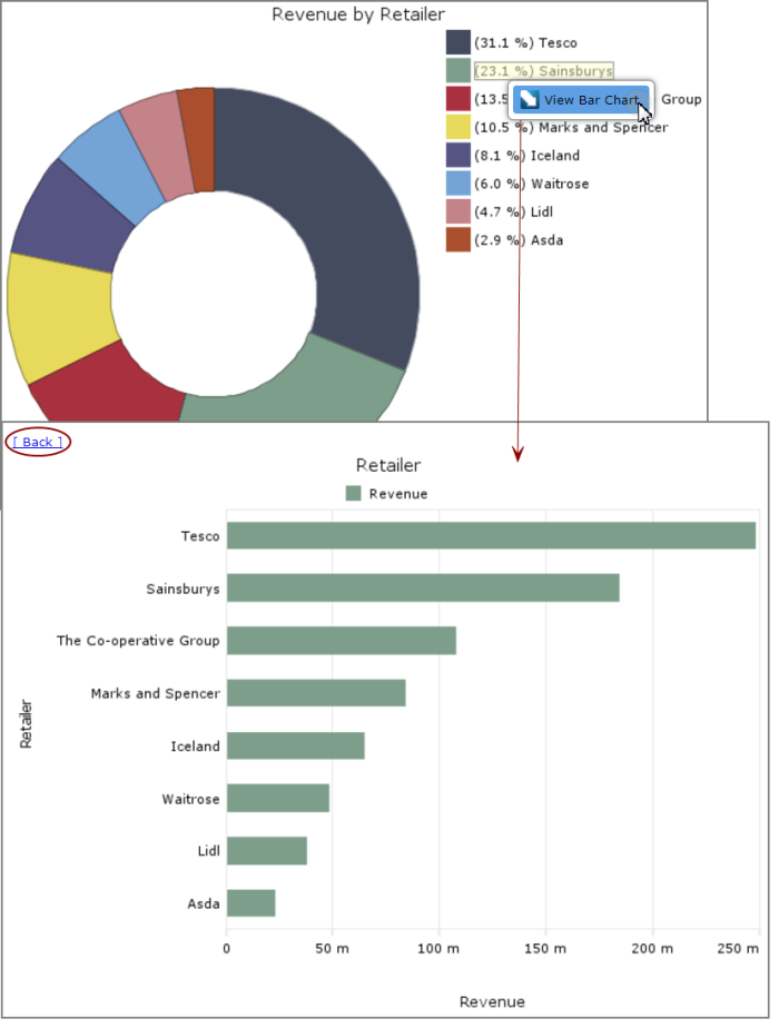
Your view of the data on the current page is
modified.In this example, you can click a value in the doughnut chart to view the data as a bar chart.
To the upper left of the bar chart, you can click Back to view the doughnut chart again.
-
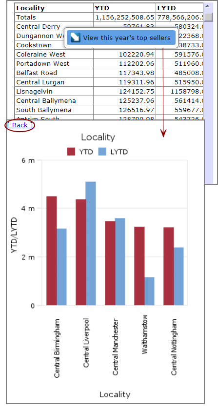
Data opens on a
new page.In this example, you can click a value in the table to view a bar chart of this year's top five sellers.
The bar chart displays on a new page. To the upper left of the bar chart, you can click Back to return to the table.
-
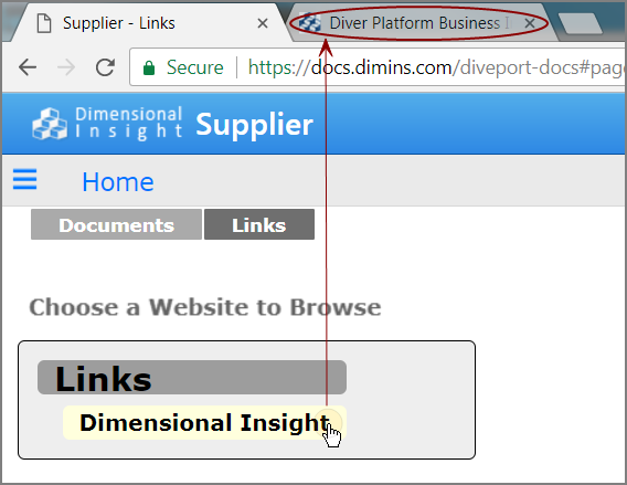
Content opens in a new
browser tab. -
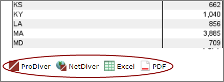
The data
opens in ProDiver or NetDiver, or in Excel or PDF format.NOTE: Sometimes, when the data is in a table, these options display to the lower left.
- If you need to view detailed numeric data, you might be able to dive on data in a table.
- For more information, see Diving on a Tabular Display.
When you click page content, you might experience the following behavior: