| Option | Description |
|---|---|
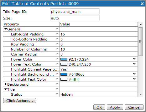
| Title Page ID | Specifies the Page ID value for the portlet title page. This value generates table of content entries for the indicated page and any child pages. The default is the open page's Page ID. To specify a different title page, enter that Page ID. |
| Size | Specifies the size of the Portlet background, in pixels. Format the value as width x height (for example 200 x 100). The default, auto, lets you resize the portlet manually. |
| General properties | |
| Left-Right Padding | Specifies the number of pixels the text is indented from the left edge of the background box. The default is 12. |
| Top-Bottom Padding | Specifies the number of pixels above and below the text in the background box. The default is 6. |
| Row Padding | Specifies the number of pixels between the rows in the background boxes. The default is 6. |
| Number of Columns |
Specifies the number of columns to use when presenting the table of contents. Use this value to control the number of entries that appear in a row. The default is 1. If your table of contents has several items, ensure that each row has approximately the same number of columns.
|
| Corner Radius | Adjusts the roundness of the corners on the background boxes. The default is 5. Higher numbers increase the roundness of the corners. |
| Hover Color | Specifies the button background color when you place the pointer on a table of contents button. The default is 255, 255, 221 (pale yellow). |
| Hover Text Color | Specifies the button text color when you place the pointer on a table of contents button. The default is 0, 0, 0 (black). |
| Highlight Current Page or Ancestor | Enables separate text and background colors—the Highlight Background Color and Highlight Text Color properties—for the table of contents button that references the current page, as well as the current page's parent, if that button is displayed. The default is Yes. |
| Highlight Background Color | Specifies the color of the button background when Highlight Current Page or Ancestor is enabled. You must specify a color. |
| Highlight Text Color | Specifies the color of the button text when Highlight Current Page or Ancestor is enabled. You must specify a color. |
| Background properties | |
| Background Color | Specifies the color of the background box holding the page entries. The default is 238, 238, 238 (pale gray). |
| Background Padding | Specifies the number of pixels surrounding the buttons. The default is 12. |
| Border Color | Specifies the color of the table of contents border. The default is 0, 0, 0 (black). |
| Border Width | Specifies the width of the border, in pixels. The default is 1. |
| Title properties | |
| Status | Specifies if the page title is a live link. The default is Clickable (live). Other options are Unclickable (flat text), or Hidden. The title is the name of the parent page. |
| Title Font | Specifies the font style and size of the title. The default is Verdana 18pt bold. |
| Title Justification | Specifies the alignment of the title text. The default is Left. Other options are Center and Right. |
| Title Color | Specifies the title color. The default is 0, 0, 0 (black). |
| Background Color | Specifies the color of the background of the title button. The default is 221, 221, 221 (light gray). |
| Pages properties | |
| Pages Font | Specifies the font style and size of the page button text. The default is Verdana 12pt bold. |
| Pages Justification | Specifies the alignment of the page text on the buttons. The default is Left. Other options are Center and Right. |
| Pages Color | Specifies the color of the page button text . The default is 0, 0, 0 (black). |
| Background Color | Specifies the color of the page button background. The default is 221, 221, 221 (light gray). |
| Fade Background Colors |
Enables transition of the button background color from the specified Low fade color to the specified High fade color. The default is No. NOTE: You can create two- and three-color transitions. |
| Low fade color | Specifies the fade start color. This color appears at the top or left side of the list of pages. The Fade Background Colors option must be enabled. You must specify a color. |
| Medium fade color | Specifies the fade middle color on a three-color transition. The Fade Background Colors option must be enabled. Do not specify a color if you want a two-color transition. |
| High fade color | Specifies the fade end color. This color appears at the bottom or right side of the list of pages. The Fade Background Colors option must be enabled. You must specify a color. |
| Indentation | Specifies the amount of space in pixels to indent the page buttons in a single column, or to put between the buttons in a multi-column table of contents. The default is 18. |
| Click Actions | Opens the Click Actions dialog box. Info, Help, Web Page, Portal Page, and Pop-up click actions are available. |
See also