About the Exception Tab
You can specify a neutral range that defines the start and end points for the exception range.
For example, if you have a column called Cases Sold, where the expected number of weekly sales is 10–15 units, you can define these values as the neutral range for the column. You can also define values that fall on either side of the range as Good or Bad. You can specify that values greater than 15 are Good and values that are less than 10 are Bad.
When evaluating sales performance for a period of time, ProDiver makes it easy to monitor predefined conditions (for example, actual case sales versus expected sales) within your organization. In addition to flagging in-range and out-of-range numbers, you can assign indicators (for example, up or down arrows) and colors to easily identify exceptions and spot trends within the data.
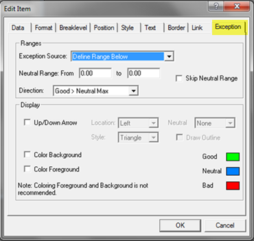
Depending on the underlying tabular, you can select one of the following options:
- Use Column Exception Values—If selected, the report column inherits any exception values configured in the underlying tabular display. You can change any display attributes for the default exception values (for example, indicator style, location, and range colors).
- Define Range Below—If selected, this option lets you define an exception range and display attributes for the selected report column.
Applies when the Exception Source is set to Define Range Below. Enter From and to numeric values (with up to two decimal places) that define the start and end points for the exception range.
Allows you to define Good as any number greater than the high end of the neutral range by selecting Good > Neutral Max. By implication, the definition for Bad is any number lower than the Neutral Minimum value. Alternatively, you can define Good as any number less than the low end of the neutral range by selecting Good < Neutral Min. Therefore, Bad is any number greater than the Neutral Maximum.
Select the Skip Neutral Range option to eliminate the range of numbers defined as neutral, leaving only numbers that fall into the Good or Bad range.
Select this option to add a geometric shape (for example, a triangle, arrow, or circle) to the left or right of the selected column. The indicator shape, depending on where in the numeric range the associated row value falls, inherits the color associated with a Good, Neutral, or Bad data value.
Select Left or Right to position the indicator icon to the left or right of the selected column.
Select Triangle, Arrow, or Circle as the indicator icon style.
Select None, Up, Down, or Side as the indicator icon position for row values falling into the neutral range.
Select Draw Outline to include a black outline around the edge of the selected indicator icon.
Select Color Background to add the appropriate background color (defined for Good, Bad, or Neutral) to the column background for a given row value.
Select Color Foreground to add the appropriate font color (defined for Good, Bad, or Neutral) to the row value font. Note that you must select one or a combination of color display options for exception reporting. Do not select Color Background and Color Foreground at the same time.
Click one of the color boxes to open the Color dialog box and change the color setting for the selected indicator icon range setting.