and Doughnut Plot Graphs
Pie plot
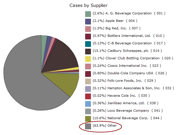
NOTE: ![]() Example
Example
IMPORTANT: If your data includes positive and negative numbers, ProDiver converts them to absolute values before the generating the pie chart.
TIP: By default, ProDiver assigns pie plot colors to dimension values in the order that the values are listed in the cBase. If there are more than 16 values, the colors repeat, even though the pie plot shows only the first 15 discrete values. These color assignments do not change if the data is sorted. Therefore, sorting data can cause duplicate colors on the pie chart if the Link Colors to Discrete Data Values check box is selected on the Graph Options, Appearance tab.
To convert the contents of an active dive window to a pie plot
-
On the toolbar, click the Graph icon
 .
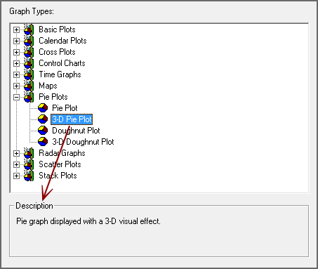
.The Select Graph Type
 dialog box opens. This is the first step in a graph creation wizard.
 TIP: Click a graph type to see a description in the Description box.
-
Double-click the pie plot graph type that you want to create.
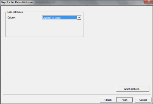
The Set Data Attributes
dialog box opens. - Select the summary column that you want to use for the graph from the Column list.
- If you want to further customize the graph, click Graph Options. Otherwise, click Finish to view the graph.
For more information, see Selecting Graph Options.
Watch the Video: Creating a Pie Chart.