CrossPlot graphs show summary data that applies to two different dimensions. CrossPlot graph types include bar graphs, line graphs, point graphs
To convert the contents of an active dive window to a CrossPlot graph:
-
On the toolbar, click the Graph icon
 .
.The Select Graph Type
 dialog box opens. This is the first step in the graph creation wizard.
 TIP: Click a graph type to see a description in the Description box.
-
Double-click the CrossPlot graph type that you want to create.
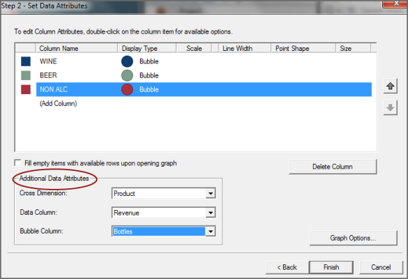
The Set Data Attributes dialog box opens. The data attribute options vary, depending on the selected graph type. This
example shows data attributes for a Line CrossPlot graph. -
To specify the vertical dimension values that you want to appear on the graph, double-click Add Column.
A list of available values appears. You can add up to a total of 16 columns.
-
If you want to change one or more colors that display data on the graph, double-click the
colored box in the left column, and select a different color from the list. -
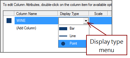
If you want to change the display type for one or more columns, double-click an
item in the Display Type column, and select a different type from the list. -
If you are generating a line graph, you can change the line width by double-clicking the setting in the Line Width
column, and selecting a different width. NOTE: If there is only one value, instead of a line, the graph displays a dot.
-
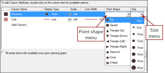
If you are generating a point graph, you can change the point shape and size by double-clicking the settings in the Point Shape and Size
columns, and selecting different options. - Selecting Fill empty items with available rows upon opening graph automatically populates the graph with the first 16 rows in the dive window.
- If you are generating a Summary graph type, ProDiver populates the graph with all summary information automatically. Proceed to step 12.
-
In the Additional Data Attributes
section, select a Cross Dimension and a Data Column from the lists. - If you are generating a Linear Bubble Plot graph, select a Bubble Column. Bubble column data determines the diameter of each bubble.
- If you want to further customize the graph, click Graph Options. Otherwise, click Finish to view the graph.


For more information, see Selecting Graph Options.