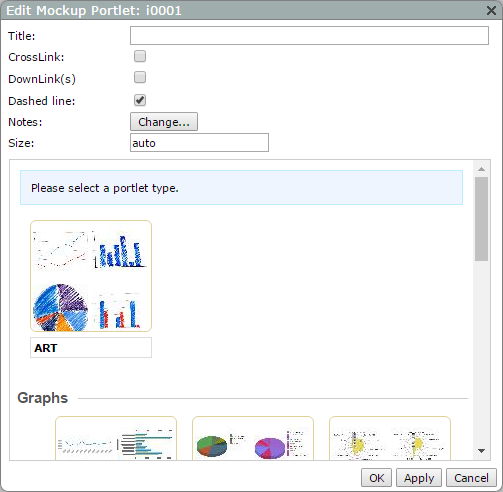
Mockup Portlet Options
| Property | Value |
|---|---|
| Title | Specifies a title for the mockup portlet. The title appears centered over the image. |
| CrossLink |
Adds a box in the mockup portlet to indicate the location of a CrossLink. This option is cleared by default. The tooltip for the CrossLink mockup displays This Portlet has a CrossLink. |
| DownLink(s) |
Adds a box in the mockup portlet to indicate the location of a DownLink. This option is cleared by default. Selecting this option activates the on
|
| on |
Specifies a message that appears in a tooltip associated with the mock DownLink. This message represents the dimension being downlinked to, but you can enter a static value. For example, if you enter Sales Region in the on box, the DownLink tooltip text displays This Portlet has a DownLink on Sales Region. If you leave the on box blank, the tooltip for the DownLink mockup dispalys This Portlet has a DownLink. |
| Dashed line | Specifies if the mock up image is outlined with a dashed line. This option is selected by default. |
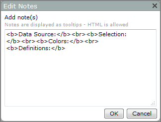
| Notes |
Specifies the text for the mockup's tooltip. Click Change to open the Edit Notes
|
| Size |
Specifies the width and height of the portlet instance, in pixels. The default, auto, uses the value specified in the Portlet Settings dialog box. The Size can be changed by entering a value in the format width height. NOTE: Alternatively, you can resize a portlet on an unlocked page by clicking and dragging the portlet resizing nodes. |
| Please select a portlet type |
Selects an image to display in the portlet. The following types are available: ART, Basic Plots, Pie Plots, Radar Graphs, Scatter Plots, Stack Plots, Indicators, Measures, Reports, and Tabulars. The representative thumbnail displays in the portlet. |
 text box
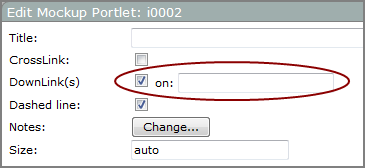
See also What Is a Tooltip?