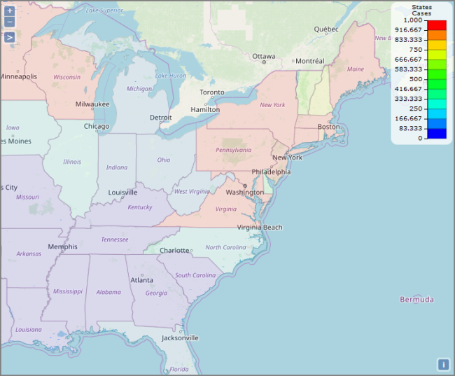
Boundary Map
Displays color-coded regions on the map based on the data.
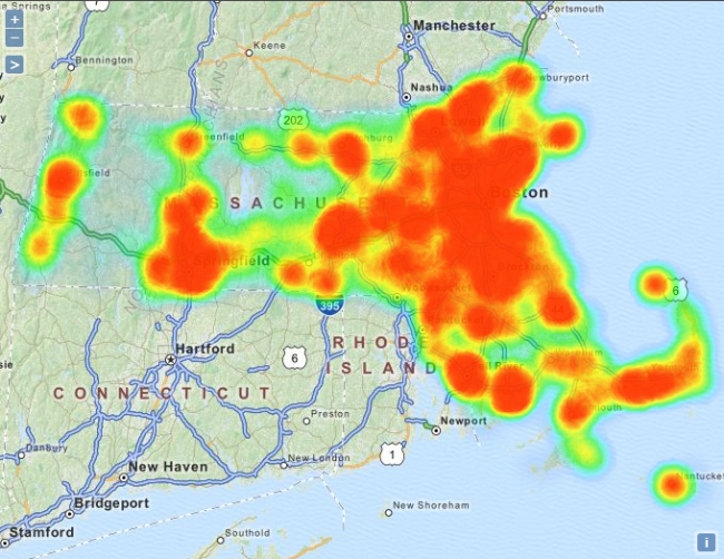
Heat Map
Displays color-coded areas of data density. The orange color in this example shows the most densely populated areas in Massachusetts.
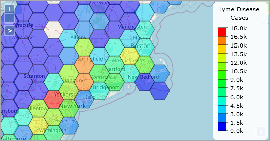
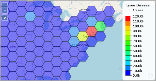
Hexbin Map
Available in DivePort 7.1(21) and later. Displays data density in colored hexagons. The following map shows the concentration of Lyme disease in the northeast section of the United States.
NOTE: The size of the hexagon does not change when you ![]() zoom in or out. The color might change because the hexagons represent a larger or smaller area of the map.
zoom in or out. The color might change because the hexagons represent a larger or smaller area of the map.
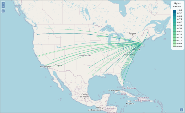
Line Map
Displays origin-destination data by drawing polylines or curved lines on a map. This example shows distance data between two transit stations.
NOTE: The underlying tabular must include columns with the following information:
- Source location in longitude-latitude format
- Target location in longitude-latitude format
- Unique identifiers/tooltips for each source/target location combination
- Summary
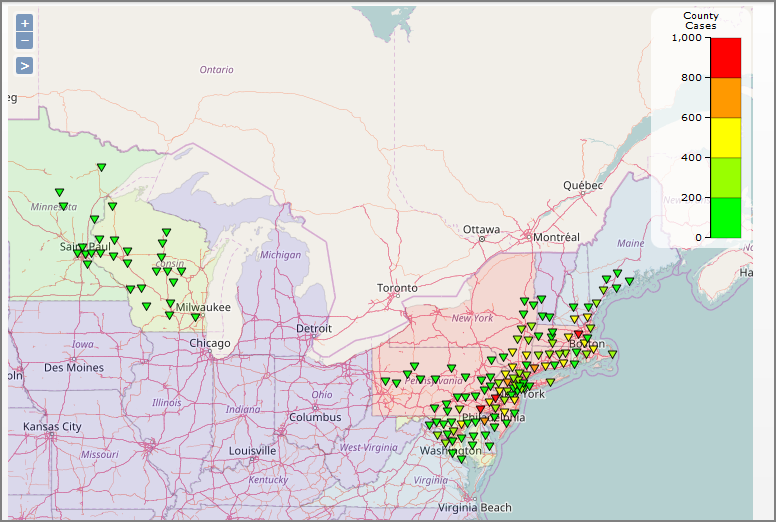
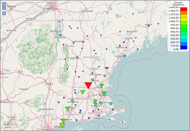
Point Map
Displays color-coded data points. This example shows New England population data.
Web Map Service Map
Displays web map services, such as traffic or weather maps. You can use a third-party open source or proprietary web map service.
DivePort allows you to include mutiple data layers on a map portlet. For ![]() example, a map can contain a boundary layer and a point layer.
example, a map can contain a boundary layer and a point layer.