About Box Plot Charts
Box Plots show the distribution of data and can be used to compare multiple groups of numeric data through their quartiles.
DivePort 7.1(21) and later can automatically summarize values when the source is cBase, cPlan, or Factory data.
Box plot options
When you create a box plot chart
-
A dimension value (horizontal axis)
-
A numeric value column (vertical axis)
-
A detail (a second dimension that is used to summarize the value column)
When you create a box plot in earlier versions of DivePort or when using a marker or dive file, you specify:
-
A dimension
-
Minimum, Maximum, High, Low, and Middle values (these calculated values must be included in the source data)
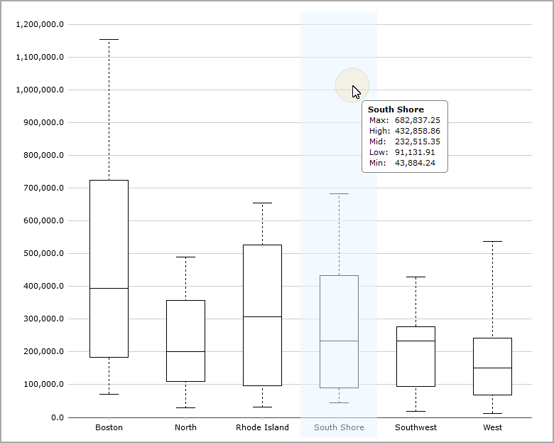
Reading a box plot
The box represents the second and third quartiles. A line inside the box shows the median. Whiskers are drawn from the 25th percentile to the minimum value and from the 75th percentile to the maximum value.
Placing a pointer on the chart shows details about the data.
See also Chart Portlet Options.