The rainbow is a beautiful example of a terrible use of color. Well, that’s not entirely true. It’s wonderful to look at in nature. But it’s misused in data visualization.
Did you know that there is one right way for designing color palettes for data visualizations? It’s not just a question of taste. Let’s take a look at why certain color combinations just won’t work for data visualization, and how you can go about designing ideal color palettes.
The wrong use of color
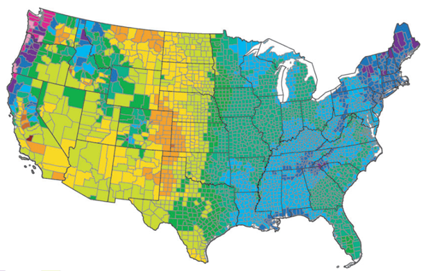
This map of the United States is showing evaporation rates per county across the country, and it uses a rainbow gradient to display the data. While the colors are visually pleasing, the jump from one color to the other makes the viewer think that there are dramatic differences in the rates. There appears to be stark differences in a few places, especially down the middle of the country, where the eastern half looks to be all dark green and blue, while the western half is all light greens, yellow, and orange.

While it looks like there is a huge difference between those colors, the legend shows the values are changing smoothly even though the colors are not. There are two problems here. One is that there are abrupt changes in luminance – the perceived brightness of a color – and there are many different hues. The luminance is also scattered – almost to a point that it looks random. The rainbow is a totally inappropriate color palette for this type of visualization where one wants to show smooth changes in quantities. In fact, the rainbow is never a good palette to choose.
HCL vs RGB
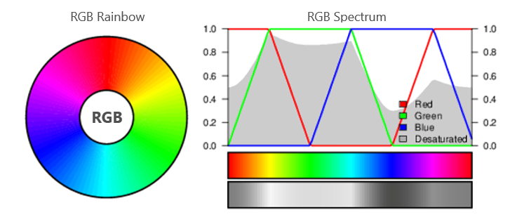
Most color palettes are designed using red, green, and blue, or RGB – it’s what we’re used to with TV or laptop screens, and it varies the amounts of pure red, green, and blue to create different colors. But if you look at a black and white version of the scale, you can see there’s no ordering of the colors, and the luminance changes drastically across the scale.
Source: Source: http://www.hclwizard.org/why-hcl/
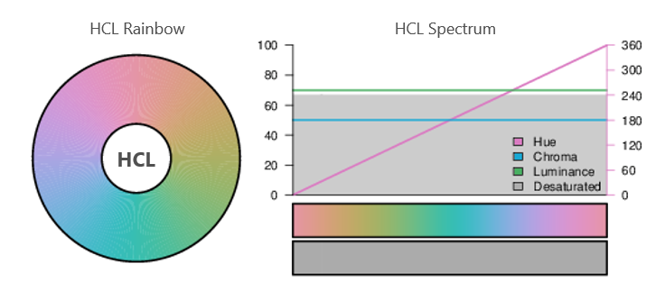
The HCL color space is the better option. HCL stands for hue, chroma, and luminance, and you can fix one of those three elements to make a more visually accurate representation of your data. By fixing the luminance, for instance, you can get colors that are all the same darkness, and you won’t get unexpected variations in the way the color is perceived.
Source: http://www.hclwizard.org/why-hcl/
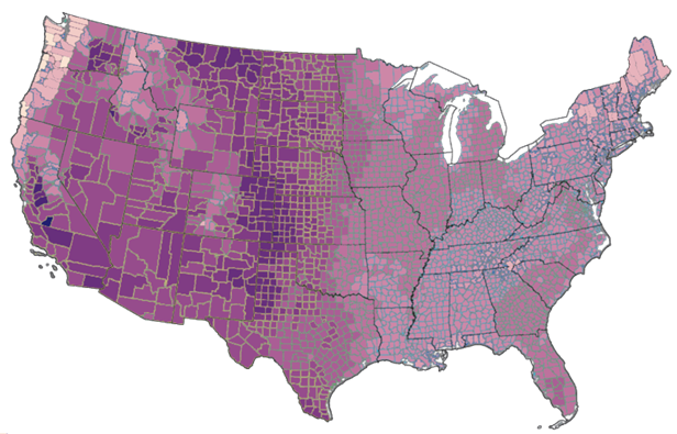
I made a version of the map we saw above with a proper sequential color palette moving from light to dark. You can see the changes, but they’re not as dramatic.
Different types of data need different types of color palettes
Basically, there are 2 main types of data requiring different types of color palettes – qualitative and ordered.

A qualitative color palette would be used for nominal or categorical data. Think of a set of names – categories where there’s no inherent order. There’s a conflicting constraint, because you want to have colors that show the data from Peter is different from that of Mary, for example, but you also want the colors to be perceived as equally important. You don’t want to unwittingly emphasize one category at the expense of the others. It is hard to meet that constraint with RGB, but it’s pretty straightforward within HCL.
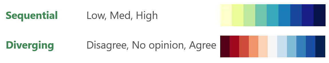
When you’re dealing with ordered data it’s either sequential or diverging data. With sequential you’re going from low to medium to high, and with diverging you’re going across from bad through OK to good – actually 2 divergent palettes, back-to-back.
There are a number of HCL color picker tools that allow you to fix the hue or chroma and then vary the luminance of the colors. This allows you to generate a smooth luminance gradient and so accurately represent the change in quantities in your chart. Dimensional Insight Workbench users can manage colors, visualize them in a color palette generator, design them, and easily apply them. We can explore that topic in a future blog post.
We started out talking about the disadvantages of a rainbow. But when you’re talking about color palettes, there is a natural phenomenon you should use as a model. A sunrise is a natural color palette with bright yellows, moving through reds and deep purples. It’s a perfect model for sequential or diverging data sets.
Sometimes data visualizations use color just for the sake of using color. Color is one of the most important aspects of your data visualization so you need to be intentional about the palette you choose. If not, you risk emphasizing the wrong information.

- Proper Use of Color in Data Visualization - September 8, 2022