By definition, data visualization is about showing information in a visual format. People often get overwhelmed when they see numbers on a spreadsheet or as text in a document.
Data visualization can do more than just show the information. It can contextualize the data and make it easier to understand. Business people often ask themselves, “Why is data visualization important?” Some may even decide it’s not worth pursuing.
However, when done well, data visualization can unlock benefits that may be hard or impossible to achieve otherwise. Here are five things people can do to maximize the worthiness of their data visualization.
1. Decide what story the data should tell
Most people who work with figures are familiar with putting them into a graphics-driven format, but they may not know how to use the information they have to tell a story. Storytelling does not merely describe a scenario, but it engages people and encourages them to offer solutions.
According to James Richardson, senior director analyst at Gartner:
“A data story starts out like any other story, with a beginning and a middle. However, the end should never be a fixed event, but rather a set of options or questions to trigger an action from the audience. Never forget that the goal of data storytelling is to encourage and energize critical thinking for business decisions.”
Telling a story through data visualization does not mean people are concocting misinformation. Instead, they’re presenting the information in ways that help the audience understand it and feel more informed.
2. Make a clear and memorable statement
Some of the top data visualizations are beautiful as well as informative. If people are creating them to foster learning in an educational setting, for example, they may get more out of their efforts by formatting the evidence in a gorgeous yet relatable way. Consider a case where the creator showed U.S. immigration patterns as tree rings.
Lisa Charlotte Rost, a data visualizer for Datawrapper, nominated this tree-ring visualization as one of the top efforts of 2018.
Rost explained, “This is a great data visualization, a beautiful image and a powerful metaphor at the same time. Like any good visualization, it makes a clear statement — the U.S. grew through diverse immigration — but also invites you to explore specific highs and lows of immigration from different parts of the world over the past two centuries.”
This example shows it’s still possible to have a beautiful outcome without losing the message. One of the benefits of data visualization is that it can combine creativity with hard facts.
3. Choose the right visualization type
Data visualization might seem straightforward, but many people don’t realize they need to choose the right kind of graphic to support their goals.
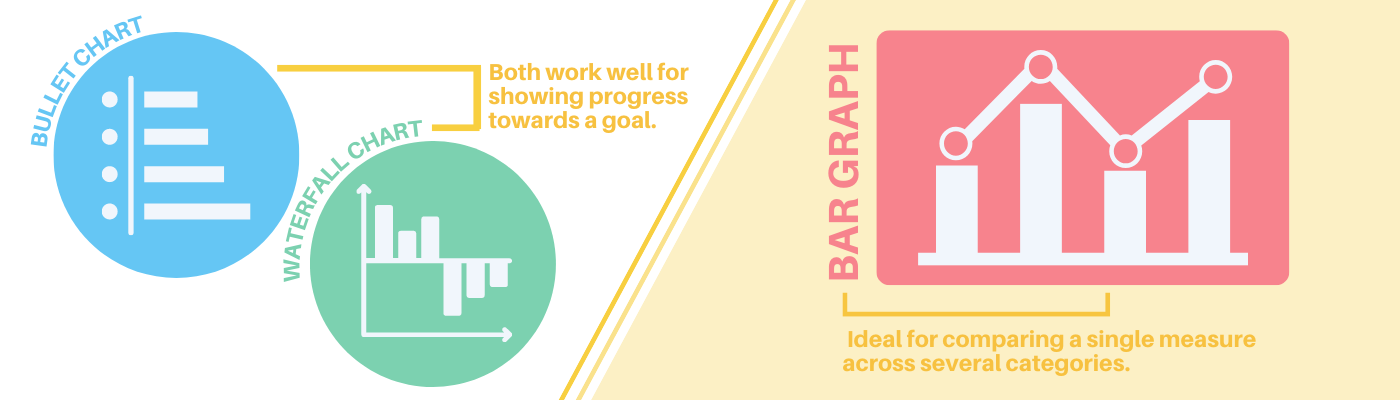
For example, bullet charts and waterfall charts both work well for showing progress towards a goal. Conversely, bar charts are ideal for comparing a single measure across several categories.
It’s not enough for a company to decide to move forward with this strategy. They must also choose the right type and ensure that it helps people draw the correct conclusions.
4. Verify the accuracy of the presented data
Business people often use data visualizations to overcome problems. For example, if a business needs to overcome a supply chain slowdown, a data visualization might help pinpoint the cause. But regardless of the reason for using this method, they must check that the details show accurately.
Various factors, including poor color choices, improper scaling methods, and deviations from standard practices, can make figures misleading. However, creating accurate comparisons and thinking of a viewer’s needs can bring the best results.
5. Be open to using fewer data points
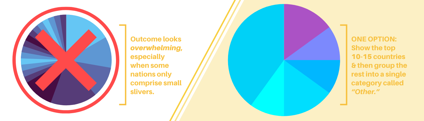
A lot of websites answer the all-important “Why is data visualization important?” question without cautioning readers that it’s not always best to use every data point available to them. For example, if a multinational beverage company uses a pie chart to show sales percentages for 75 countries, the outcome may look overwhelming, especially when some nations only comprise small slivers.
However, one option is to show the top 10-15 countries and then group the rest into a single category called “Other.” If necessary, companies might create more graphs to drill into the results for the nations in that division.
Perhaps they may only distribute them to the employees whose work directly relates to those lands. Showing all the percentages at once to everyone could prove too much to digest.
Proper presentation brings ideal results
The benefits of data visualization are plentiful, and business owners should feel eager to harness them. However, as these tips show, specific data visualization strategies can make the outcomes even more impressive. To learn more about what your visualization options are, check out Dimensional Insight’s Visualization Library.

- 5 Ways to Get More Out of Data Visualization - June 2, 2022
- 5 Data Analytics Trends for 2020 - January 9, 2020