Everyone has his or her unique way of analyzing data to find the right answers. This is why self-service in a business intelligence tool is so important. It’s also why drag-and-drop dashboards are so appealing. I am not stuck with what someone else decided is a good way to look at the data. I can focus on what is important to me. Still, in the end, I need to share my findings with other people in a way they like if I want to get my point across.
Dimensional Insight’s “Stamps” are pre-designed charts that can be updated with different data and filters with a few clicks. Users can build dashboards in minutes. Let’s examine a hypothetical scenario to see how you can use these Stamps to optimize your analytics experience.
How to create a dashboard in just minutes
Below (Figure 1) is an example of what I built when I wanted to review sales into retail stores (using demo data).
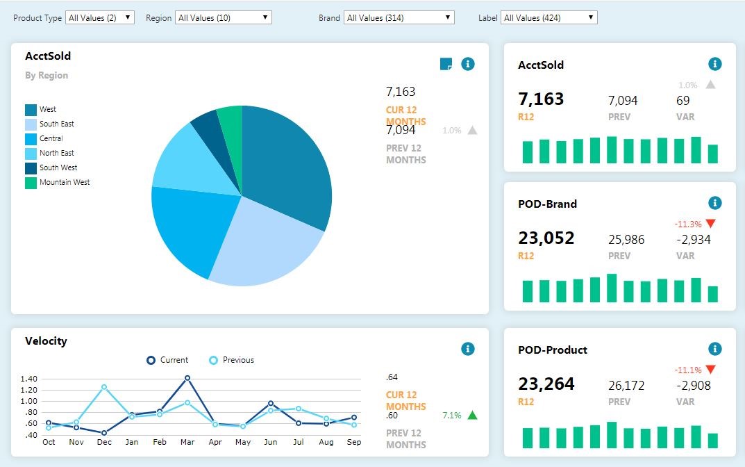
Figure 1
I was so excited that I could build this in minutes.
I took note that the Points of Distribution (POD) for Brand and POD for Product decreased by almost the same amount. That indicates that potentially most of the decline in product sales is due to multiple items from the same brand or brands. Clicking on the “R12 POD-Brand” number brought a pop-up breaking out the difference in sales between the most recent 12 months and the prior 12 months (Figure 2, below). Note that Malibu had a large decline.
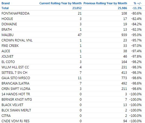
Figure 2
Modifying the dashboard with a few clicks
I realized at this point that the number of distributors should be included, since distributors are the ones that sell into accounts. I was also curious about the impact of samples. It took just a couple more minutes before I had version two of the dashboard available (Figure 3).
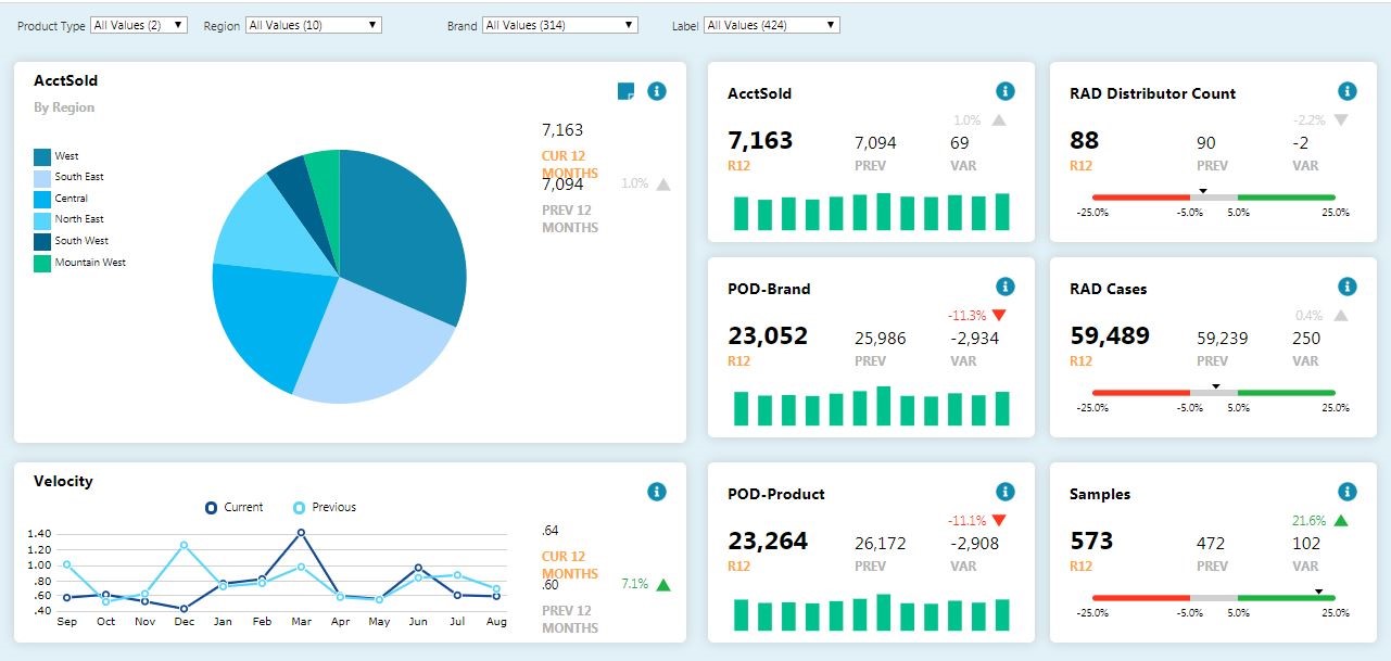
Figure 3
In the Retail Account Data (RAD) Distributor box at the top right, you can see there are two less distributors for the current rolling 12 months than there were in the previous rolling 12 months.
Looking at the Velocity chart on the bottom left, there is a sharp decline in April and again in July. It appears we may have lost one distributor at the end of March and maybe another at the end of June.
Was the loss of these two distributors the source of decline in sales of Malibu branded products?
The answer was found by selecting Malibu from the Brand filter. The updated dashboard (Figure 4) breaks out the decline in Malibu sales.
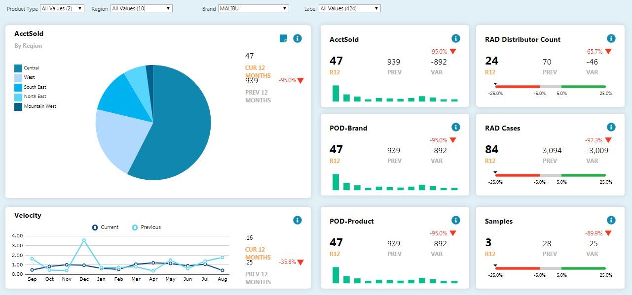
Figure 4
The chart labeled “AcctSold” at the top right no longer shows the Southwest region. The whole region stopped selling Malibu. The box labeled “RAD Distributor Count” at the top right shows 46 distributors stopped selling Malibu between the most recent 12 months and the previous 12 months. The data makes it appear we can’t blame declining Malibu sales on losing two distributors. The middle chart on the right shows volume dropped from 3,094 cases to 84 cases. The conclusion we can draw is that it is time to start talking to the distributors that dropped it to find out why. This process could be repeated to identify other causes of changes in sales.
Conclusion
The new Stamps functionality in Dimensional Insight’s Measure Factory enables greater self-service, allowing you to create your own reports that make the most sense for your role. This helps you quickly get to the answers you need, resulting in reduced costs, and greater sales and profits.
(Please note that this blog has hypothetical sales. It does not reflect actual sales of any brands.)


- How Stamps Can Help You Make More Informed Business Decisions - January 13, 2020
- 3 Critical Metrics for Distributors - July 18, 2019
- 3 Essential Metrics for Beverage Alcohol Suppliers - June 12, 2018