In my first post on exploratory data analysis (EDA), I discussed why it’s important to get a “sense” for the data you’re working with before applying analytical techniques that may come with critical assumptions and prerequisites.
In this post, I’ll expand on the concepts I discussed in that post and also examine some other exploratory techniques. The goal is to make you familiar with various forms of data analysis so you can use them to make the right decisions for your organization.
Exploratory data analysis
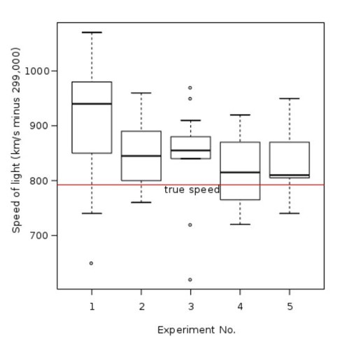
EDA prescribes a set of concepts and tools that help the analyst develop that “sense” for the data. Chief among these is visualization. John Tukey was a leading proponent of visualization and is known for devising the “box plot” among many other things. The box plot depicts the distribution of a data set by showing the position of the median relative to the first and third quartile boundaries—that’s the box—as well as the presence of outliers outside of the box. It also provides boundaries, known as “fences,” beyond which outliers are considered “extreme”.
The box plot offers an “at a glance” impression of the “skew” of the data’s distribution as well as the potential influence of outliers. Overlaying the mean on the box plot also clearly demonstrates the effects of outliers and skew. And there are other useful visualizations that complement the box plot, including histograms, stem and leaf plots and scatter plots. Best of all, they are all reasonably straightforward to both create and interpret.
There’s an interesting irony here. The simplicity of visualization and the somewhat hit-or-miss nature of exploratory analysis don’t seem consistent with the discipline and rigor of the serious mathematician or statistician; nor is it clear how their application would produce game-changing advances. However, at Bell Labs, Tukey’s work led to a better understanding of the nature of communication networks, and a refined fabrication processes for semiconductors. And incidentally, that work also led to the development of the first statistical software packages, including “S” and ultimately its successor “R”, one of the most popular statistical tools in use today.

Re-expression or transformation
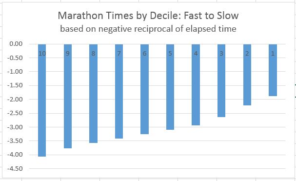
Re-expression, also known as transformation, is another powerful exploratory technique. Once you understand a distribution – and conclude that it’s not normal—you may still be able to find patterns that approximate normality. Common transformations used in re-expression include applying the square root, logarithms, squares, cubes and other powers to raw data. Another clever transformation involves using the reciprocal to represent durations.
When “less is better”—as in the time to complete a race or race—using traditional approaches emphasizes what is “slow.” Extreme slowness will dominate any visualization and obscure the significance of the “winning time”—not particularly helpful! The reciprocal puts the emphasis on the “fast” times by making them “big” while keeping slow times “small” and increasingly less significant as they get slower. It’s a powerful example of how combining some math with visualization can make data more digestible.
Revelation: Seeing what isn’t there
Possibly the most important principle of EDA is revelation: helping to see things in the data that are not readily apparent. This typically doesn’t happen all at once, but is the result of iteratively applying the various techniques and reevaluating at each step. The result: a well understood data set that then is ready for the more common “confirmatory” statistical techniques.
Exploratory data analysis tips
So what can we learn from the evolution of Exploratory Data Analysis? A few things stand out:
- Resist the temptation to rush headlong into confirmatory techniques, like regression and analysis of variance—just because they happen to be in your toolbox—or more accurately your Amazon Web Services instance. As the saying goes, “if you have a hammer, everything looks like a nail.”
- Use exploratory techniques first to get a “sense” for the data you’re working with. That may feel a bit “squishy and unsophisticated”, but as Tukey would advise: you need to start at the beginning. There really aren’t any shortcuts – at least that won’t eventually get you into trouble.
- Keep it simple: take advantage of simple visualizations then progressively apply more advanced techniques like re-expression to enhance understanding. But don’t overdo it. If transformations don’t add to meaning and understanding, then back them out and try something else.
- Don’t lose sight of what you’re trying to do. Analysis should contribute to building on the knowledge and wisdom of a particular domain. If your results don’t make sense to the people who are immersed in that world, you’ve likely missed the mark – or maybe you’ve uncovered an important counter-intuitive insight. Both are equally valuable: ruling something out can be just as important as discovery.
The ultimate goal of analysis is to derive meaning from data, regardless of how you choose to go about it. You may well discover that there are opportunities to apply regression, analysis of variance and various forms of machine learning and artificial intelligence. But you’ll be more confident in your results and conclusions if you use an exploratory approach to first get a sense for what you’re working with.
In the next post, we’ll go deeper on the topic of visualization.
Learn more
In the meantime, if you’re interested in more background on Exploratory Data Analysis, these three books represent the foundational thinking. Unfortunately they tend not to be in general circulation, so you may need to pay a visit to a university library.
- Exploratory Data Analysis, John Tukey, 1977, Addison Wesley
- Data Analysis & Regression, Mosteller & Tukey, 1977, Addison Wesley (see Chapter 1 in particular)
- Understanding Robust & Exploratory Data Analysis, Hoaglin, Mosteller & Tukey, 1983, John Wiley
And if you’re new to the Practical Analysis series, you can see the rest of my posts.
Related reading
- Practical Analysis: Understanding Visualization Concepts
- Practical Analysis: The Foundation of Analytics Knowledge
- How Exploratory Data Analysis Helps You Generate Meaningful Insights

- Practical Analysis: The Next Chapter - May 21, 2020
- Exploratory Data Analysis Part 2: Helping You Make Better Decisions - October 11, 2019
- Practical Analysis: Understanding Visualization Concepts - September 19, 2019