If you follow our blog, you know I typically write articles about dashboard design. However, now we have expanded this topic to “Getting More Out of Diver”, which will encompass not only dashboard design, but also help you better understand your data and how to accomplish your goals within Diver.
This article is my first under this new topic. I believe it will help you get more out of Diver. In short, I’d like to introduce you to a resourceful web site that will help those in healthcare better understand their hospital’s performance by comparing it to a benchmark.
Health Services Research Information Central (HSRIC)
If you work with data for the healthcare industry, you will want to check out this site. It’s a service of the National Institute for Health (NIH) and is chock full of valuable resources.
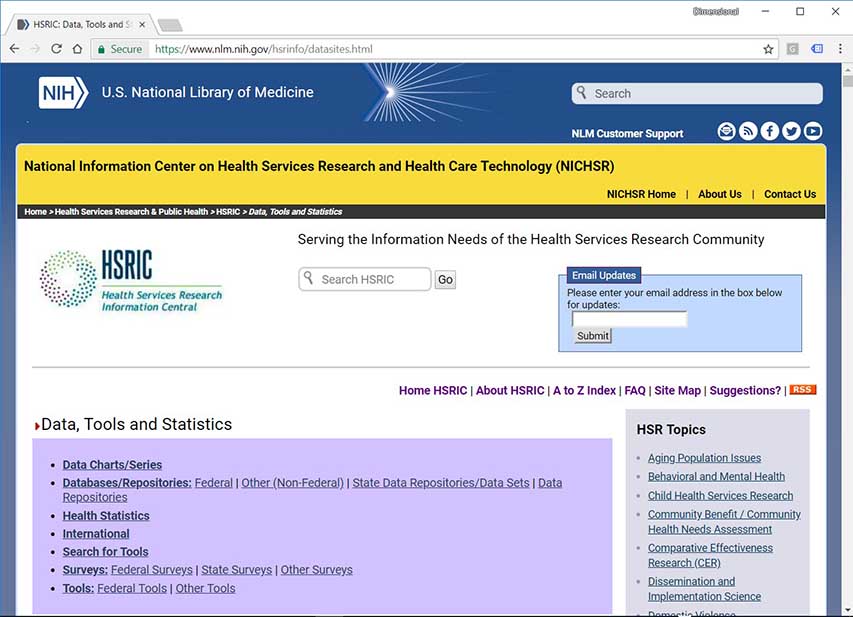
The Health Services Research Information Central (HSRIC) was created to improve “the collection, storage, analysis, retrieval, and dissemination of information on health services research, clinical practice guidelines, and on health care technology, including the assessment of such technology.”
How could you use the data provided on this site? You can use the data as a benchmark against your own health care system’s data. Entire dashboards with specific hospital performance data might be compared to findings from the research provided here. At a minimum, business intelligence analysts will find the data to be very interesting.
The site is really a list of links to other sites sorted by site content type and includes a brief description of almost every site in each “Details” popup message. Here’s an example of one of the sites listed under “Other Tools”:
“Why Not the Best? Comparative Health Care Performance Data” – (Commonwealth Fund)
Details
Free resource for health care professionals interested in tracking performance on various measures of health care quality. It enables organizations to compare their performance against that of peer organizations, against a range of benchmarks, and over time. Case studies and improvement tools spotlight successful improvement strategies of the nation’s top performers.
Here is a list of the categories of site content types:
- Data Charts / Series
- Databases / Repositories
- Federal
- Other (Non-Federal)
- State Data Repositories / Data Sets
- Data Repositories
- Health Statistics
- International
- Search for Tools
- Surveys
- Federal Surveys
- State Surveys
- Other surveys
- Tools
- Federal Tools
- Other tools
Within the seven main categories, I counted 341 sites listed on this one page.
Additional resources
Here are two more sites on “Health Services Research Information Central” (HSRIC) that I think might be useful when tracking your own health system’s data:
Ambulatory Health Care Data (National Center for Health Statistics, CDC (NCHS))
There is no “Details” popup for this link. So, I got the details below off the Ambulatory Health Care Data web site:
Based on NAMCS and NHAMCS.
The National Ambulatory Medical Care Survey (NAMCS) is designed to meet the need for objective, reliable information about the provision and use of ambulatory medical care services in the United States. Findings are based on a sample of visits to non-federally employed office-based physicians who are primarily engaged in direct patient care and, starting in 2006, a separate sample of visits to community health centers. The National Hospital Ambulatory Medical Care Survey (NHAMCS) is designed to collect data on the utilization and provision of ambulatory care services in hospital emergency and outpatient departments and ambulatory surgery locations. Findings are based on a national sample of visits to the emergency departments, outpatient departments, and ambulatory surgery locations of non-institutional general and short-stay hospitals.
County Health Rankings & Roadmaps- (Robert Wood Johnson Foundation (RWJF), University of Wisconsin)
Details
Provides county-by-county health rankings for each of the 50 states and Washington DC, explanations of each health factor, and actionable strategies to improve the health of communities across the nation.
What does the expert say?
Before sharing this site with you, I wanted to be certain that a healthcare data expert would consider this site to be of value, just as I do. So, I spoke with George Dealy, Dimensional Insight’s VP of Healthcare Applications. Here’s what he had to say:
“Let’s focus on one of the sites listed on HSRIC, the County Health Rankings. I’m pretty familiar with it because we’ve used it here at Dimensional Insight. That is a really good and interesting resource that’s referenced by this NIH web site (HSRIC). They have a really good site. It is a collaboration between the Robert Wood Johnson Foundation and the University of Wisconsin Center for Population Health. They compile public health statistics from a variety of different sources including NIH, but also others like a lot of local and state health departments for every county in the US. So, it is actually an example of something that you can integrate into your own data because it provides population-level measures at the county-level for every county in the US. Even if it doesn’t relate to your data, at least it provides an indication of what is going on from a health factors and outcomes perspective in your area. I think that’s really cool. There’s a lot of data. There’s a lot of measures. And, it’s been curated.”
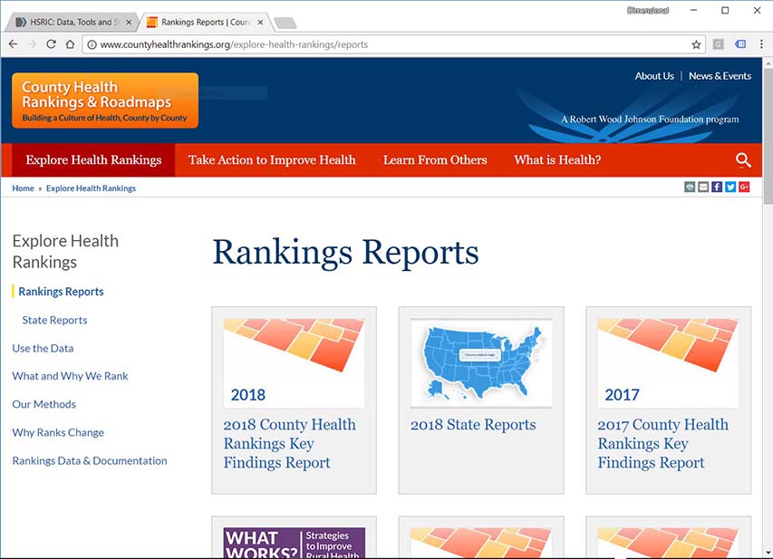
Dimensional Insight is currently working with the “County Health Rankings” in its development team.
George also mentioned that the “City Health Dashboard” looks interesting. It is also from the Robert Wood Johnson Foundation, a reputable source of health information.
“Look at the City’s data. It’s going to give you fairly specific data and is set up very similar to the County Health Rankings. They are working with city health records. 500 cities participated.”
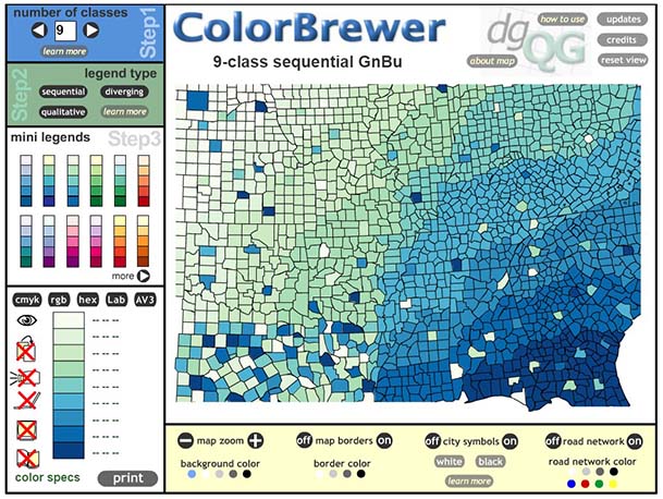
George’s feedback confirmed what I had suspected. The HSRIC is of value to people working with healthcare data. And some resources are even of value to those working outside the healthcare industry like this juicy tidbit: Color Brewer. The Color Brewer is “an online tool designed to help people select good color schemes for maps and other graphics.”
Hopefully, I’ve helped you see that Health Services Research Information Central is the kind of site that you can spend hours upon hours uncovering valuable information for use with Diver, DivePort, and really any of Dimensional Insight’s applications. Please check it out.
Ready for a test drive of our healthcare analytics software?

- Meet the Dimensional Insight Team: Gabrielle Amarosa - December 1, 2022
- What You Need to Know About President Biden’s Marijuana Pardon - November 2, 2022
- How to Ace this Year’s OND - September 27, 2022