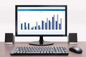
 Do you need to compare periodic sales data across different regions or different products to inform and support your sales team? You have the data, but you need to quickly turn it into easily consumable, visual presentations. Enter DivePort’s powerful chart portlet where you can produce and edit a multitude of visualizations without context switching as you customize your dashboard.
Tweet: Learn about Chart Portlet and the Future of Dimensional Insight Visualizations
The chart portlet is one of DivePort’s newest features. It was designed to be the main visualization tool for Spectre data in DivePort 7. However, you don’t need Spectre data to take advantage of the new chart portlet. Most of the features are compatible with models and marker files, too.
Wizard setup
When designing the chart portlet, Dimensional Insight development focused on making it fast, clean, and intuitive to use. They paid special attention to usability of the dialog, with a wizard configuration for new portlets.
To streamline the setup process, the wizard steps you through selection of the required options for the portlet, including source file, chart type, dimension, and values. Then, you can configure additional options depending on the type of chart that you select. See Figure 1.
This wizard configuration and new dialog style can be applied to other portlets as well. In addition to the Chart Portlet, the Map Portlet and the QuickView Portlet also have updated dialogs. There are plans to extend this dialog update to all portlets in DivePort.
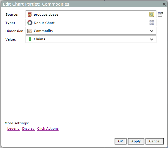
Figure1: Chart portlet edit dialog
Under the covers
Useful as it is, there’s lots more to the chart portlet than a spiffy wizard dialog. The Chart Portlet’s rendering system uses D3.js, which was chosen because it is a modern web visualization library that allows users to do a lot of complicated things quickly and easily. D3 makes it easy to efficiently create many different types of interactive visualizations directly in the browser (see Figure 2). D3 also has many features that the Chart Portlet hasn’t yet taken advantage of, which allows room for the Chart Portlet to continue to grow.
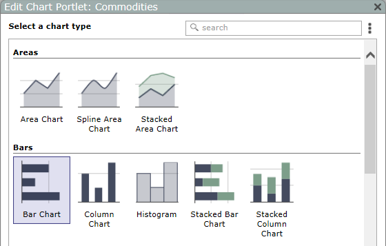
Figure 2: Sample of chart types
Visualizations in DivePort: then and now
Even more exciting, with the chart portlet, you can build and tweak your visualizations directly from your Spectre data files or tabular markers in DivePort without having to go to a separate application. Let’s do a quick review of 6.4 configuration process to compare and highlight the ease-of-use of this new capability.
6.4 visualizations
In 6.4, visualizations start in ProDiver with ProDiver’s graph functionality. ProDiver graphs are powerful. They have a lot of features, are very versatile, and offer all of the basics plus several very specialized chart types out of the box. However, some consider the set-up dialog to be a bit difficult to navigate with the number of options that have been added over the years. When you have your graph defined, you then must save it to a marker file and import it into DivePort.
Once you imported all of the graph markers that you’d like to turn into a dashboard, you create a marker portlet for each marker. Other than placement of the marker portlets, there is very little control within DivePort 6.4 to modify how your visualizations look. If you want to make any changes, you have to go back to ProDiver, modify the graphic, save, and then go back to DivePort. This workflow requires a lot of context switching as you work to customize your dashboard. Wouldn’t it be nice if you could do all the work for visualizations in the place where you’re actually going to use the visualizations?
7.0 visualizations
In the 7.0 chart portlet, you can. The chart portlet is extremely powerful when used in conjunction with Spectre, especially cBases with cPlans. The chart portlet can produce a multitude of visualizations from a single cBase or cPlan. You don’t have to make separate dives for every visualization that you want. Under the covers, the chart portlet makes the dives against the cBase or cPlan based on the preferences you specify during portlet setup.
In DivePort, the chart portlet edit dialog has a few cBases and cPlan only options that give you more control over the resulting chart. For example, you can change the sort order in the chart or choose a specific number of data values to display. There are a few chart types like box, open-high-low-close chart (OHLC), and candlestick (see Figure 3), for example, where you might need a bit more control over your source data to produce the results that you want. For these cases, you can make your own dive files.
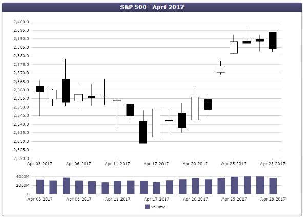
Figure 3: Candlestick chart
Chart portlet options
The chart portlet setup wizard supports a variety of different chart types for you to choose:
- Areas: area chart, spline area chart, stacked area chart
- Bars: bar chart, column chart, histogram, stacked bar chart, stacked column chart
- Finance: candlestick chart, OHLC
- Lines and points: line chart, scatter plot, spark line, spline chart
- Pies: donut chart, pie chart
- Statistics: box plot, horizontal box plot
The setup and configuration dialogs have different options depending on which chart type you select, but for each type the dialogs display options in logical groupings to make them easy to find. Let’s look at some of the setting dialogs for a stacked bar chart.
The edit chart portlet dialog displays the data source, chart type, dimension, and values. You populate these values with the wizard setup process, but you can edit them at any time with the edit portlet dialog. In this example, there are two values in the stacked bar chart: gross profit and sales. You can add additional values to the chart. See Figure 4.
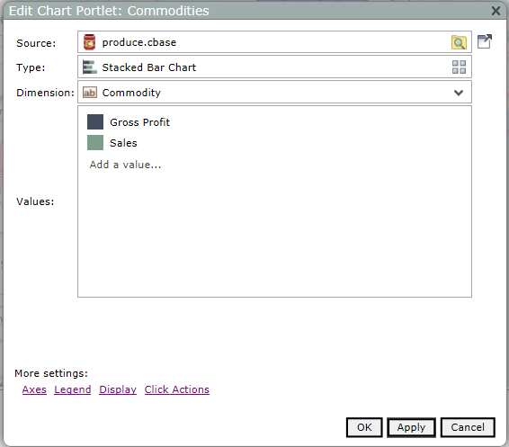
Figure 4: Example stacked bar chart options
You can edit the value settings, such as to give the value a more meaningful name or change the colors. See Figure 5.
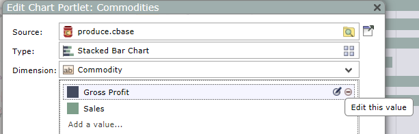
Figure 5: Example editing values in a stacked bar chart
In this example, the value in the cBase column is GP, so let’s change the label, which displays in the legend, to Gross Profit. See Figure 6.
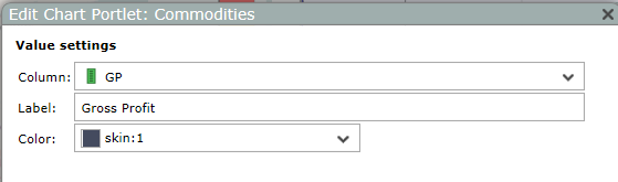
Figure 6: Example value settings
In the axes settings, you can modify the default settings. Let’s enter a scale format for the horizontal axis. The gross profit and sales are in dollar amounts, so we enter a scale format of $,#0 so that the values display with dollar signs. See Figure 7.
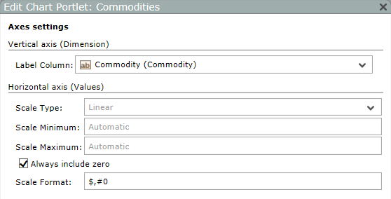
Figure 7: Example axes settings
In the legend settings, you can choose to display or hide the legend. If you choose to display the legend, you can specify the location and the width. See Figure 8.
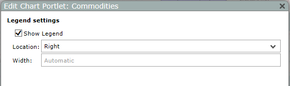
Figure 8: Example legend settings
In the display settings, you can add a title and modify the fonts. Also, there are sort settings to sort ascending or descending. You can apply dive filters to select the number of items to display and whether to hide null values, all without modifying the underlying source file or manually creating a new dive. Options like these are useful to display, for example, the top or bottom number of values for the dimension, such as for sales. See Figure 9.
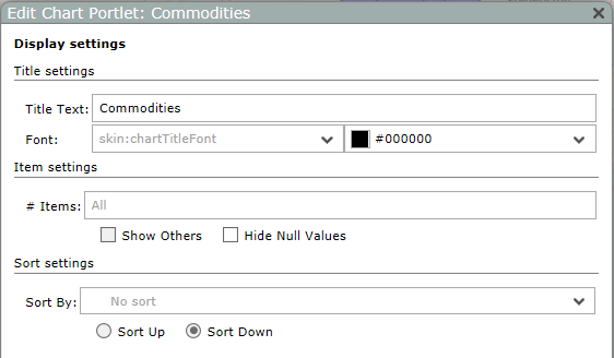
Figure 9: Example display settings
Here is the completed stacked bar chart. See Figure 10.
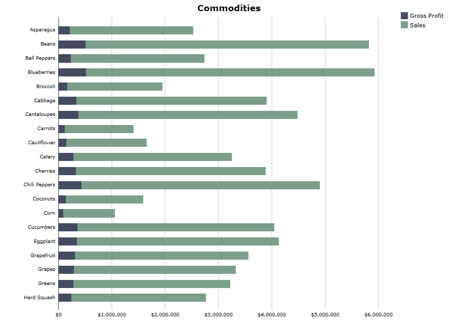
Figure 10: Example stacked bar chart
As mentioned before, the options that are available in the dialogs vary depending on the chart type, but the layout is consistent not only across the various chart types but in other portlets which have the new design.
Visualizations: future
With D3 as the underlying JavaScript library, there are exciting new visualizations that can be developed. The Dimensional Insight development team is working to incorporate some of into the chart portlet these while keeping the current ease of use. It takes extra attention to where and how options are located and presented in the setup dialog, as it’s key to keep the chart portlet as easy and intuitive to use regardless of how many features are added. The development team is even researching ways to make the chart portlet more interactive and possibly animated.
Short term
In the short-term, the development team is porting additional features from ProDiver’s Graphs. Support for multitab and crossplot are planned along with more chart types. Look for a new chart type, Waterfall (see Figure 11), and the ability to have a chart with dual axes (see Figure 12) in an upcoming release.
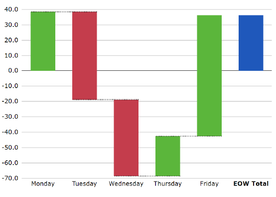
Figure 11: Waterfall chart
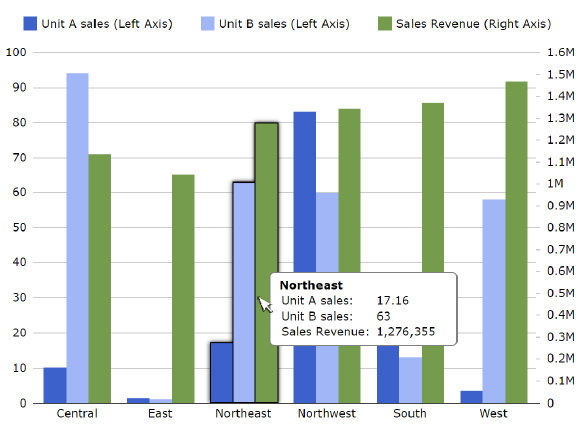
Figure 12: Column chart with dual axes
Long term
For the long term, the Dimensional Insight development team is working to create tools to make more interactive and compelling visualizations. These tools may include features for animation, geographic visualizations, and visualizations that you can dive around in.
Related posts

- How to Access Dimensional Insight Online Help - May 3, 2018
- Learn about Chart Portlet and the Future of Dimensional Insight Visualizations - September 13, 2017
- How to Use Map Portlet to Visualize Geographic Data - August 10, 2017