 Take any population – any group of people. Let’s say you have a group of healthcare professionals in one room. They have in common their area of work. But if you were to ask that group of people what “population” they belong to, you might get a variety of different answers. Red Sox fans, for instance – or Cubs fans. Or something else entirely, such as gender, age, residency, political leanings, etc.
Tweet: What to Consider as You’re Starting to Measure Population Health
That’s the thing with populations. There are myriad ways to define them. Sometimes they are easy to define, but most times they are not. There is a lot of overlap in populations, especially when it comes to the healthcare environment. In this blog post, we’ll talk about some of the biggest challenges when it comes to dealing with populations within the healthcare environment – what’s known as population health management. We’ll also look at some examples of how you can use population health information and apply it to solve real-life problems.
Defining a population
The inherent nature of populations from a health perspective is that 15-to-20% of the population tends to represent 80% or more of the cost of providing healthcare. Effectively measuring population health requires not only understanding which individuals already require treatment, but also identifying those who are most likely to need it in the future.
The first step in measuring the health of a population is to define who is in that population. Seems straightforward, right? Unfortunately, more often than not, it’s anything but. The overlap in populations means that the same person can end up in many of them. So segmenting needs to be done carefully and with an appreciation of the impact for lots of “double-counting”. You won’t necessarily get this right the first time around, but you can revisit your approach at pretty much any time. The more specific the definition of a population segment, the more helpful it will be for data analysis. By nature, this is an iterative process. As your analysis helps you understand the patterns in the data – from identifying hotspots to targeting intervention strategies and assessing their impacts – you can continually go back and refine your definition to make it more precise.
Understanding how you will measure
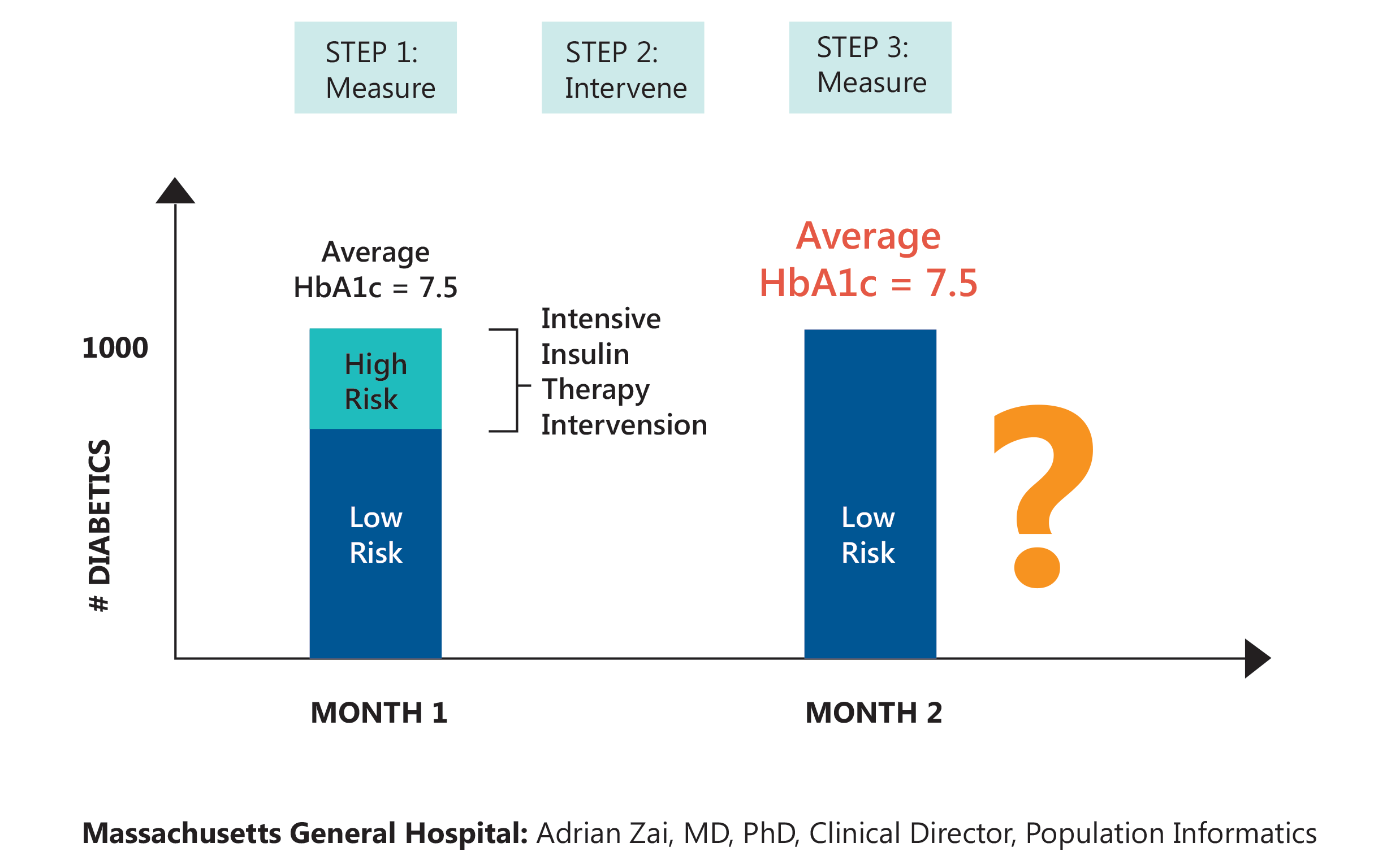
One of the things we try to do in actively managing populations is to take population subsets such as the diabetic population and pinpoint where the opportunities to intervene lie. Figure 1 (below) shows an example of this (from Massachusetts General Hospital’s population informatics initiative): On the left, we have a population of diabetic patients comprised of both low-risk and high-risk individuals. The goal is to move as many of the high-risk patients into the low risk category as possible (and the lower risk individuals out of the population completely as well.)
One way to do this is through intensive insulin therapy intervention. Then we measure if we’ve been successful. Assume we achieve our goal, as indicated by the chart on the right. But the average of the measure we use to diagnose diabetes – the hemoglobin A1c test – is the same for both the before and after states. How can that be? Well, without getting into a detailed discussion of statistics, it has to do with the random variation inherent in populations. But these are clearly two different situations: one better than the other. The point is, we need to be careful both in how we measure and how we analyze and interpret the results since there’s almost always more to the picture than is initially apparent. Understanding impact, good or bad requires some real data detective work!

Figure 1
Accessing and connecting the data
Perhaps the biggest challenge with population health is accessing the necessary data. There are constraints on many potentially useful data elements that prevent you from accessing it. For example, privacy protections and limited access to payer claims data. Even when you can get to the data, the next problem is connecting it with a specific individual. That’s a particularly vexing challenge in the United States because we don’t (yet) have a universal patient identifier. Much of the rest of the world has figured out that this is probably a good idea – and in many cases the superior state of their population health reflects it. As health information exchanges mature and payers, such as Medicare, provide more access to claims data, the data available for constructing population data sets will expand, improving opportunities to measure the health of populations.
Time
Time is another challenging factor you need to consider when modelling population health data. Populations are dynamic over time: People are born and die, they move around, and in some cases, they “disappear” from the data completely for unknown reasons. And people age – one year at a time. This is, again, where setting specific definitions is important. When measuring the population of two-year-olds, to assess vaccination rates for example: what makes someone a two-year-old? That changes every day! Setting a specific beginning and ending period for your measurement is just one of the many challenges of dealing with time.
A real-world example
If this seems complicated, there is some good news: you don’t need to take on all the challenges at once. There are opportunities to create basic, but useful data sets using the information you have access to today. That at least provides a baseline for your populations. It also provides some good perspective on what additional information would be useful and gives you a chance to establish competencies around dealing with population data.
Here’s an example of how to pull together some useful information to better understand a real-world problem. In Ohio, Anthem, one of the largest health insurers (payers) in the country, has announced plans to pull out of 20 Ohio counties — and is also weighing whether to withdraw from parts of Missouri as well. Can you predict the impact this will have based on available information and trends over time?
We modeled this population using information from the County Health Rankings Project (conducted by the University of Wisconsin and the Robert Wood Johnson Foundation). It shows the demographic, socio-economic, environmental and health state information of populations county by county since 2010 to provide a basis for comparing them in a variety of different ways. This information could be supplemented with other publicly available data sets, such as the Dartmouth Health Atlas, as well as information the health systems and payers collect on individuals in the process of providing care. Even with this single, summarized data set, it’s clear to see why these counties may be unattractive to Anthem – and pose a challenge to care for the individuals in this population.
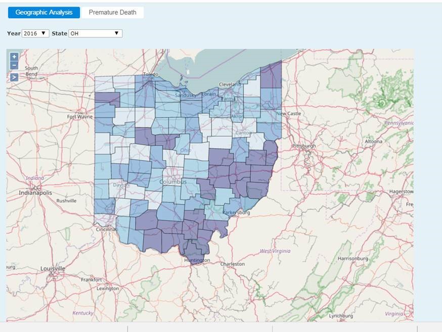
But how do we make this information immediately actionable? One measure in the Country Health Rankings data focuses on preventable hospital stays, which is based on information collected by public health agencies. The high-level data points toward a problem. Counties in the worst quartile for this measure have more hospital admissions than are good for either patients – or possibly even hospitals themselves. (These counties show up darker in Figure 2, below.) The information available in the electronic health records systems of these hospitals will provide a pretty good idea of exactly who these individuals are setting up opportunities to determine how unnecessary admissions could be prevented in the future.

Figure 2
So where should you start?
Chances are pretty good that, without making additional investments beyond tools you already have, you can use readily available information to build an initial foundation for population analytics. With that foundation in place, you can begin your journey toward better understanding your populations and developing strategies to improve their health – all while continuously growing your population analytics competencies. Bon voyage!
Ready for a test drive of our healthcare analytics software?
- Practical Analysis: The Next Chapter - May 21, 2020
- Exploratory Data Analysis Part 2: Helping You Make Better Decisions - October 11, 2019
- Practical Analysis: Understanding Visualization Concepts - September 19, 2019


