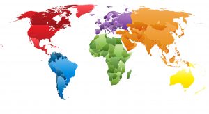
 Everyone knows the old adage, “A picture is worth 1,000 words.” How true this is, too, for data represented geographically! Maps provide an intuitive way to compare data across various regions turning tabular data into easily interpreted visual information.
Available in Dimensional Insight’s Diver Platform 7.0.26 and later, the map portlet is redesigned with a configuration wizard, graphical user interface, and significant new functionality to make it easy to integrate geographically represented data on your dashboards.
Mapping visuals have limitless uses and benefits. Do you have patient and encounter-related healthcare measurements you want to analyze spatially? Would a geographical representation of the distance between patients being treated for particular conditions help with providing care or analyzing disease incidence? In a sales environment, think of the benefits of a geographical view of sales in one territory versus another. Dimensional Insight’s map portlet can display your geographically coded data for any of these applications, and now it’s easier than ever.
New features
First, here are some of the exciting features supported with the new map portlet:
- Map portlet configuration wizard
- Step-through GUI wizard with common default values provides simple and consistent configuration for all map types
- Edit map portlet dialog box to adjust default configuration values for custom look and feel
- Map layer support
- Updated version of the OpenLayers 3 map library
- Default base layer map of Open Street Map (OSM)
- Optionally various Thunderforest and Stamen base layer maps
- Four map layer types: boundary, point, heat, and web map service
- Maps with more than one layer
- Multiple markers in the same map portlet
- Controls for the render order of map layers from the edit map portlet dialog
- Map controls
- QuickViews with maps
- Zoom in, zoom out, and pan functions
- Zoomable heat maps without pixilation
- Restrict zoom levels and layer visibility by zoom level
- Visibility control for users to hide or display each data layer
- Map legend enhancements
- New format for map legends
- Labels for boundaries are mapped and provide the values being rendered in the map
- Alternate region labels display in the hover information of boundary maps
- Highlight when hovered over boundary map areas
- Point map enhancements
- Custom icons available as points in point maps in addition to circles, squares, and triangles
- Ability to vary point size and opacity based on summary values in point maps
- Clustering of points in point maps to show multiple points as one larger, numbered, point
Now let’s see how those new features translate into the mapping experience. The map portlet wizard guides you through the initial setup selections of base layer, layer type, data source, location, geometric source, location key, and value for all map types. You can tweak the results with the edit map portlet dialog to fine tune the parameters.
Map base layers
There are a variety of base layers available in the new map portlet, so you can give the portlet the look and feel you want. Here are the supported base layers. The open street map layer is the default.
- Open street map layer
- Thunderforest base layer options: Mobile Atlas, Neighborhood, Open Cycle Map, Outdoors, and Transport
- Stamen base layer options: Toner and Toner Lite
Note: No longer available are Google Maps, Mapnik, Cycles, or MapQuest
Imagine the different overall look the map portlet has with the Thunderforest Outdoors base layer versus the Stamen Toner.


Map layer types
On top of the base layer, you can use different map layer types. Let’s look at each of these in more detail and see how the map portlet uses a simple and consistent configuration for all types.
The map portlet supports four different map layer types:
- Boundary
- Point
- Heat
- Web map service
Boundary maps
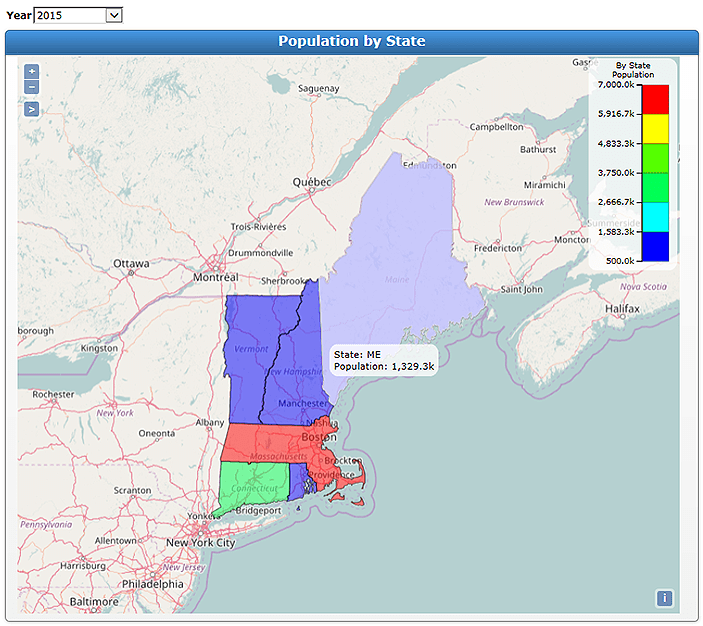
Boundary maps display color-coded areas that locate predefined regions, such as state or county, on the map. They work well with county, state, and zip code data. For example, the data summarized over a region might be population or sales.
- Different scales available in the legends in the upper right corner
- Ability to zoom in and out and pan
- Labels for the boundaries are mapped and hover information provides the values being rendered in the map
- QuickViews are workable with maps
In this example boundary map of population by state, a QuickView determines that the map display the 2015 population. At the time of the screen shot, the cursor hovered over Maine, so the state of Maine is highlighted and the popup label shows the population value of 1,329.3k (1,329,000) that is rendered in the map.
Point maps
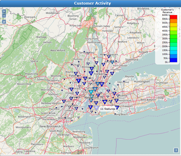
Point maps display colored points or custom images on the map that locate latitude-longitude points. They work well where a directive or location has been encoded as longitude and latitude and can show an individual entity such as account or location. There are more options to adjust in point maps than boundary maps, for instance color, size, opacity, shapes, and so on.
In this example point map of customer activity in the New York area, we’ve enabled the option to cluster the points. This means that where there is a large density of points, instead of showing many points on the map, one larger point is displayed. The popup information shows how many points are consolidated into that one point.
Heat maps
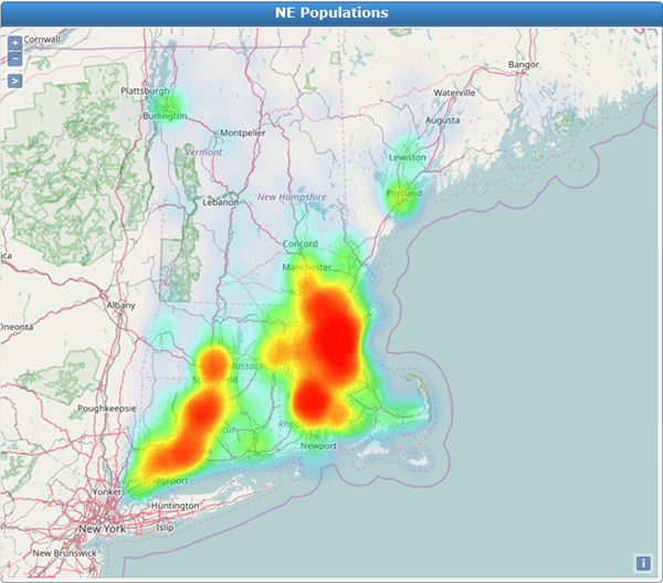
Heat maps display densely or loosely colored areas on the map that locate the density of points in an area. They display the same data as point maps and can show the density. For example, heat maps allow you to quickly see what part of the state your patients are coming from.
Heat is a representation of the concentration of longitude-latitude points. When you set a value like population for a heat map, that value influences how much weight a point has in the map. If there are very few points with high values, most of the points would be very light and not contribute much to the coloring of the heat map. Lowering the feeling of the weight scale, you can allow more points to be heavy and thus add more color to your heat map.
With heat maps, scale influences the appearance of a map in a more extreme manner than in a point map. The radius and blur configuration options for heat maps are not as straightforward as for point maps. Therefore, your first few attempts at creating heat maps might take a bit of trial and error.
In this example heat map of population, note the controls in the upper left that are available in all maps.
Web map service layers
Web map service layers are data sets from map services on the Internet that serve GIS data layers of geo-referenced maps. They are advanced layers, but they can be useful if you know of an available web map service that provides data you want to use in your map.
To use a web map service, you enter the URL of that web map service and terminate the URL with a question mark. The map portlet queries the service and provides a list of the available layers.
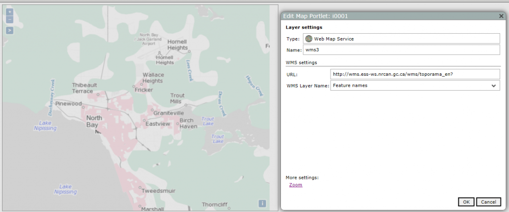
For example, Natural Resources Canada has a web map service with many available data layers. The URL that you would use in the map portlet wizard is: http://wms.ess-ws.nrcan.gc.ca/wms/toporama_en?
The following map, shown in edit mode, has three layers from Natural Resources Canada on a base Stamen Toner Lite base layer. The web map service layers show built-up areas in red, vegetation in green, and feature names.
Multi-layer maps
When you display maps in your portlets, different layers come into play. Since the objective is to display the data on the map, usually the last layer drawn is your geocoded layer. Therefore, when creating the map, the final guide must include the geographic dimensions to the map. Geographic dimensions can include:
- County, in the format of a string: county, comma, no space, state
- County zip code, which is a concatenation of the state zip code and the county code
- State, as long name or the abbreviation
- Zip code, the 5-digit zip code
- Longitude, latitude values can be mapped when provided in the format: longitude, space, latitude
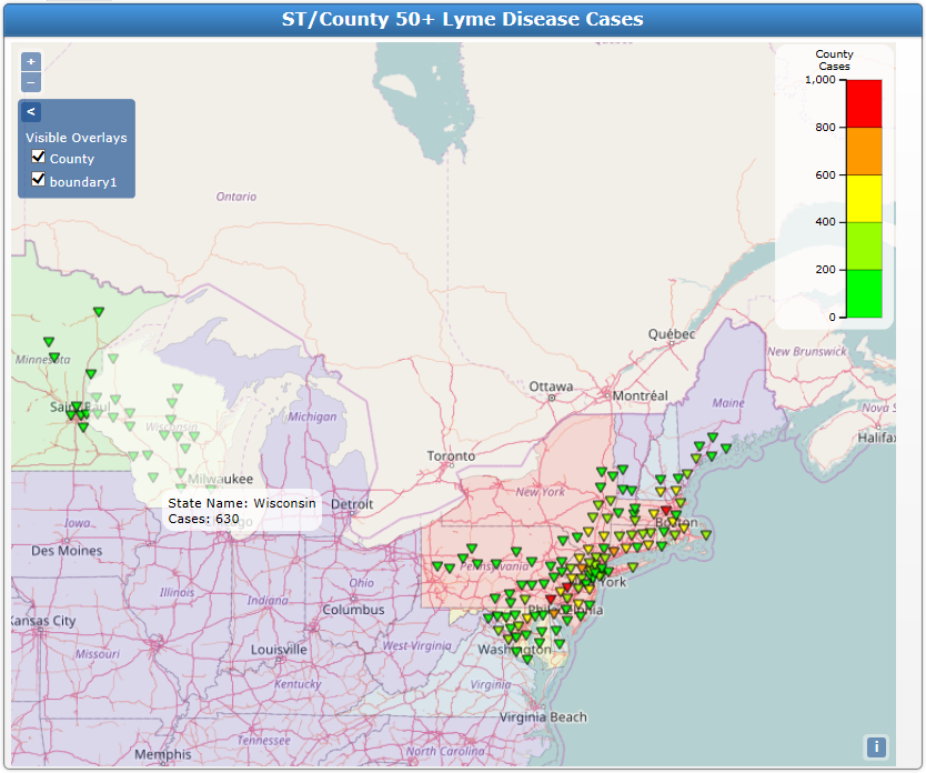
The following example map portlet shows support for multiple markers as different layers in the same map. The point map shows the incidence of Lyme disease as case per county, and it displays over a state boundary map. As with the boundary map shown previously, the hover information shows the boundary name and the rendered value; in this example, there are 630 cases of Lyme disease in the state of Wisconsin.
When viewing maps with multiple layers, you might want to isolate a layer to display it independently. The map controls in the upper left allow users to select which layer or layers to display.
More settings: Position and Extent
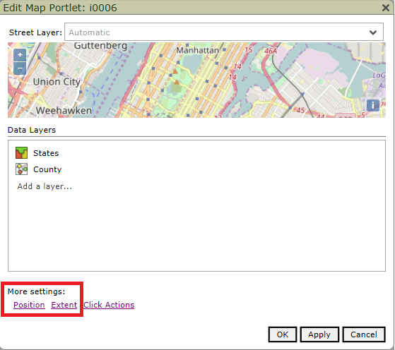
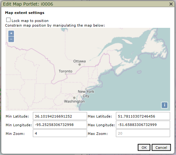
The map portlet has additional settings you can configure. These settings are configured at the portlet level rather than within a data layer. For example, this screenshot shows the map portlet edit dialog box with links to configure the position and extent properties.
Position
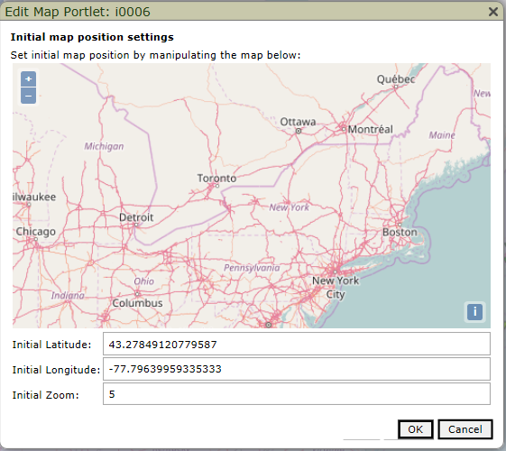
The position properties set the initial position of your map so it always opens centered on the same point and at the same zoom level. The latitude, longitude, and zoom properties are automatically calculated as you zoom in or out so you don’t have to know these values to set as the initial location.
Extent
The extent properties have several functions. You can prevent any zooming and panning of the map by locking the map in a specific location and zoom level position. With this selection, the zoom actions are removed from the map portlet.
A less restrictive constraint limits how far or how close users can zoom and how much they can pan the map. The minimum and maximum properties are set, as with the position properties, by zooming in and panning the map to automatically calculate the latitude, longitude, and zoom level. The best practice is to choose a center and an initial zoom on the position page before setting an extent constraint. Then, choose the extent settings that make sense given the position.
Planning
When planning to use maps, consider which map type would be best to visualize your data. Is it sales region? Density of congestive heart failure patients in a state? Customer volume or patient count? Boundary maps utilize the data type of county or state or zip code, while point and heat maps render latitude and longitude values. So, what does this mean for your design of your cBases or models? What data will you transform into those color-coded visual representatives that make it easy to spot trends?
It’s important to understand your data and to create the Diver marker file that fulfills the data source prerequisites of the map portlet. The data sets must include geo-coded information on entire populations, not just counters. As you develop this type of data, geographic analysis becomes increasingly useful and illuminating.
- How to Access Dimensional Insight Online Help - May 3, 2018
- Learn about Chart Portlet and the Future of Dimensional Insight Visualizations - September 13, 2017
- How to Use Map Portlet to Visualize Geographic Data - August 10, 2017


