In January, I conducted our company’s bi-monthly customer webinar and talked about some best practices for dashboard design. I also presented a new user interface design that our designer John Hu had recently created. The dashboards and reports he created are wonderful! This design is now being used in the 7.0 version of our healthcare and manufacturing applications, and the look really gives a fresh appeal to Dimensional Insight products.
At the end of the webinar, one of the attendees asked me if I could help her get the same look and feel on her dashboards. In this article, I do just that – outline the steps to get the look and feel of this user interface.
Step 1: Determine the right elements
Here is a look at the user interface that I’d like to gain inspiration from:
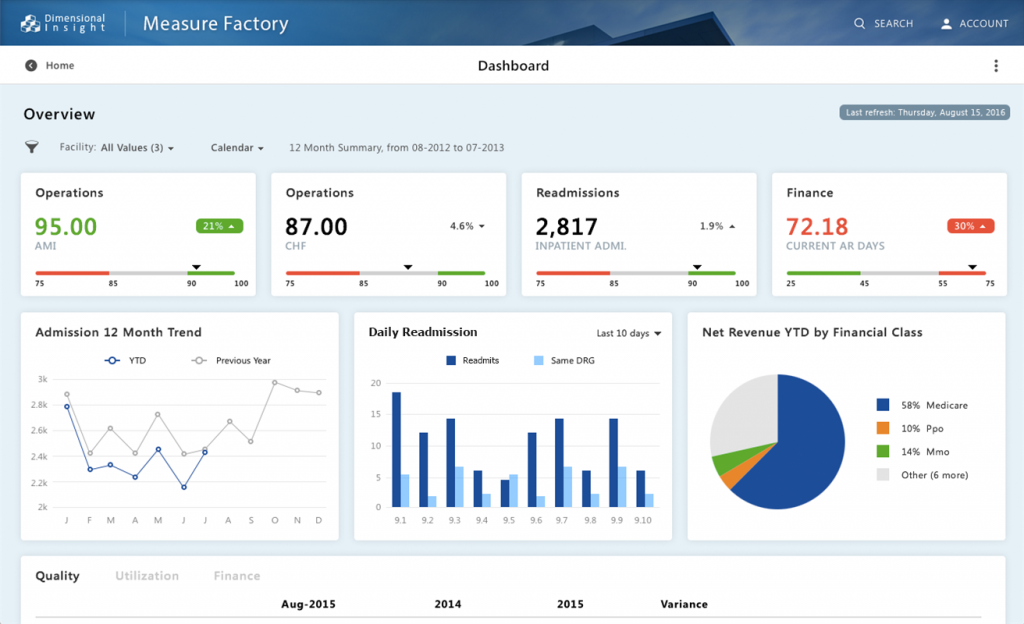
Normally, when I take inspiration from a certain look for a dashboard that I’ve seen, I take a screen capture of something I like and use it as a background image in DivePort. (It’s easy to do this using one of DivePort’s portlets.) Because the image of the desired look is stationary in the background, I can “float” additional portlets over the image, using trial and error to mimic the desired fonts, shapes, and colors. However, in this case, the look and feel I am trying to achieve was designed right here in our corporate office! So, with access to the files used to create this look, I can easily uncover the specifics of the desired fonts, shapes, and colors without the time-consuming process of trial and error.
The look and feel of a dashboard are determined by the cumulative effect of the elements used to build the dashboard. Here is a list of physical elements so that we can plan how to change our own dashboards:
- Background color
- Portlet background images
- Font style
- Portlet colors
Step 2: Apply the skin and background images
The main thing to do to get John’s dashboard design look and feel is to apply the “Skyline” skin. This skin file comes with version 7.0 of Diver. You will notice that once you apply this skin, the background color of your dashboard turns light blue.
If you are not familiar with skin files or how to change to a different skin file, you can find instructions on how to use them in the DivePort Administrator Manual under the section, “Customizing the Look and Feel” on pages 2-38.
Light blue is pretty – yet without the white boxes (the second physical element to mimic) used in John’s design behind each portlet, the color will obscure the readability of text and numbers in the portlet. The white boxes in John’s design were custom-created individually to the size he wanted behind each portlet. You can do the same by creating white box image files with a drawing program like Adobe Photoshop or Gimp and then using a portlet to place each image behind each chart or table.
You will notice that all of John’s white boxes have an ample margin of 15 to 20 pixels. Make sure your white boxes are also 15 to 20 pixels larger than the portlet information on all 4 sides of the rectangle.
Step 3: Find the right font
The third physical element to mimic is the font style. The font styles used are:
- Page Title – 24 pt Tahoma Bold
- Portlet Title – 16 pt Tahoma Bold
- Chart Labels – Tahoma Regular
Follow the size weight and color of each of the font styles to mimic John’s look and feel.
Step 4: Update portlet colors
The last physical element we are mimicking is the portlet colors (the colors used in pie charts and bar charts). These colors are included in the skin file. So, when you changed the skin file to “Skyline” you updated all the portlet chart colors too.
John’s dashboard has many special effects like subtle drop shadows that appear on rollovers. These nuances are part of a lengthy CSS file and are beyond the scope of this article. However, by now, your dashboard will have the same look and feel as John’s.
Are there any dashboard design challenges you would like me to tackle in future articles? Feel free to email me at [email protected].

- Meet the Dimensional Insight Team: Gabrielle Amarosa - December 1, 2022
- What You Need to Know About President Biden’s Marijuana Pardon - November 2, 2022
- How to Ace this Year’s OND - September 27, 2022