Figure 1: Take a screen capture of the home page to extrapolate colors.
Are you interested in “dressing up” your dashboard interface? One easy way to do so is to leverage the existing corporate look and feel of your own company. When you use your “Corporate Identity Standards,” you visually communicate to your users that the dashboard tool is important to the company, which can accelerate user adoption.
Your company’s graphic designer has probably already properly balanced the colors, fonts and graphics to create your existing corporate identity standards, so you won’t have to struggle with getting these things right. Let’s take a look at how to leverage them in a fast and easy way to make your dashboards look good.
Identify the 4 core components to corporate identity standards
The first step is to “lift” key components of your corporate identity standards. If your company has a graphic designer, ask him or her for your company’s corporate identity standards manual, which lists all the components of your company’s system. If no such manual exists, don’t worry, you can easily extrapolate some de facto graphic standards from your company website.
There are 4 components you should look for – imagery, company logo, colors and fonts. Your company’s web site probably contains these components. Here’s how to capture them:
1. Imagery: Visit the website and borrow graphics from the home page as well as other pages that have representative color schemes, photos or illustrations (note: confirm with the webmaster that imagery is appropriately licensed). Here are a couple of easy techniques for doing that:
- You can download most web page graphics simply by right clicking the image and selecting “save image as.”
- You can take a screen capture. Windows 7 ships with a handy screen capture utility called “Snipping Tool.” Or you can take a screen capture by clicking SHIFT-PRTSC (this copies the entire screen as an image into your clipboard, which you can then paste into a graphics program).
Once you have several images and screen captures to work
from, open them in your pixel-editing graphics program. Paint (a utility that ships with Windows), Gimp (a free download), or Adobe Photoshop (not free, but with awesome capabilities) are all suitable options (among many others). Crop so you just have the part of the image that you intend to use. You can use a single image, or multiple images pieced together, to create a decorative border on a single side or several sides of a dashboard interface (top, right and left sides, or bottom). Make sure this decorative image is large enough to add visual interest, yet not so large so as to detract from charts and graphs on the dashboard page.
2. Logo: Make sure at least one of your screen captures includes your company’s logo. Use your pixel-editing program to copy and crop it (note that your graphic identity standards might have “white space” rules about cropping it too aggressively).
3. Colors: Use the eye dropper tool in your graphics program to understand the RGB color values of the dominant colors of your logo and web graphics. You can also download freeware eyedropper tools (there’s a handy one called ColorPic). Record the RGB values so you can reuse them in type, shapes and lines on your dashboard. You can even use these colors in your dashboard’s pie charts, bar charts and line graphs.
4. Fonts: Ask your company’s webmaster for the names of fonts and styles used on your company’s website. To ascertain them on your own, locate them on the page source of any page on your company’s website (the page source of any web page can be accessed from the “tools” menu of most browsers). You may have to find the CSS file to do this.
Tie the components together for your dashboard
Now that you have the 4 core components, you can begin to experiment with using different combinations of the elements in your dashboards. I’ve included screen shots of a sample dashboard to show how this idea works.
Let’s say I’m creating a dashboard for Game of Thrones. I don’t have access to HBO’s graphic designer, so I’m going to try and extrapolate what the Game of Thrones corporate identity system might be composed of. The first thing I do is go to the website: www.hbo.com/game-of-thrones/index.html. Wow, this is a very edgy design! I take a screen capture of this home page. (See Figure 1.)
I can see that the font is a sans-serif font, but I’d like to match it as closely as possible, so I decide to view the page source. (See Figure 2.)
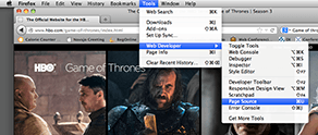
Figure 2: View Page Source to access font information.
I quickly locate the name of the CSS file. (See Figure 3.)
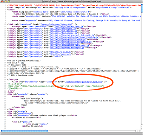
Figure 3: Locate the name and location of the cascading style sheet.
I open the CSS file, search for “font” and highlight all occurrences of it on the page. (See Figure 4.)
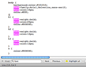
Figure 4: The dominant font is most likely the font used by ‘body’.
By locating “font-family” under “body” I can see that the dominant font used on the page is “Arial, Helvetica, sans-serif.” This confirms my educated guess that the font is a sans-serif font and provides me with two alternative fonts to use on my dashboard. Personally, I like the sophistication of Helvetica.
OK, so I have my font and some source imagery for colors. But there’s not a lot of color variety on the home page that I captured. So I explore the site to see if there’s more interesting imagery. The Viewer’s Guide has some handsome images. (See Figure 5.)
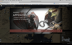
Figure 5: Visitor’s Guide page of the web site.
I take a screen capture of that page too. Next, I open both screen captures in Photoshop and use the Eye Dropper tool to isolate colors used on this site. (See Figure 6.)
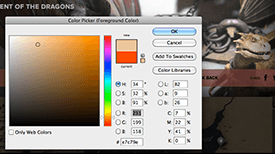
Figure 6: Use an eye dropper tool to select colors on the web page and record their RGB values.
I take note of the color RGB values that I’ve found:
Tan = 231, 199, 158
Black = 51, 49, 37
Gray = 164, 170, 168
Olive Green = 189, 187, 102
Burgundy = 86, 46, 44
I may not use all these colors, but at least I have the information to use if needed.
I love the map on the Viewer’s Guide page and decide to crop it to use as a page accent. (See Figure 7.)
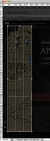
Figure 7: Cropping out a piece of corporate imagery provides me with material for a decorative border.
It’s a little dark so I use Photoshop “Levels” to lighten the midtones. (See figure 8.)
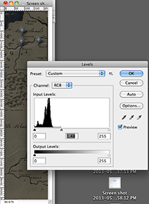
Figure 8: Lighten the mid-tones by dragging the middle triangle to the left.
Then I save it as a .png file.
The only thing missing is the Game of Thrones logo. I actually had a hard time finding it on the website so I took a copy of the one I found on Wikipedia. (See Figure 9.)
Figure 9: The Game of Thrones logo.
Now I can combine these elements on my dashboard to create something that looks like a Game of Thrones dashboard. (See Figure 10.)
Figure 10: One possible way to design a dashboard for the Game of Thrones series on HBO.
This dashboard looks great! The changes to the look and feel are subtle enough to avoid competition with the indicators, and yet there are enough visual clues to indicate that this is definitely a Game of Thrones dashboard.
If you’re looking for more tips on dashboard design, you can read more blog articles about dashboard design on the Dimensional Insight Blog.

- Meet the Dimensional Insight Team: Gabrielle Amarosa - December 1, 2022
- What You Need to Know About President Biden’s Marijuana Pardon - November 2, 2022
- How to Ace this Year’s OND - September 27, 2022