 In the past, I’ve focused on visual design tips in my Dashboard Design column. However, response from our recent customer webinar on dashboard design was mixed. Half of the audience said they would use the visual design information. The other half was more interested in a different kind of design. NOT visual design, but DATA design. So, for this month’s article on Dashboard Design, I am focusing on data design.
The practice of dashboard design draws on a practitioner’s knowledge and expertise in different domains: data design and visual design. It is a rare individual who has advanced skill levels in both domains. And, the field of dashboard design itself is constantly in flux. So, for the dashboard designer to seek continuous improvement is not only desirable – but it is necessary. How can you improve your own dashboard design skills? Let’s examine 3 ways.
1. Read an article
“3 ways data dashboards can mislead you”
![]()
This article was published last month in Harvard Business Review. Harvard Business Publishing’s mission is to “improve the practice of management in a changing world.” And Harvard Business Review purports to be “the leading destination for smart management thinking”. I’ve always loved Harvard Business Review because its scholarly articles offer great insight at a level not found in run-of-the-mill business publications.
The author of the article is Joel Shapiro. As the executive director of the data analytics program at Northwestern’s Kellogg School of Management, Mr. Shapiro is well-qualified to comment on the subject of dashboards.
The overall message is to be wary of dashboards because they “are poor at providing the nuance and context that effective data-driven decision making demands.” And the author supports this claim with the 3 drawbacks, which he calls:
- The importance trap
- The context trap
- The causality trap
The article serves as a warning to be careful about the treatments you do use. The article should make you really think about what you choose to display, why it is displayed, and how you are displaying it.
2. Download a tip sheet
“Download the Top 25 Best Dashboard Design Tips Sheet PDF”
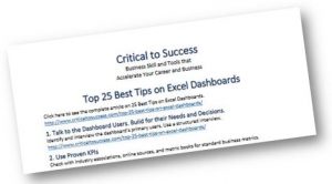
This tip sheet is useful. It walks the practitioner through basic steps and offers advice along the way. The tips are intended for users of Excel, but broad enough that they could be used with any type of data analytics solution or tool. For instance, the first tip is the same one I always adhere to for visual design: “Talk to the Dashboard Users. Build for their Needs and Decisions.” Here is just a smattering of some of the other tips which, by the way, are just a sentence or two and sometimes include links to supporting information from other sources like Wikipedia or Microsoft. (Sometimes there are no links to supporting information.)
Tip number 3:
- Map the Metrics that Drive Your Custom KPIs
Use Post-It notes to map your processes, then identify the KPI and back track to find driver metrics.
https://en.wikipedia.org/wiki/Flowchart
Tip Number 17:
- Show Trends when Analyzing Growth
Show trends by smoothing erratic data and showing the overall direction of movement.
http://www.criticaltosuccess.com/using-excels-trend-function-create-trend-lines-excel-charts-dashboards/
You’ll notice that this tip refers to two other articles on the same blog, and the articles are referring to Excel for the solution. I believe the tip is a good one for any dashboard designer. And, it can be achieved using Diver Platform or many other business intelligence solutions, for that matter.
Tips 20 to 25 have no supporting information which is a shame. Why should the reader trust that he should be wary of using pie charts as tip number 20 suggests? However, though these finals tips lack supporting evidence or information justifying the use of the tips, I agree with the tips! So you may want to check them out.
3. Sign up for a class
Data Visualization Course on Coursera
Data Visualization is the first of 6 courses in the Data Mining Specialization, “Analyze Text, Discover Patterns, Visualize Data – Solve Real-World Data Mining Challenges.” offered by the University of Illinois at Urbana-Champaign on Coursera. If you decide to audit the course, the course is free. However, you can also take the course with the intention of receiving certification. In this case, there is a fee to participate and receive a certificate upon completion of the course.
Coursera is a wonderful online “school”. You can usually find a free course covering any topic you like. And for people who need certification, there are plenty of options available.
This course is taught by John C. Hart, a professor of Computer Science at the University of Illinois at Urbana-Champaign.
The course includes 4 weeks of classes:
- The Computer and the Human
- Visualization of Numerical Data
- Visualization of Non-Numerical Data
- The Visualization Dashboard
The course schedule is flexible and the work is self-paced.
Please let me know if you find a use for these kinds of tips so I can direct my future posts to cover the most beneficial information. You can always reach me at [email protected]. Note: the more responses I get requesting more information result in more articles about the requested topic. Yes Paul, that article on DivePort is in the works!

- Meet the Dimensional Insight Team: Gabrielle Amarosa - December 1, 2022
- What You Need to Know About President Biden’s Marijuana Pardon - November 2, 2022
- How to Ace this Year’s OND - September 27, 2022