 In the past, I’ve written articles about dashboard design at a conceptual level, dispensing advice about how much white space to use or sharing thoughts about whether to use images. Today, I want to share something more concrete: step-by-step instructions to set up a dashboard so that you save time on design. This will become a sort of Dashboard Design Look Book once we create several different dashboards.
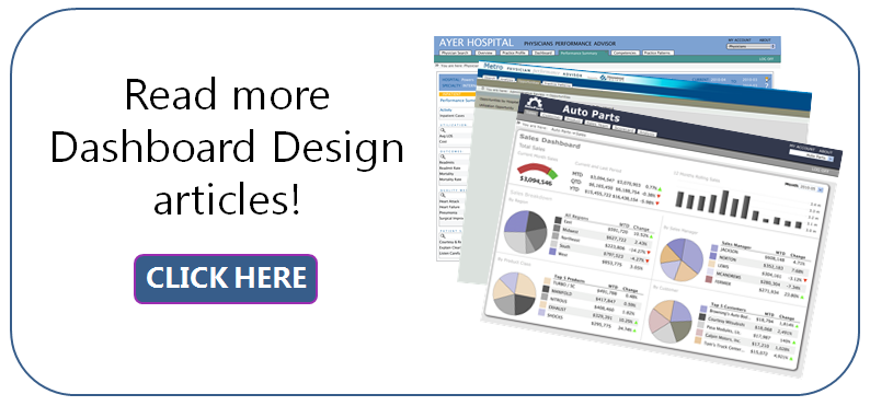
Here’s what I did: I selected some interesting-looking dashboard designs from our company’s archives and then I reverse engineered them. Now, with the instructions I’m supplying, you should be able to create the same look and feel in your own interface – whether it be DivePort or another tool. I’ll do a different look and feel each month so you will have a variety of dashboards to build easily!
Here is the look and feel that I’m delivering this month (Figure 1).
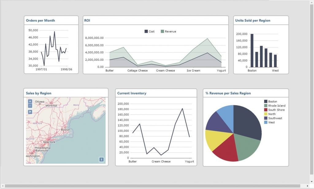
Figure 1
Step 1: Determine the dashboard screen size
To start, I wanted to create a dashboard screen size that could easily be displayed in its entirety on a tablet computer. In my article “How to Determine the Ideal Screen Dimensions for Dashboards”, I discussed how to determine the best resolution to accommodate most, if not all, of your users. But today, I’m thinking of the future. Many people are moving to tablets because they are so handy. So, I wondered: “What size screen will look best on most tablet computers?”
I looked at this nifty site to get an idea of what would work: https://www.productchart.com/tablets/
Check it out. By using the sliders on the left-hand side of the page you can change variables and determine which tablet computers can accommodate the requirements indicated. In the case of this exercise, I wasn’t sure about best pixel size. The interface defaulted to 480 x 272 (Figure 2) – small compared to what I had imagined. I had thought 1024 x 768 would be fine to capture the lion share of tablet screens that exist.
Just for giggles, I used the Pixel slider to go to the largest pixel dimensions available: 2732 x 2048 (Figure 3). Just as I suspected, there are very few tablet computers that can accommodate a dashboard that extends to this size. So, I slid the slider back to 1024 x 768 (Figure 4). Not bad! I didn’t count the number … but a visual assessment told me that this was going to accommodate most tablets people own.
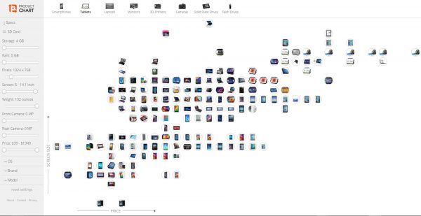
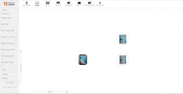
Figure 3
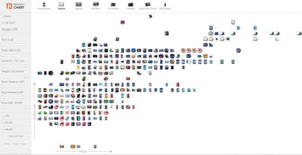
Figure 4
Step 2 – Use a “Manual” layout.
In DivePort, I made sure my page was based on a “Manual” layout.
Step 3 – Add the background rectangle
I added a “Background” portlet at the desired size and made it a rectangle. Here are the rectangle specifications that I customized:
Portlet Instance Settings
Position: 0 0
Size: 1280 768
Edit Background Portlet
Rectangle Color: transparent
Thickness: 0
Fill Color: 226,226,226
Step 4 – Add the white boxes
Next, I added the white boxes that would serve as boundaries for each chart. Again, for each of the six boxes, I added a “Background” portlet at the desired size and made it a rectangle. Here are the rectangle specifications that I customized for each of the six boxes:
Portlet Instance Settings
Size and Position were determined by dragging and dropping into position.
Edit Background Portlet
Rectangle Color: 183,183,183
Thickness: 2
Fill Color: 255,255,255
Corner Radius: 6
Step 5 – Add the chart titles
Although each chart does have a Title Display capability, I wanted to use a different font for my titles than what is available in those interfaces. So, I used the HTML portlet to create the titles of each chart. I knew the font I wanted was our company’s corporate font and that employees *should* have it on their machines, but just in case, I used a font-family specification that would cover several suitable alternatives.
Here is the HTML code that I used:
<span style=”font-family:segoe ui,helvetica,arial,san serif; font-size:14px; color:#416786;”><strong>Units Sold per Region </strong></span>
Step 6 – Add the separating rule
The next step was to add the gray horizontal line that sits below each chart title. I added a “Background” portlet at the desired size and made it a line. I used these line specification customizations:
Edit Background Portlet
Line Color: 183,183,183
Orientation: Horizontal
Thickness: 2
Step 7 – Determine color palette
For this dashboard look and feel, the colors come from “Skin 1”.
Voila! This look and feel is complete.
If you see a dashboard look and feel that you would like me to use in this dashboard design look book series, please send it to me at: [email protected].

- Meet the Dimensional Insight Team: Gabrielle Amarosa - December 1, 2022
- What You Need to Know About President Biden’s Marijuana Pardon - November 2, 2022
- How to Ace this Year’s OND - September 27, 2022