 To use images or not to use images? THAT is the question (well, one question) for dashboard developers. When is it a good time to use graphs, photos or illustrations and when should you just present the data in its own numerical glory?
As with most forms of communication, the answer is: it depends. There are three things you should consider as you decide whether or not to use dashboard images:
- Know your audience and how they process information
- Understand the technical level of your users
- Determine what type of data will be communicated
Knowing these three things will help you decide whether it is worth the effort to include imagery. Let’s examine each in some more detail.
Tweet: Should you use images on your dashboard? Here’s how to find out.
Know your audience
Educators know that individuals learn in different ways — the brains of each person are hard-wired to receive information predominantly from different sensory systems. The differences in the way people receive information are real and should be taken into consideration when trying to reach your audience.
One of the most common categorizations of learning styles is Neil Fleming’s VARK model. According to Fleming, people’s learning styles can be categorized into one (or more) of the following modalities:
- Visual (V)
- Auditory (A)
- Read/write (R)
- Kinesthetic (K)
Visual learners have a preference for seeing data in charts, graphs, patterns and design.
Auditory learners learn best through listening to information from lectures, discussion, radio, etc. and by talking through issues with others.
Read/write learners prefer information displayed as words and written numbers, and they are able to retain information by writing it out.
Kinesthetic learners prefer to learn via experience—moving, touching, and doing.
(Want to know what kind of a learner you are? Take this quiz.)
What all this means for dashboard design is that some people will really benefit from the use of dashboard images — while others will not.
Want to play it safe? If your user audience is large and varied, including images can help you create dashboards that are well understood by most of your users.
Understand technical level of users
Are your users executives with little technical expertise? In this case, densely populated dashboards, rich with words and numerical data may be considered boring and garner little interest. Visually impactful dashboards may have more appeal.
However, if your users are highly technical, they might find visual, image-rich dashboards frivolous and be more comfortable with data-heavy dashboards.
But this is not a “one size fits all” deal here. You’ll find it’s ineffective to stereotype individuals into categories that describe dashboard preferences. The fact is that television, the Internet, and movies have become so visually sophisticated that many people expect the same types of graphical treatments in all areas of their lives.
Instead of making assumptions about the preferences of your users, ask them. Show samples to expedite the process. For example, below are two ways to display the same information on a dashboard — one with imagery, the other without.
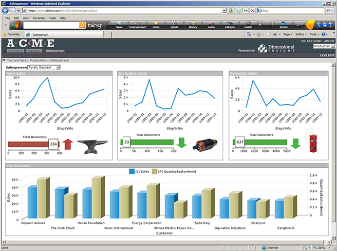
Figure 1
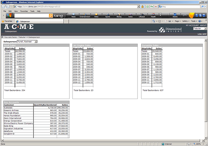
Figure 2
Determine data type
Another factor that will help you determine whether or not to include dashboard images is the type of information to be displayed. Some types of data (such as specific product-based data) lend themselves well to image inclusion, while other data (such as qualitative data) are more difficult to represent with dashboard images.
If a table includes a summary of data from a specific country, region, or location, it may be logical to augment this with an image representing that location — whether it be a map, photo or logo/emblem.
The bottom line
There’s no one way to represent data on a dashboard, but your users will definitely have their preferences! Use the three steps outlined above to help you determine the best way to display data and enable your users to make the right business decisions.

- Meet the Dimensional Insight Team: Gabrielle Amarosa - December 1, 2022
- What You Need to Know About President Biden’s Marijuana Pardon - November 2, 2022
- How to Ace this Year’s OND - September 27, 2022