 Companies invest a lot of money in business intelligence; as a result, you expect to receive information in an easy-to-view and intuitive format that can help you make better business decisions.
However, there are times you might feel frustrated when your BI tool’s dashboard is not delivering adequate information. What’s the problem? The issue may lie in the hierarchy of information (or lack thereof) provided by your dashboard.
Hierarchy of information determines the best way to display information on a dashboard.
-
Top level:
Displayed information should be broad and generalized.
-
Consecutive levels:
Should contain more detailed and specific information.
This framework can be used to help you visualize how data is contained in layers as you “dives into your data,” but it can also help explain how you see information on a single page or dashboard.
Tweet: How to use hierarchy of information to simplify your dashboard
Consider the frustration you experience if you’re not getting the right information. Could it be that the correct information is displayed — yet it is done so in such a way that it is hard to read or hard to find useful items? If so, the correct hierarchy of information is not being expressed visually.
This hierarchy must be decided on prior to building and designing the dashboard. By organizing elements on a page to express this hierarchy, you and your users can access the right information and digest it properly. This, in turn, expedites the decision-making process.
How do we correct poor hierarchy of information on a dashboard? Start by deciding what the proper hierarchy (or order of importance) of the items on that page should be.
As an example, let’s take the manager at a brewery who wants a dashboard to analyze sales. Here’s a list of some of the data he may want displayed on the dashboard:
- Sales
- Sales by Product
- Sales Growth
- Sales by Region
- Percentage Goal
- % Discounted Items
- Cost of Goods Sold
- Gross Profit
- Total Quantities Sold
- Quantities Sold by Product
- Current Inventory
Let’s figure out how to best display this information according to hierarchy in two easy steps.
Step 1: Limit the number of key metric groupings on the dashboard to fewer than 7 groups.
By limiting the number of metric groupings on a single page, the information is more “digestible.” If needed, Diver users can add ClickViews to their dashboards to dive into related metrics.
Here’s how the brewery manager’s metrics might be reorganized into a hierarchy that displays just 7 key groupings of metrics on the dashboard:
- Sales
- Sales by Product
- Sales Growth
- Sales by Region
- Percentage Goal
- % Discounted Items
- Cost of Goods Sold
- Gross Profit
- Total Quantities Sold
- Quantities Sold by Product
- Current Inventory
Step 2: Ask what is important to the end user?
Now that we have decided that only Sales by Product, Cost of Goods Sold, Gross Profit, Total Quantities Sold, and Current Inventory will be displayed, we must decide which of these is most important to the end user to view first. In this case, Gross Profit has been chosen. Gross Profit is the broadest and most generalized piece of information; it has the highest hierarchy. At the next level, Sales and Cost of Goods Sold show more detailed information than Gross Profit. So, at the second level of hierarchy is Sales and Cost of Goods Sold. The lowest level of hierarchy on this dashboard contains Total Quantities Sold and Current Inventory.
The images below show how this information, with its inherent hierarchies, might be displayed to express the levels of importance of the information.
As you can see, various design fundamentals (size, location & proximity) can be utilized to create and reinforce the desired visual hierarchy. Let’s examine when you would use each of these layouts.
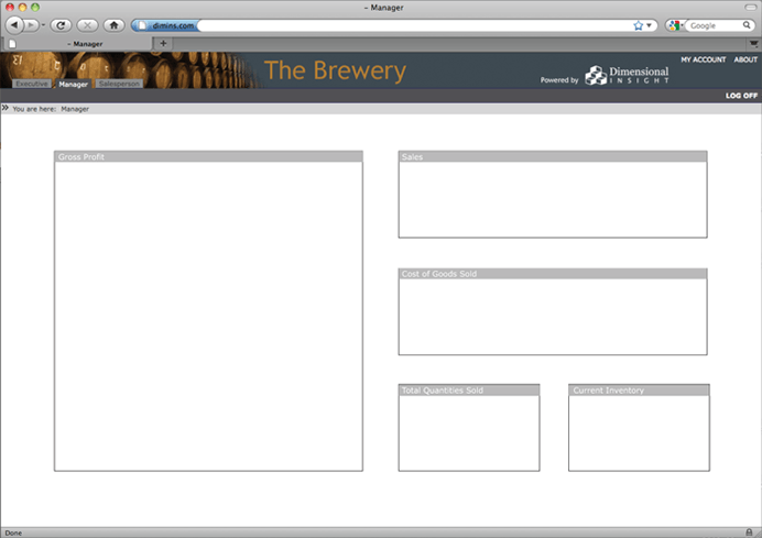
Figure 1
Figure 1 – Size contrast: In dashboards, the item with the highest contrast receives the most attention. In this layout, in the area below the navigation bar, the highest contrast is in the size of the shapes in the layout. In order to utilize this layout, you might use a single (large) indicator to display the Gross Profit. Or, because the allocated space is so large, you might decide to display a pie chart of total revenue and color code each component of expenses that would be subtracted from the revenue, ultimately revealing the remaining Gross Profit.
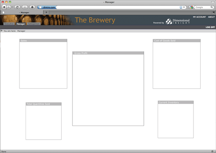
Figure 2
Figure 2 – Location contrast: The main thing we notice about this layout is that the items are centered. The highest contrast appears in the largest centered box. In this example, this central position should be used to display Gross Profit.
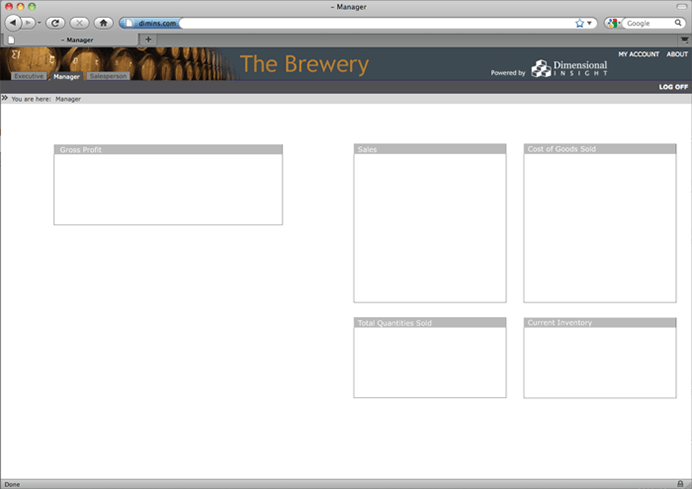
Figure 3
Figure 3 – Proximity contrast: In this final example, the upper left hand box is the only one with large amounts of white space around it. It has the highest proximity contrast. For people who read from left to right in their native language, the left hand location generates more attention for that box. In this example, the upper left hand box would be the best place to position the Gross Profit.
What would poor hierarchy of information look like?
- Not enough contrast: Every item on the dashboard is exactly the same size, shape, proximity, intensity, hue, saturation, etc. to each other.
- Too much contrast: Several items have large amounts of contrast causing the eye to flit from each high contrast item to another, but never to find one resting place.
- High contrast on the wrong item(s)
In conclusion, although business intelligence software is a powerful tool for summarizing data and extrapolating information, it alone does not mean you’ll be making the right decisions. The software must be applied in such a way that complements your unique business needs. One part of that application lies in how you design dashboards so you can best understand the insights from your BI software. By asking the right business questions and using them to define dashboard layouts (the answers), you’ll be much better equipped to leverage your data properly.

- Meet the Dimensional Insight Team: Gabrielle Amarosa - December 1, 2022
- What You Need to Know About President Biden’s Marijuana Pardon - November 2, 2022
- How to Ace this Year’s OND - September 27, 2022